Brainstorming about a new front page/website

Hey everyone,

The front page and the website as a whole (wwww.compilgames.net) is getting old and would need a complete refresh to be more attractive!

Do you have any idea on what could be added/removed? Which features should be highlighted? How big the download links should be?

Concerning the design, any idea on a (responsive) template that could be used? If you’re a designer, any help on the design is welcomed!

Thanks for any help! :smiley:

I kind of like the visual appereance of the startpage. It dffently made me think that this software had the features to make profetional stuff.

What made me leave and not download Gdevelop at first when I was looking into different software on the net, was that I thought it was not free… It was not completely clear for me on the startpage and then I found prices (for the webapp) -So I left… That could be more clear.

One thing that was important I looked after, when searching the internet, was examples on games already made, and a clear list of the features of the software.

As for the Forum… Is it possible to make a link to Google translate, to give easy access to both French and English forum? I have found a few interesting things in the French forum, and I see no reason why we can’t use all the knowledge to help each other.

More toturials could also be nice. The “ingame” examples are nice to look at, but they don’t really tell how they where made (Like making more levels, saving data, )

Personally I like the design of the website, only the information should be shared in a different order.
In my opinion you should share content like so:

Header: Show GDevelop logo and the slogan “To bring your ideas to life” and a “Free Download” button.
That’s it, keep it simple like this. You can also show some logos here that represent what GD is.
For example, open-source logo, Linux logo, HTML5 logo just to be not empty and look good
The most important thing, don’t tell a story right at the beginning and don’t mention “without programming” here with no further details because many people think that such tools are limited and they just leave your site as soon as they see such information. I was doing so, really I was download GD after maybe 2 years I found it and only because of HTML5 and Linux support otherwise maybe I would never give it a try simply because the information shared on the website was telling me it something limited. Just keep it simple: name, logos, slogan, download button.
Regarding download, would be nice to see only a small pop-up menu with the options: Windows , Ubuntu, openSUSE…etc when I move my mouse over the “Free Download” button or click it.

Under Header have a menu bar with the next options:

Community - link the forun
Features - Detailed list of features
About - about you, who you are, what is motivating you to develop GD, what is GD…
GitHub - Link the Github site
Play - Link games made in GD
Wiki - Wiki

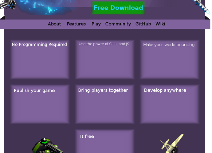
Next under the menu, make a list of key features and if you can make a nice logo for each as well, just to be more attractive:

No programming required
-tell few words about the event system and expressions

Use the power of C++ and JS
-tell few words about the C++ and JS features and extension development (people would see immediately, it not that limited)

Make your world bouncing
-few words about the built in physics system

Publish your game
-few words about the supported platforms

It free and open-source
-few words why is this a good thing

Bring players together
-few words about the multiplayer feature

Develop anywhere
-just mention cros platform IDE and few words about GDevApp

By the end, put a “Read more…” link so people who wants to know more can read more detailed list of features

Bottom: information board for latest news, updates, recent forum comments ask for donation and contribution on github staff like that and tell more about GDevApp.

I just made a quick sample of what I have in mind. It not a suggestions for an actual design only a basic example for how content should be placed on the website in my opinion.

To add a bit more modern feeling, you could apply some mouse over, mouse click animations and also in the header, for example when the website loads things in the header would nicely move in to the header from outside the screen. Maybe GDevelop logo from left, the slogan from the top and the download link would be just jump in from the background also you could add some animation to the background, things moving, flying staff like that to feel more live and modern.

4ian, do you have something in mind, or are you waiting for more (really there are not a lot) designs/suggestions? :slight_smile:

I’m building something, I should release the website on GitHub so that improvements can be added (new games in the gallery…).
I will set it up online somewhere so you can see it :slight_smile:

Here is the design I came up with so far: 4ian.github.io/GDevelop-website/public/

Let me know what you think of it!
It’s open source by the way: github.com/4ian/GDevelop-website

it is a nice presentation, but it is lacking the community aspect of it. I suggest you add a nav bar at the top of the page that

links to the forum,

to whats new page showing the latest version improvements+screenshoits
stencyl.com/features/whatsnew/
with gif files presenting the new features

to the “manual” - linking to the wiki page.

To a blog like “tutorials” section
scirra.com/tutorials/top

To a development blog like
scirra.com/blog
In this case you can just link to its twitter account, fb or google plus

to gdevapp

buttons to share this front page on social media… A video to demonstrate the engine when you click on the picture.

It has to feel like a living page with dynamic content that is changing with each release. The problem of the old page was that it is static. See
enigma-dev.org/

you could add a whats new box anywhere that has some living content in it.

Awesome! A large front page is a great choice, nice structured by the way! :mrgreen:
I spend some seconds on the games gallery searching some kind of arrow to switch images, the drag system surprised me, very nice! :smiley:

A nice detail would be make the external links open in a new tab, instead in the frontpage one.
I agree with blurymind about gifs or screenshots for the features.
I noticed about a not-translated string in the GD screenshot with spanish translation, in the sources, the string “Stop the preview” is marked as to be translated, but doesn’t appear in the crowdin page :confused:

Thanks guys for the feedback :slight_smile:
I’ll try improve it before releasing the new version of GD :slight_smile:

Updated with a menu bar giving access to the whole “GDevelop ecosystem” : 4ian.github.io/GDevelop-website/public/

Nice! :smiley:
The link doesn’t work (error 404), I have to delete the “/public”, or add “/main.html” :wink:

It is definitely better. But still the focus is the presentation of the engine, rather than the community.

A live page is a page that dynamically shows latest news from both the development of the engine and the community.
This could be another page, called “News” :

it could get content from different places and show it in one place.

  • Latest github commits +link to the github
  • Latest new tutorials+example files + link to submit a tutorial
  • Latest posts at the forum +link to said threads
  • latest from twitter +link to twitter page
  • latest on the Trello board + link to the feature suggestions forum.
  • Links to fb,g+,twitter

Such page’s main goal is to display the pulse of the community and the engine and motivate those who visit it to jump in and become a part of it. The community.

Posted at blenderartist about the new website/other news. See if we get some feedback from those guys:
blenderartists.org/forum/showthr … ost2845828

I dont like that the community links are hidden by default and it also now takes two clicks to get to the forum.

Would it be possible to make the menu horizontal rather than vertical. And Have it open by default when you first visit the page, then when you scroll down it could hide to make way for the fancy presentation that the main page has now.

Well, when you go for downloading GD, you have directly the two most important community links (Forum & wiki) just right after. So people new users won’t miss it.
And I can’t see any drop in the forum visits in my analytics since the new website is online, so not sure I should bloat the landing page with the links by forcing them to be visible.

The goal when a new user is to have him to download and try GD, hence the screenshots, catch phrase and the two bigs Download and Learn more button.
The goal is then to make sure the new user is able to take part to the community and that’s why button are here below the download section. For existing user, the menu and the “Browse GD ecosystem” buttons are showing every site related to GD.

Well, that’s the rationale behind the current design. :slight_smile: