Custom graphics vs hand drawn

I was just wondering what people think about this subject.

As I not exactly a great artist I tend to use free game sprites for my games but I have noticed that many of the graphics I have downloaded have been used on countless other games.

And It just feels like I am copying other people so I am starting to try and create my own images although they are nowhere as good as the images you can download does it make your game stand out more from the others ?

Here are a couple of examples that I made for a horror point and click I am currently working on.

Any feedback greatly appreciated

1 Like

Looks pretty great to me! If you don’t mind some nitpicking: the handle on the door on the right should be on the other side of the door (I think?) to keep consistent. Also, there is no clock (unless that’s intentional lol). Bravo! :clap:

I would really encourage to make your own drawings. At least if you like to draw.

For the programmer, graphics can be only clothing on his code, and he’s happy to find already made graphics . It’s not necessarely laziness, but more that we like to focus on coding, but maybe not on drawing. The programmer may be happy by only programming, express himself this way. But in the finnished work, the game, to the player’s eyes, the graphics are a big part of the whole thing, so it cannot be a simple cover on top of the code but more something that goes well with it. Even for us, who program the games, isn’t it a good feeling to finish a game that is 100% made by us ?

To draw your own things is also a way to avoid standardisation. It’s not only that you could use exacly the same sprites than others, but more that you would use exacly the standard kind of sprites, the ones that please a large amount of people but is not necessarly an expression of yourself.

A bit like with youtube and social medias algorithms that show us what our kind of people like (rabbit’s holes), the sprites we can find for free, are (I guess, I never really took a deep look at them) part of a standardisation, a style that easily, without taking risk, pleases the consummer. But doesn’t mean it’s deep or interesting, it can be only kind of adictive/exciting/buzy. (a bit like auto-tune in music, if I may compare). So many games look the same and are a bit mind-numbing.

Also a game graphics doesn’t have to be a Boticelli masterpiece. By finding a good graphic idea, and if it goes well, hand in hand with the game spirit, it’s perfect.
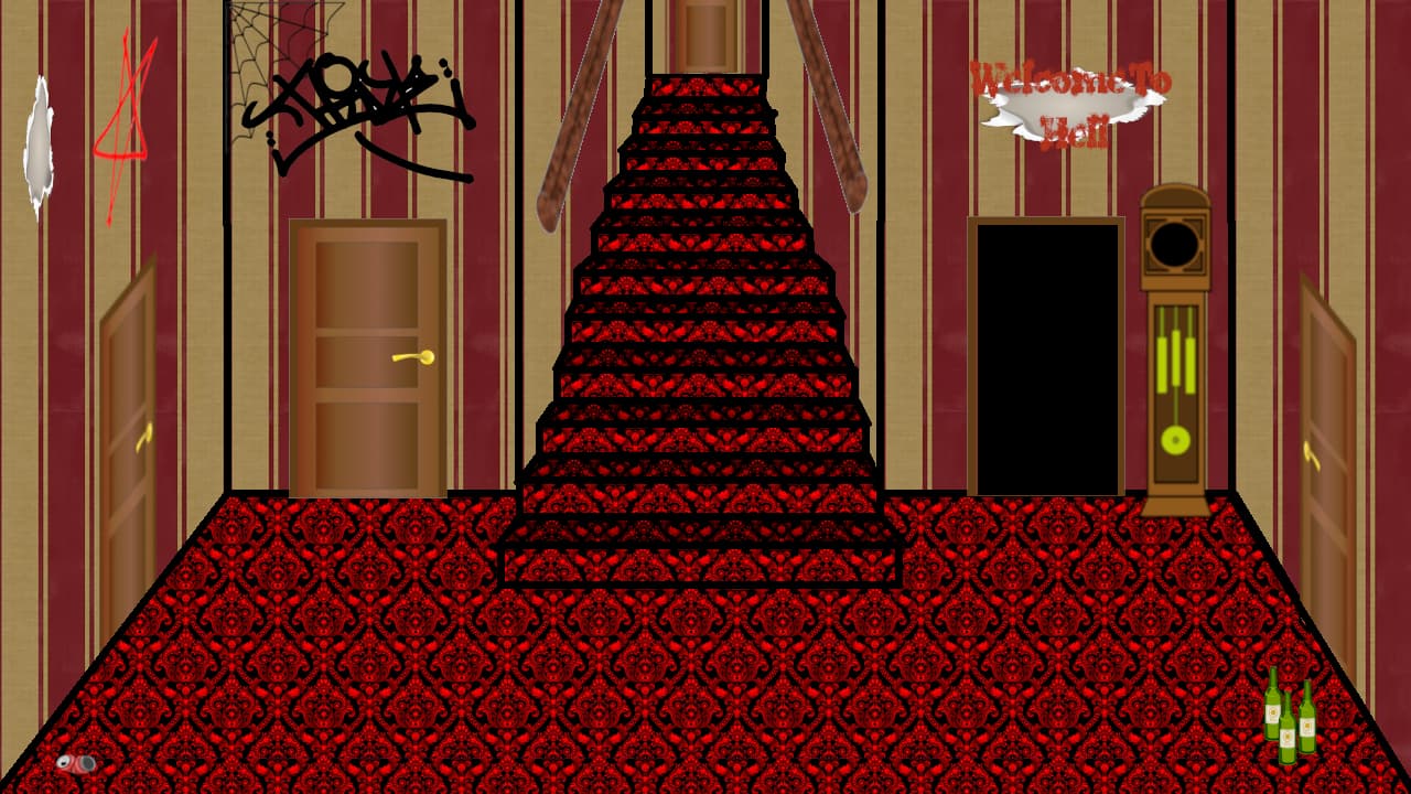
If you like to draw but think you’re not good at it, then keep on drawing, you’ll get better for sure. And what you show here looks great.

Also on a society point of view, with internet and free images, drawers are less needed, and hence the drawer’s activity is less important. Not to take already made pics but make them or ask a friend to make them is also a way to give drawers, not necessarly money, but a reason, a meaning, to draw.

So I’d say that if someone likes to draw a bit, it would be sad to go for already made sprites. Else, using custom graphics can be great tho if the code, concept of the game is good. Also maybe exist free sprites that are more original, artistic, and not the standard.

What I do so far is that, since I want to focus on the code, and don’t know yet if the game would be good, I use very ugly sprites, squares, rounds, or quick drawings quickly made with piskel. So if I finally come with a good code, good game, I can work on drawings knowing that I will directly use them. It’s more motivating and avoid to loose time on drawings that in the end would not be used. The weak point of this option is that the game is ugly during development, while graphics and atmosphere can be the most important in some games.

On a commercial point of view, standardisation, no risk, copying what already pleases and is addictive works for sure. But originality and art can sell too, and sometimes way more (look at the Beatles ^^).

Thank you I am going to try and and make the clock animated and add a a separate sprite with a moving second hand

I think it’s good, you’ve created something unique.

If you think it’s worth it, you could make the wallpaper stripes along the stairs a bit narrower to show that they’re further away. At the moment they actually look wider than the in the room.

Would a plain colour look better for the carpet? Or less of a distracting pattern?

The red Welcome to Hotl sign is hard to see. It blends in with the wallpaper. See below.

If you’re interested, you can read about ‘value’ or how light or dark something is in art/illustration. A picture can have many different colours but if they’re all a similar value then it will be boring looking. What you’ll find is that a picture will look good, not because of the colours but because of the use of value. If the value is right, it doesn’t matter a whole lot which colours you use.

I’ve de-saturated your picture so that it’s in greyscale. Doing this is an easy way to get a true idea of how it looks. You’ll see that the Welcome sign is barely visible. There’s a lot of dark with the carpet and a lot of mid grey with the walls and doors but very little light. So if you change either your doors or your walls to a lighter value then it would really lift the overall look.


One technique is to create the scene/picture in greyscale, choosing three or four values:

When that has a balanced/pleasing look, you then add your colour/hue using the colour blending layer option.

I agree that your own artwork is much better than using (reusing) the free assets that are out there, as nice as they are. I love games with their own artwork, it doesn’t have to be fantastic art to really speak about the game.

One thing I might add to the great suggestions already is that I like both your pics above. The Title pic with the manor house doesn’t have a lot of pattern on it, and the interior does. I think to make them look more like they are linked (so people understand they are intentional assets, not collected from different sources), maybe add some more pattern detail to your manor and keep everything outlined in the black line on the interior as well (doors, railing, clock) so it has a consistent “look” that carries through on all the assets. I like the look very much with your graffiti bit and the spider webs, nice touch, you should scrawl the “Welcome to Hell” in that style, too!