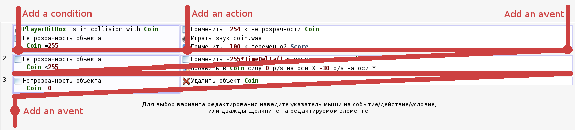
The icon “+” to the left, will not always be visible, but instead there is an empty place.
I think that the elements of the addition of new units must be at the bottom. Where next will be a new unit. That seems logical. This will create a sense of “writing” code.
When all the “Add” elements in one place, it will easily react with them. Furthermore, it will help to ensure that the interface looks easier.
I don’t want to tell that my version is better. Simply, I think that it is necessary to take the direction on simplification of the interface.
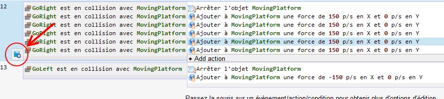
User often insert events in the middle on the event list to keep them grouped with events having the same role. So I think it’s important to keep a simple way to insert event in the middle of the list. If we only show a button to add event at the end, user will have to drag them where they want them to be, which is quite time consuming considering an event sheet can be very long.
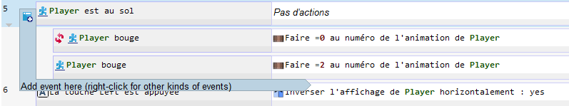
[size=150]Here is what it looks like if the event hovered has sub events : [/size]
No, I’m not talking about the bottom. I meant it as a user reads and thinks events. He thinks about a new event at the end of the event or between events, or at the end of all events.