As some people suggested here [Résolu] Diriger le héros vers le viseur, the event editor usability can be improved. That’s why we are currently investigating how we can improve it. So, we’ve begun working on an improvement of the event editor in order to fulfill two objectives : be easy to use for beginners and allow fast/quick editing for more experienced users. We also want to modernize the look of the events : by using simple colors instead of gradients (flat design).
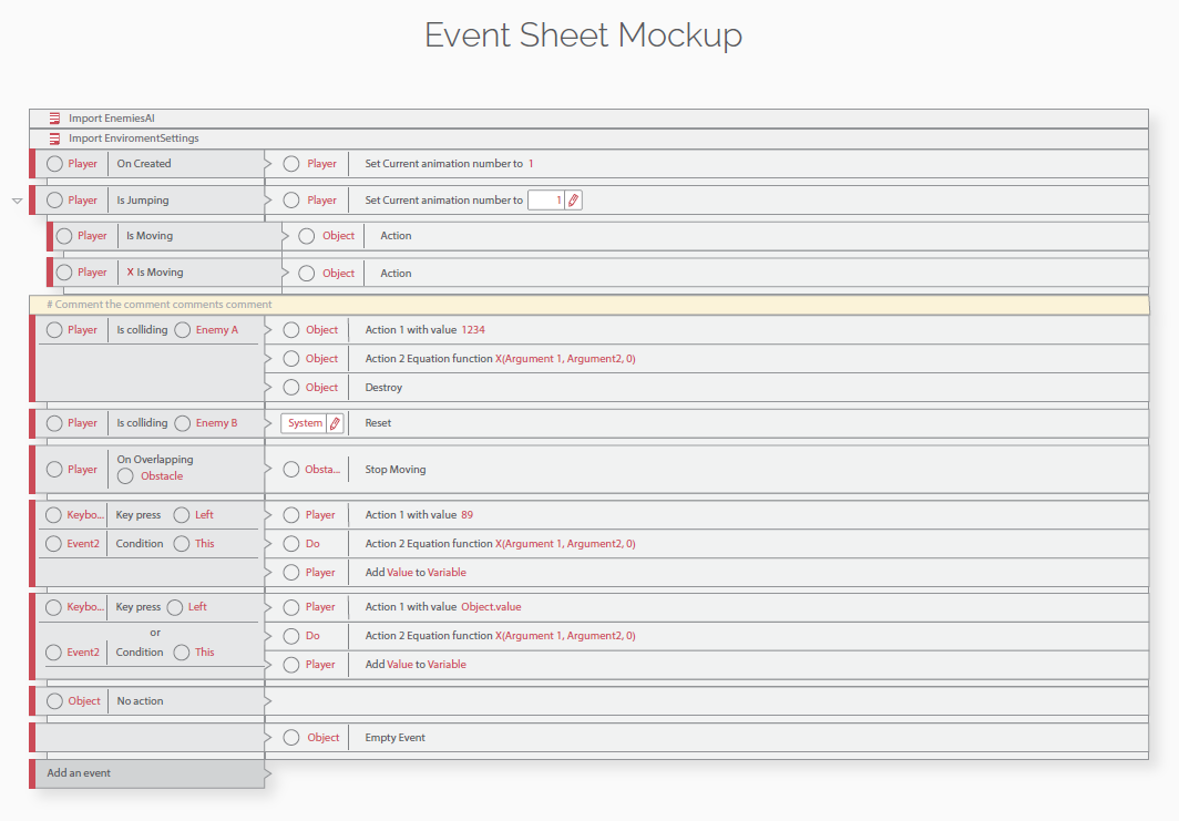
[size=150]Here what it looks like :[/size]
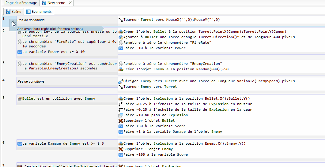
[size=150]Explanation : [/size]
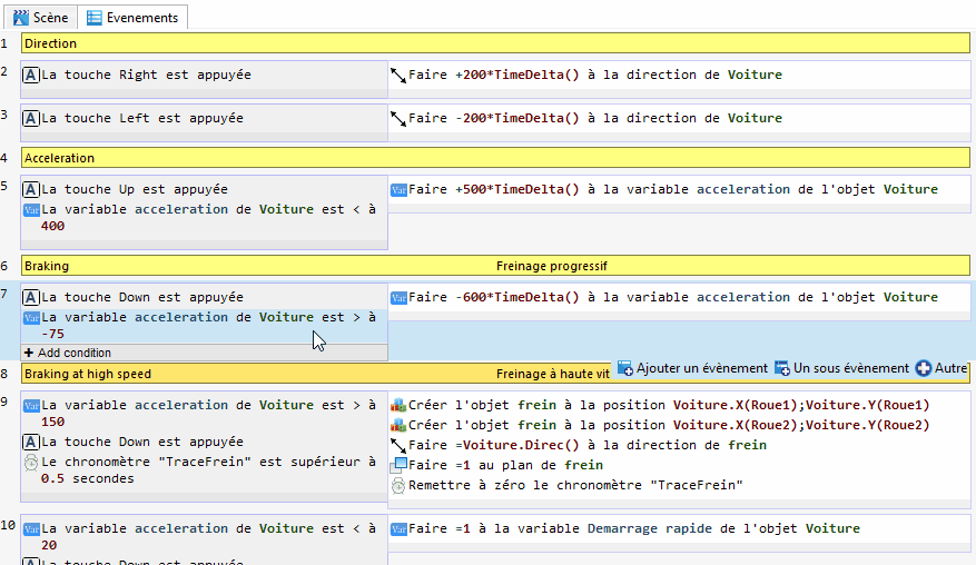
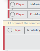
The conditions/actions lists (in each events) have a thick grey line. Moving the mouse over the conditions/actions list (not only the line) extends this line that becomes an “Add condition/action” button.
Currently, the panel with “Add event”, “Add a sub event”, etc. will be changed next.
The event without the mouse over the list of condition/action :
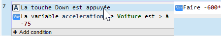
The event with the mouse over the list (but not over the button) : You can see that the thick grey line becomes a button (a bit bigger than the line so as it’s easy to click on it).
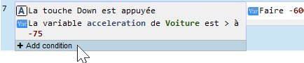
The event with the mouse over the button : The button changes color.
[size=150]We need your opinion on this because it’s difficult for developers to see how a user really uses the software.[/size]
[size=150]For the curious : [/size]
You can test the current state of this mock-up by compiling GDevelop from the feature/improve-event-editor Github branch here : github.com/victorlevasseur/GD/t … ent-editor Note : this is not a stable version (it’s the base of the future v4 with the event editor modified) and using your projects with it will make them incompatible with the current GDevelop version
Nice!
I think there is not a better (faster and easy) way to add new actions/conditions, are you planning to put a similar expandable line to add new events/sub-events?
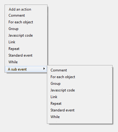
Personally I would prefer using right mouse click to choose what kind of event I wish to add or comment or group also if right clicked on a condition able to choose add new condition or in case right clicked on an action able to choose to add new action. Also if I choose to add sub event (mouse is over add sub event), would be nice to be able to choose from a sub menu what kind of sub event we wish to add: I have in mind something like this:
Regarding design, well, if you want it to look more modern I wold go with the mockup made by ‘who_is_da’. it really cool.
Don’t know if it’s a good idea : this create a lot of menus and you need two clicks to add a condition/action.
But, it’s sure that we need to find a way to allow users to add any event at a subevent.
That’s already what I used to add the bottom buttons (see the first post of this topic) to the condition/action lists. I made some adjustements like adding a text when the list is hovered so as it’s more user friendly, especially for beginning. Then, I don’t like the idea of adding sub-events by shift clicking on the same button that is used to add condition and clicking on the small left part of the event to show a menu to add an event.
[size=150]Some news ![/size]
I’m currently searching how to replace the “Add event” panel. I came up with this solution : adding a “+” button when the event is hovered by the mouse. This button allows to add an event under the hovered one. There is also a “…” to add sub-event (of every kind) or other kind of event under (not as sub-events).
No, I mean in the mockup I like specifically the way it looks
For example, there are those narrow red lines at the left side of the events, how about that, when the mouse is over the event, those lines would play a slide in and slide out animation to show the plus (add) sign?
So it would looks something like this with no mouse over the event:
With mouse over the event:
With mouse over the plus sign:
Anyway yeah, I agree on the plus sign whether it is just appear, disappear on mouse over or play some kind of animation
For the animation, it’s not possible : it would require too much work and will need complicated code.
For the “arrow” between conditions and actions, it is possible but only one by events (not every lines because it would suggest that each condition is related to one action in the event).
Actually, it doesn’t really need to play a smooth slide in and out animation if it really that complicated, but maybe a simple animation change would do:
mouse is not over
2.mouse is over event
mouse is over plus sign
as seem on my images.
I was just thinking about that the color line could be used also as a solid indication of the event:
Active
Deactivated
Faulty (error in expression or something)
Oh well… So the plus sign going to appear when the mouse is over the event and change it color to green when the mouse is over the plus sign or the plus sign will be visible for each event and only change it color when the mouse is over?
How about changing event editor into sorta-but-not-quite webpage and allow users to skin it using CSS3? I personally like gradients and wouldn’t want them to go (don’t like flat design - gradients, if properly used, can make things like buttons pop out so you won’t have to wonder whether it’s a button or unclickable/untouchable label).
I already have been thinking about this. Alas, for now integrating a webpage with wxWidgets is still difficult/clunky and interacting with it is even more difficult.
But my long term goal is to be able to merge GDevApp/GDevelop events editors.
I guess here Victor is aiming to make small changes keeping the same codebase for the events editor. And he is right: the events editor is already a solid codebase without bugs, it’s quite usable and proven. We should stay focus on these “small” aesthetic/buttons changes that are still able to bring the events editor to the next level!
Thanks
But your mockup has some problems (in my opinion) : they are too many buttons and the user doesn’t know if they add conditions or events (as they are just under the condition list). Also, it would be nice to have the “events related” buttons not mixed with the “add condition” button because, some events like the “While event” have two condition lists : it doesn’t make sence to display the “add event” button on both.
[size=150]Some other news ![/size]
First, thanks for your feedback. I’ll take some of your remark into account like changing the colors a bit to follow more GDevelop style.
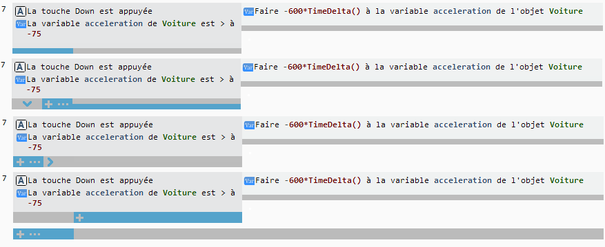
Secondly, I made some tests for the “Add event” button and here is the result :
A button appears on the left side of the event hovered by the mouse. When the mouse is on the button, the button changes color and a rectangle (ended with a triangle) with “Add event” written appears just under the event to show that the added event would go there. It’s also written that the user can right-click instead of left-clicking to have more options like “Add sub-event” or the other event kinds.
[size=150]Your opinion ?[/size] (except on the colors that will be changed to follow GDevelop style)