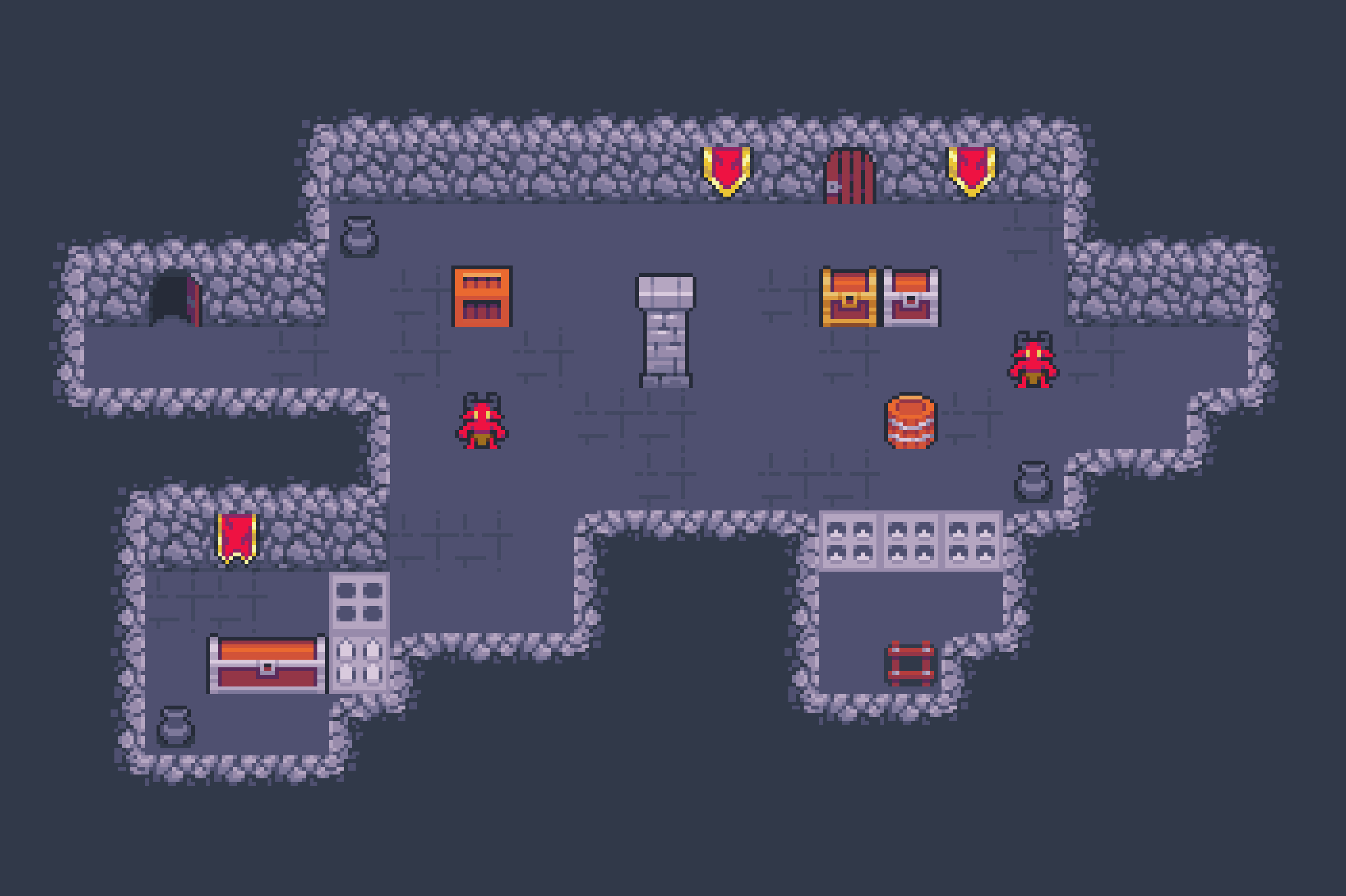
I’m no artist nor a level designer but, I would recommend having the floor contrast quite a bit from the walls so the player can tell the difference without actually trying to think. And patters might could help if it has a different pattern for the floor than the walls. I do think those two look quite different from the walls, but hard for me to tell without an example of them on top of each other really.
Like these images (found off a google for pixel art dungeons) the floors are similar colors, but brick pattern is quite different.
Yeah! As a player, I can look at that and automatically know that’s the ground vs the walls. Playing around with various colors and patterns wouldn’t hurt either to try and find something that will “Click” for you and your levels look.
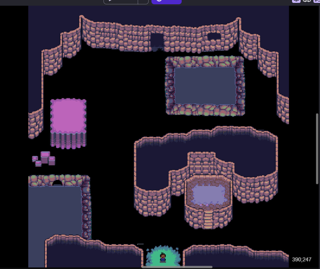
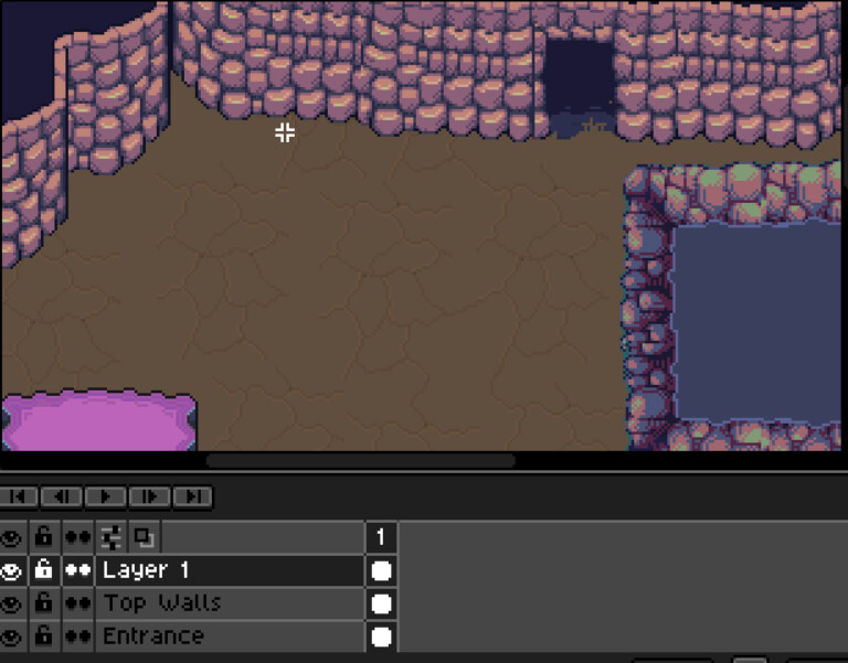
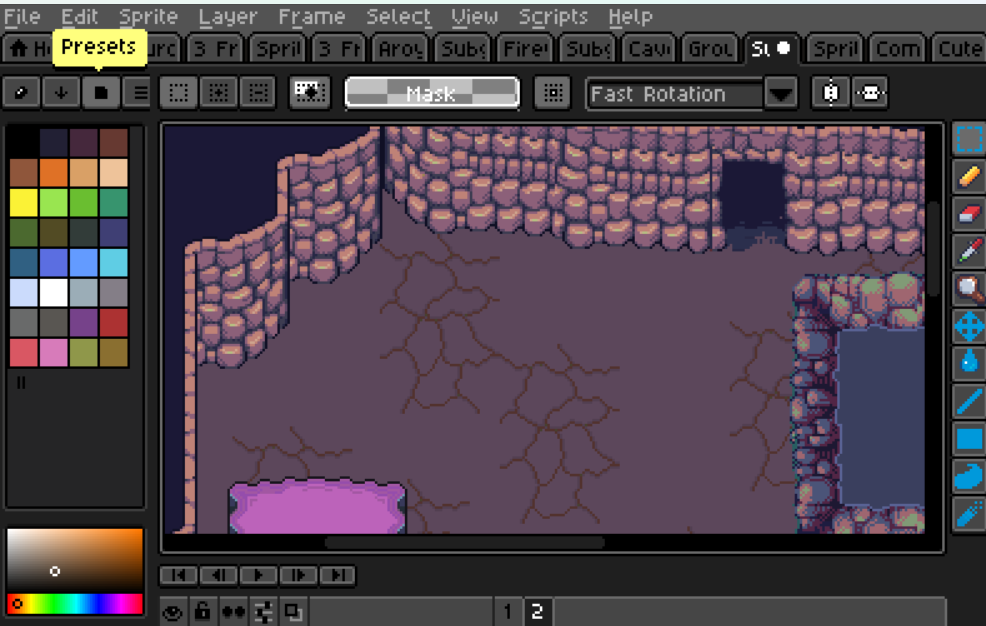
Funny you mention “playing with various colors and patterns” because I was just doing that, recently. I’ve been debating on using a different shade of purple for the ground and here’s what it looks like, so far.