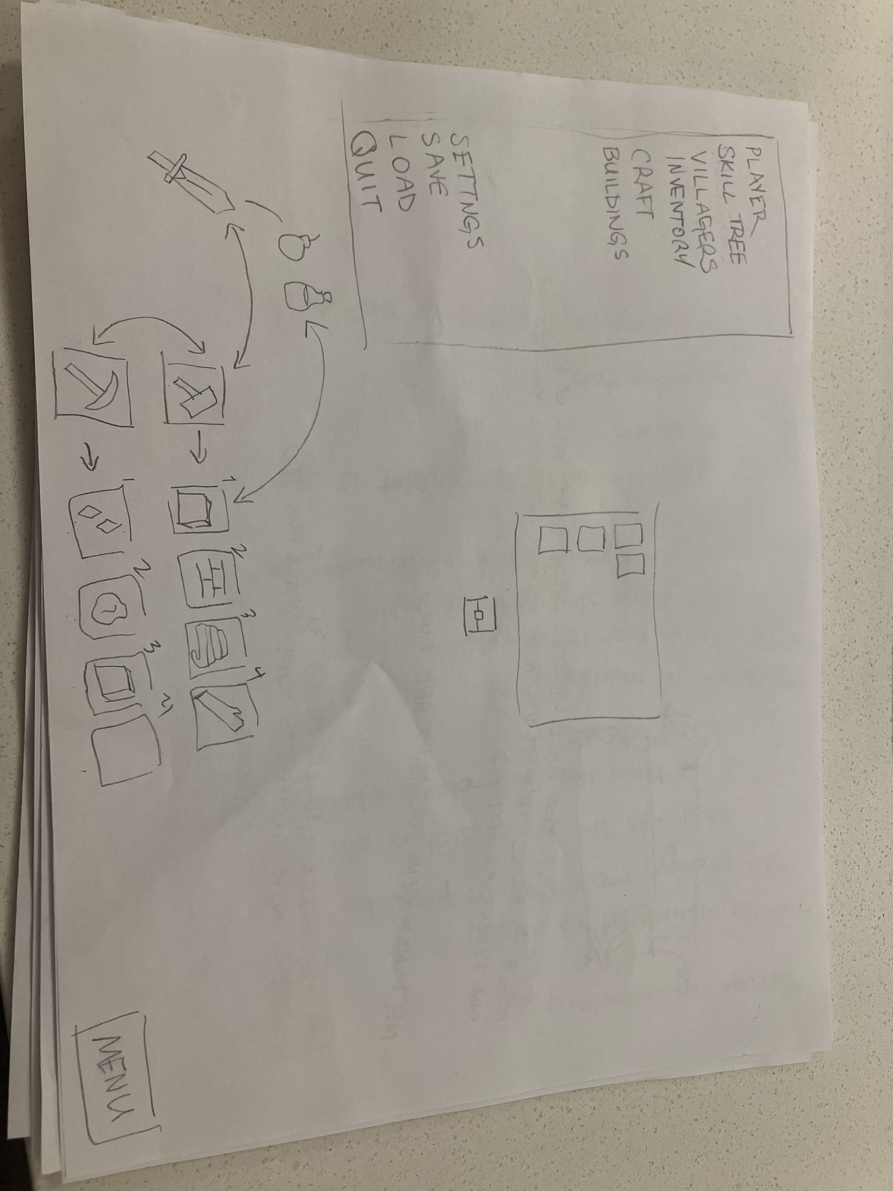
I’m in the middle of fixing up my game’s graphics in order to finish the “building” demo, and my hotbar in particular has gone through the most change, but I’m not sure if I’m in love with it or not.
First draft:
My fiancé didn’t like it, and said it should be in the top left corner of the screen.
Second draft:
Second draft was somewhat of a success but was too simple for what I have planned with the graphics.
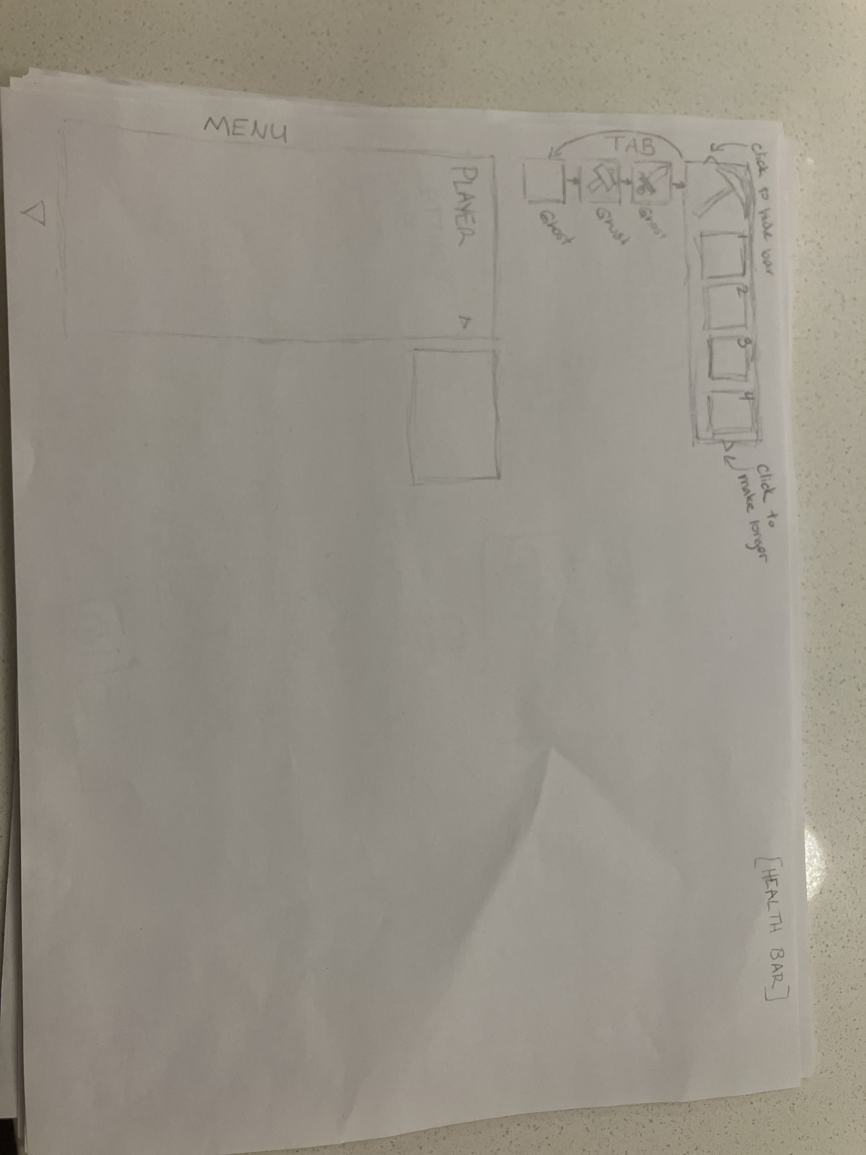
Third draft:
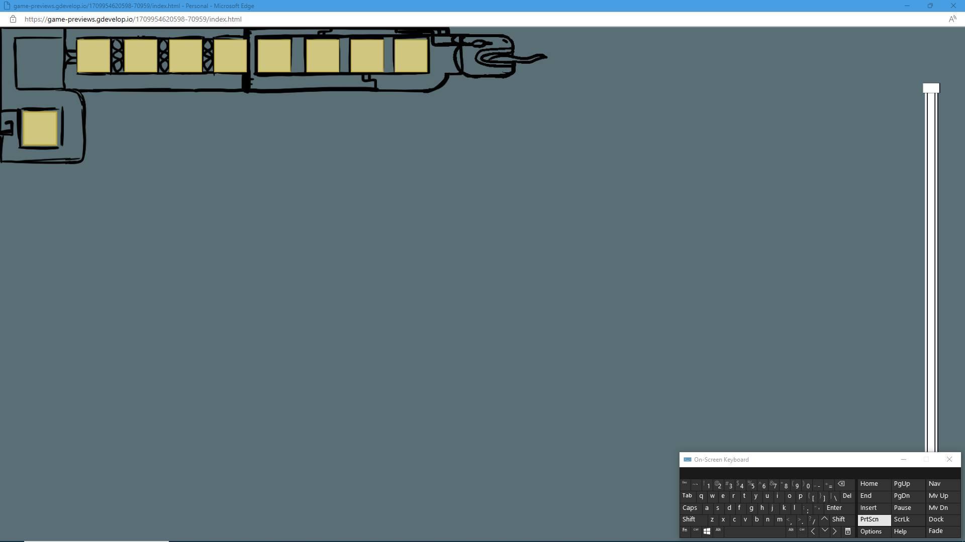
It’s a sketch and uncoloured but as you can see, this is what the hotbar looks like extended. By pulling the head of the dragon to the right extra slots will slide out from behind the first 4 slots. If you slide it to the left, the extra slots are hidden away again. Big square is main hand, and the square underneath is the secondary handheld item.
I want to keep it this way, but for the look? I dunno. Should I keep it a dragon? Maybe something else? It is a game about Dwarves and building your own mountain fortress, so it would need to be something within that realm of fantasy.
What do you guys think? Is simple and plain more your thing, or do you like a more detailed look to menus and UI? Should I keep it in the top corner? Does it even matter?