Need some UI Feedbacks for my very first prototype

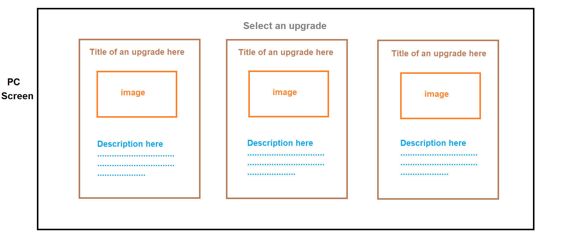
Currently, I’m making a game with a random upgrade mechanic just like other rogue-like/lite games where when you level up or collect something a “pick 1 from 3 upgrades” will be shown.

In my game you can choose to pick one, skip or reroll them.

I need your feedback about where should I place the skip and reroll buttons UI at.

Here is the prototype

If there need to be a re-roll and a skip button where should they located?

In my opinion it’s this


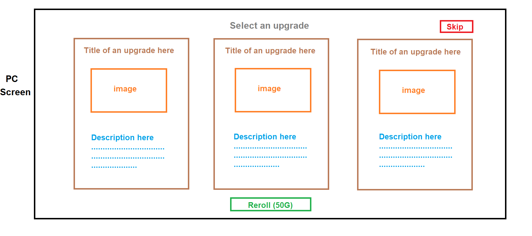
The Reroll is at bottom-middle
The Skip is at top-right

What are your thoughts? Both buttons should be located nearby each other or separated?
You’re welcome to share with me, especially from user experience aspect.

1 Like

Your design is great imo.

2 Likes

I think your UI is perfect, because it describes everything, look:

  • Description (it is important for the player knows what the upgrades do)
  • Image (sometimes, images makes the selection faster, that is better for experience)
  • Price (if I was the player, I will know that the price of the button is 50 gold, because you put inside “()”)

I can’t explain exactly, but I like so much your UI, because it is interactive and easy to understand.

1 Like

Thanks guys, I guess I’ll use it.

Hi,

I like what you’ve got so far (how it’s currently set up). :slight_smile: