I’ld say the first.
Xierra
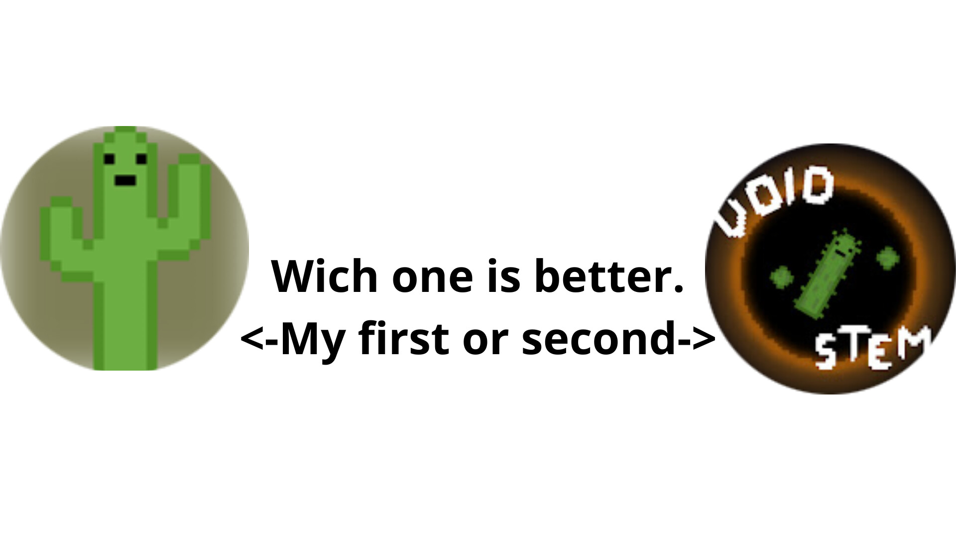
The second one feels more like a logo, while the first is more like a regular PFP.
Ill go for the second PFP, just for the more detailed cactus.
What would the icon be used for? If it’s the game icon, I would say the first one due to it being more clear.
Hi Void-Stem, I hope you don’t mind but I had a go at modifying your first icon to give a third option. I made it more of a close up view and gave the cactus a bit of an angle like in the second icon. I also changed the background color so that the cactus would stand out better (more contrast) and put a simple border around it.

That looks great! I like the edit that you have made.
Cooooool
What is the icon for?
Hi all!
Super!
Xierra
The first was just made for game icon, but because i did not like for the game I changed it the second for the use YouTube, X and more.
Oh, this edit looks good!