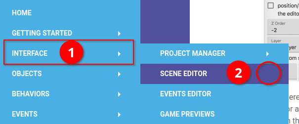
If you go to, say, this page of the wiki: Scene Editor [GDevelop wiki] there are a few issues with the styling of the menu that become apparent:
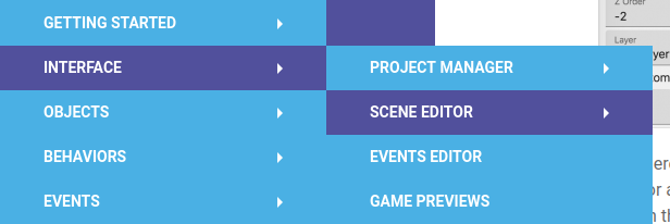
- There’s no indication as to which part of the menu you’re in, by way of the parent menu item being highlighted. I know there’s the URL and the breadcrumb trail, but since the current page in the menu is highlighted, I think the parent items should be highlighted too.
- If you do manage to work out that you’re in the ‘Interface’ section and hover over it, you’ll see that the current page, ‘Scene Editor’ is highlighted. Yay! But because it’s highlighted, there’s now no indication that it has a sub-menu (i.e. the arrow’s hidden/removed).

Here’s what it’d ideally look like instead:

If there’s an issue queue for the wiki where I can post this instead, please let me know.