Like the title says, the animation name in the instance panel was really a super useful feature, now with only the Numbers i Can’t track all animation and which one i need most like before without searching in the object then return to instance panel.
3 Likes
I dont usually use this feature so im not really sure on the impact… but this seems like a step back in quality of life.
Stop trying to make things slick and compact, i hate stuff like that.
I much prefer to have to scroll but have everything i want clearly visible and easy to spot then have tiny symbols compacted… thats not GDevelop.
GDevelop UI feels like your using a game to work on a game, i love the big bold fonts, how everything is in contrast and easy to see and work, BIG buttons… i love of this, its so nice to having to squint at my screen.
Please dont make crappy “slick design” stuff…
For example, a massive offender of this was the FF7 REMAKE game, the combat menu, even for people with good sight, is tiny, you have to squint at your screen…
The Remast for Final Fantasy 10 did the same crap, they had such a nice UI but for the remaster they made it “new”, with tiny, HD, “slick” fonts and menus which sucks… when i was struggling with it, i asked a friend since i know my eyes are really bad, but everyone i asked said they hated the new UI and that some stuff was almost impossible to see.
Stick to the design that made you, stick with the disgn people have grown to love and work with.
Just a little rant…
1 Like
I understand you, unfortunately they need to look elegant, also because their main gain at the moment seems to be schools, so they want to look their best for them, the problem with this however is that this instance panel wasn’t a great thing in my opinion , because we lost both the arrows and changing the values which honestly I used a lot and preferred compared to the scroll, and the possibility of changing the animations by name which is really a thorn in my side at the moment, given that I tend to use a single object for several objects in which I only change the animation and based on the animation I give a different effect to weapons for example. furthermore I would add that it was also a missed opportunity to add very useful features such as flip or opacity. What I fear most at the moment is since this panel just came out it will probably take years to see the old stuff reimplemented plus some new stuff. just a big disappointment of mine
Hello MagicBiscuit,
I am the Designer of GDevelop. I am usually in charge of setting the bases of the visual (colour, spacing, contrast…) changes on UI components. For future readers, allow me to explain some of the changes, specifically regarding the instance panel (since they might be wondering too):
- You said that the old UI was the design that made the app. I would say that it was the UI that the app used at the beginning where UI components had different standards. Standards (as other things in the world) tend to evolve with time, so I would argue that what makes the product (and consequently the app) are the technical limitations of the time, the different type of users, and human/machine interaction conventions (which tend to evolve with time too). So, the UI is a big part of the software, but it is no the UI that made the software. Indeed, we did noticed that the “bulky look of the old app” was stopping people from taking the app seriously, thus stopping them from using the app. That’s why the team decided to start evolving the 2006 look.
- You said that you personally prefer big letters, big buttons and don’t mind scrolling, which is understandable. However, we had feedback form other groups that said the complete opposite: the information amount is too imposing (which makes them scared to use the tool), and the big buttons “make it look like a toy”. Indeed, we want the tool to be taken seriously so we made choices to display more information (by using the icons that could replace words. BTW, I am not planning to turn every word into an icon), and tune down the purple buttons… which indeed, make it look “slick” or “modern”. We knew that some friction would be expected and some people might perceive the components as “too tight”… while others will like that more things can be displayed.

The GDevelop team is quite small (I myself am the only Designer, for example!) and in a perfect world with enough time, changes like this are tested in a controlled environment and measure on a certain amount of time in the future to know if the friction of change is compensated by the efficiency of creation and adoption of the tool by new users. We cannot do this. We design, collect feedback, code, test and launch features like this in less than 2 weeks! With this amount of time there are some things that we didn’t have the chance to observe and measure… that is why we keep our eyes on the feature request channel. ![]()
Which takes me to the feature request itself: @Kruger we had some doubts regarding this component (wether keeping or not the text) so your observation has been noted, and I’ll keep an eye on it (since I remember interviewing some other users who were using the names too because numbers weren’t transparent enough.)
Thank you both for your comments.
3 Likes
Thank you for considering adding the text animations again (without them I’m really going crazy ahahaha), I understand that perhaps the drop-down menu could seems Windows Xp/Vista era, but if it can help you, would be cool to see the name to the right of the number instead of putting the drop-down menu back for example:
Animation
0 - Idle
1 - Run
1 Like
@Luni - Ill be honest, hearing that kinda bummed me out and almost brought a tear to my eye… the “Toy” feel and look is kinda what got me into GDevelop, i keep praising the design of the UI on every chance i get, because the whole thing feels warm, fun, functional, informative, the whole thing oozes love and heart for the app.
The “Slick” and “New” feel that most software use, are outright cold and analytical, far more “unfriendly” and i always hated it, specially, like i mentioned, when it makes its way into my favorite games…
Working on GDevelop has been such an amazing experience because of all those “Toy” elements.
…and as i keep mentioning, even if unintentional, its a accessibility feature for people like me.
I have less then 1/10 of vision, legally blind, cant leave my house without my cane… if i where to tell people that i made a fully featured game, they wouldnt believe me, but i did, thanks to how GDevelop looks… so i supose, thanks to you Luni, and for that, a very special thank you to you @Luni
I really hope things dont change too much… ![]()
I already suggested it in other feature request
But i gonna repeat cause i think it would be best from two worlds
We should call animations by numbers
BUT have animation names as suffix which we can’t click
Like for example how Aseprite did it with PX after value you input for resolution
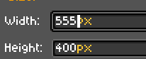
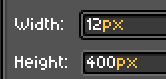
You control/change/edit only numbers here
But you always see px at the end
Imagine same with animations
You can change number like you change height
But only number is selectable value here
Where suffix would be animation name in some different color or whatever but would be still there
And it would not be selectabe or editable
And that would solve the problem in my eyes
1 Like
I kept thinking about this whole “Old” vs “New” and “Toy like” vs “Modern” thing…
Heres my argument… look at what open source is designing, but id say more importantly, look at what games are being played and what games people seem to be asking for.
There has been so few new games that have actually made it, most of what is being played now is old games, and the more “new” games come out… the more people switch to playing older stuff.
New isnt good, it hasent been for a long time… all it serves is to show how the older way was better.
Im not saying go back to Windows 95… but there was a sweet spot in design where stuff just worked.
I get that you want to bring in new people and show them that this is a “serious” engine… but look at the great majority of people using GDevelop… what was the original thought behind the engine?
GDevelop is an engine for people who enever learned how to code and the people using it are the people who go “Hey, this dosent requier code and seems user friendly, let me try making a game”, its not a big dev group or corporate that decides to make a game and use GDevelop as the engine of choice… not saying that dosent happen, im talking about the vast majority.
The “toy” feel, the user friendliness, all the tooltips with descriptions as if someone is talking to you, the way things are layed out as if your playing a mini game or that your about to get an achivement when you press “Create your first event” is what makes GDevelop so awesome…
You even have nice UI animations that give the app a whole new level or warmth, like when you drop an object into a folder, the folder wobbles a bit, thats something you wont find in most “modern looking” software.
Paired that with how GDevelop is a proper engine that allows you to make everything you can think of, id say makes the one of the greatest game making engines ever.
All GDevelop needs to have a massive boom in usage isnt going “modern” or less “toy”, its simply pooling all the resources into adding proper 3D support, with as much ease of use as 2D… people would go nutts.
I can understand what you’re saying. I could also feel like tools and things evolve a little too fast and it is not easy to keep up with everything!
Just as “old” isn’t always good, “new” isn’t always bad: for example, the UX copy (the friendly messages like talking to a friend), the folder interactions, and the UI animations that you’ve mention are all new. They weren’t part of the app in the past and were introduced in the last 2 years or so.
The app/tool will stay as it is. “Friendly” is a quality that is at its core, and will keep allowing non-technical users to create games. The UI visuals (which is only the tip of the iceberg of the tool) will evolve (accessibility is intentional and I’ll keep making sure that the visuals have enough colour contrast), but the function will remain. ![]()
Anyway, we are stopping the hijacking this feature request. Sorry to all future readers!![]()
Please do not forget to like Kruger’s original message to vote for the feature
2 Likes