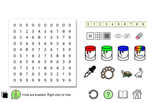
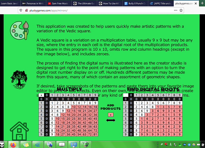
[APP] Magic Square Painter

Apologies in advance for being long-winded. I’m reposting about this here as the “official” app thread with some edits to reflect changes. While it is made with GDevelop, it’s not a game per se, hence the [APP] tag.

I’ve separated the information into collapsible sections. Click the headings to expand.

Target Audience

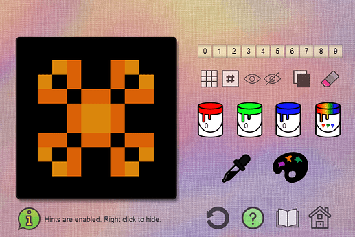
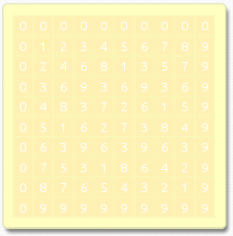
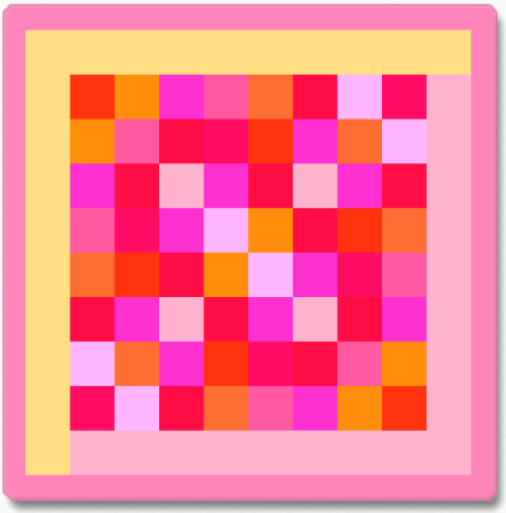
The app is designed to put tools for creating math-based patterns, like these, at the fingertips. It is intended for use by young children with guidance from parents and educators, in conjunction with other lessons, as well as anyone of any age who enjoys playing with colors. Feedback is welcome.

Scenes

Home, Studio, and About

  • The home screen background color is random.
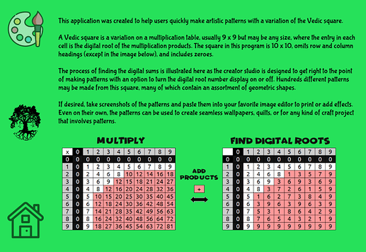
  • Instructions for use are included on a very short “help” (question mark) layer in the Studio, not under About. The About text has been shortened. It’s not necessary to read this part in order to use the Studio though, unless you want to know more about the numbers.
Studio Features and Options

It probably seems like a lot of buttons, but many of them do ‘double duty’.

Everything is controlled by mouse clicks; no key presses to remember.

  • Rainbow bucket for random combos
  • RGB paint buckets for custom colors
    – It’s possible to randomly color different parts: frame, grid borders, text, and bg tiles.
  • Create and save mixed hues to the custom palette using the pipette
  • Change number text color
  • Change the frame color
  • Change the grid line / border color
  • Change bg tile colors by number selection. Click one number button, hold and drag your mouse over the others to quickly select or deselect more than one.
  • Eraser; works on anything that you can add color to when the option is selected.
    – Coloring shortcuts … Left click = white. Right click = black.
  • Show or Hide the number text, grid lines, frame, and/or the studio canvas texture
    – yes, one or the other or both at the same time
  • If you want to start over, click the refresh arrow button.
  • Turtle & Hare color picker speed controls
  • Ability to change the studio background color using any of the buckets or custom palette
Compatibility

Unfortunately, it probably won’t work on any mobile devices at this time. A desk/laptop and Chrome browser is recommended. It also (mostly) works in Firefox, but there may be slight differences from Chrome in display and responsiveness of Studio options.

Known Issues

Clicking “About” in Firefox causes the app to crash.

Screenshots (Updated June 1, 2020)

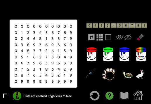
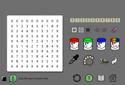
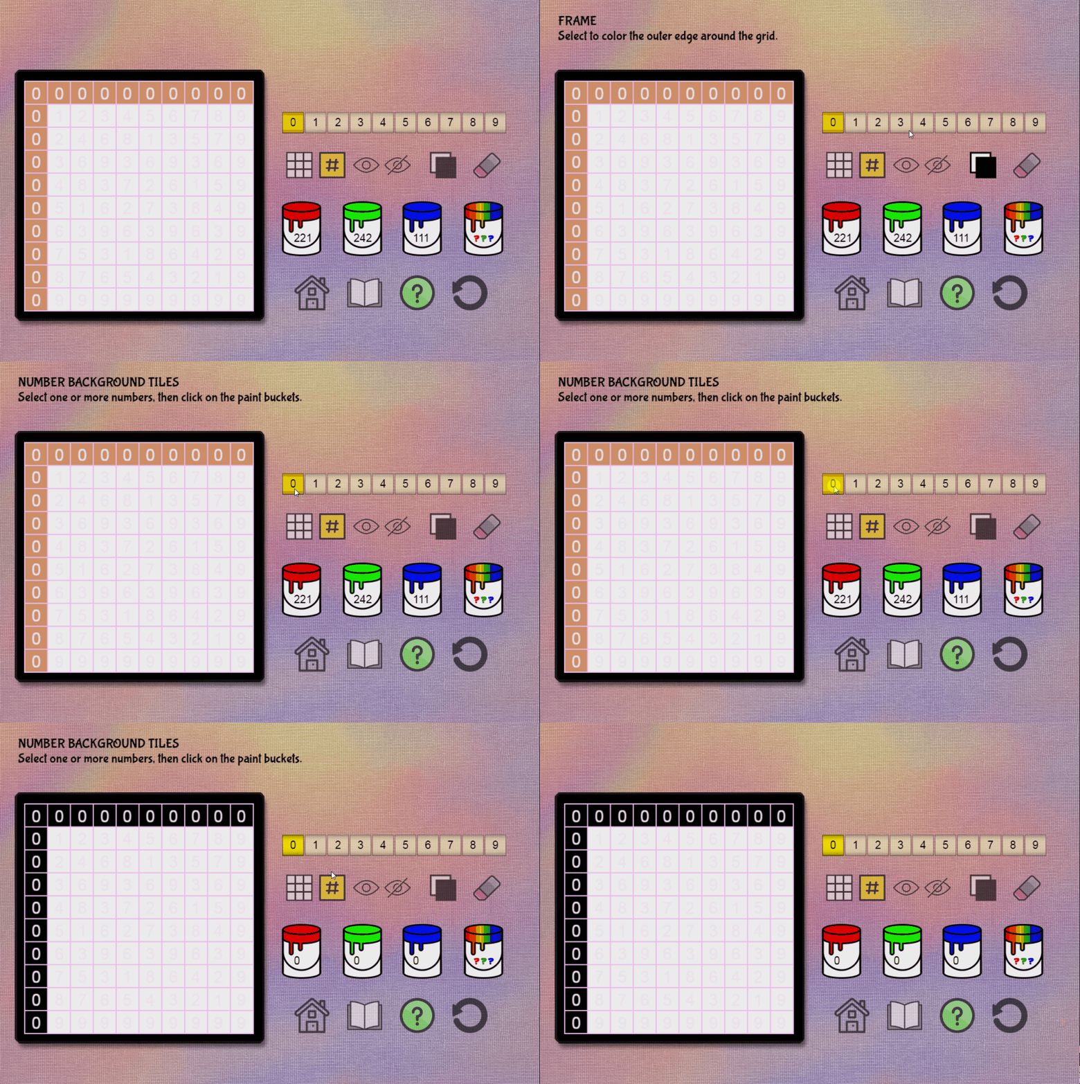
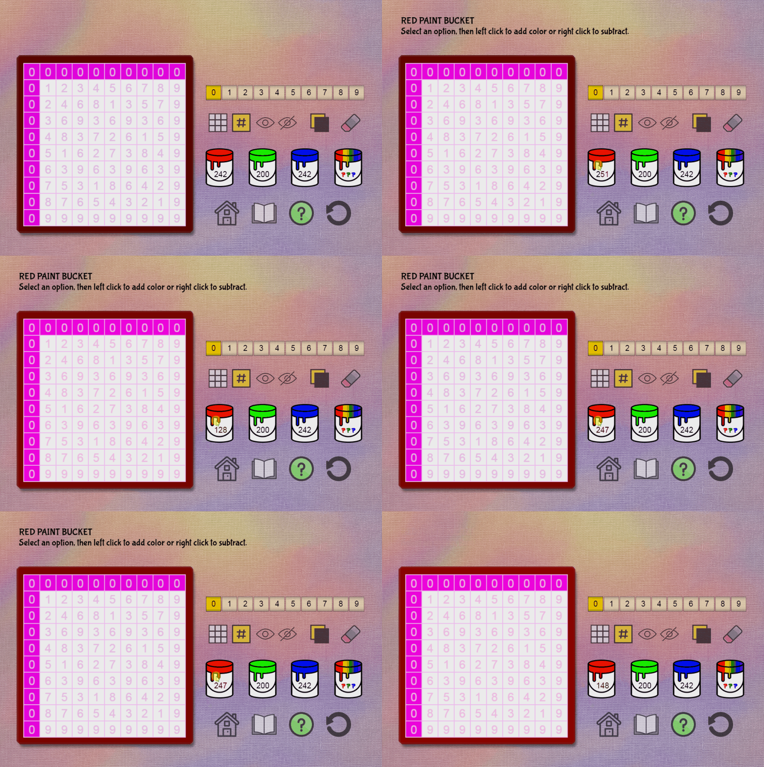
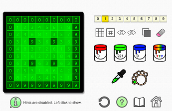
Examples of the Studio, the shades shown here are basic, but you can use any color you like.


Try it here:
http://pluckygames.com/apps/painter

If you’ve visited the link before, please clear your browser cache to see the changes.

Thank you and happy painting! :grin:

3 Likes

Very cool concept - in my 12 years of mandatory schooling, I’ve never used, much less heard of a Vedic Square! I’ll look up the concept later (the pic , but it reminded me of a Sudoku square with less sub-grids. Didn’t explore much due to framedrop issues below:
My dual-core AMD A4 laptop (intergrated graphics card) could barely handle the game though, the interface frequently needed half a second to process what I was doing - it didn’t register most clicks, so I’ll try it again on my desktop when I get to.
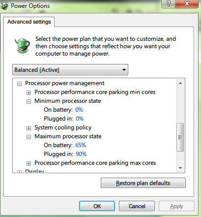
(If you want to emulate a slower CPU using Windows, Control Panel > Power Options > Change Plans Settings > Advanced, then lowering both Minimum and Maximum Processor State. image
)
Careful though, this causes your entire Windows to slow down (but under most cases, it won’t crash), so don’t close the window so you can change it back easier)

Currently, the Learn page overlaps in my 768p display, so I couldn’t read the fun part.

There are other things, but as mentioned, I’d have to try the game more on a better computer to really explore things.

1 Like

Thank you so much for checking it out and showing me those issues!

A secret that isn’t really a secret:

I never heard of Vedic squares in school either lol. I discovered it on my own (forget exactly how it started now) and learned about Vedic squares after Googling the number sequences out of curiosity.

Also found out some dude has written extensively about them in relation to correspondences with the I-Ching and many others have too in different ways. Now I see that some teachers have their students make these patterns in “math infused art” lessons, but have no idea what they use.

I will try to do the emulator thing and see what happens on my end.
Unsure of how to optimize it for better performance though hmm… :thinking:

Sorry about the font issue. I saw Bouh say on another thread that custom fonts are to be fixed in the next issue of GD. Here’s a screenshot of what it should and hopefully will look like:

For the text part, yup, he mentioned that in one of my topics. The workaround is to use normal Text instead of BBText object for now (or you can wait, of course).

For the performance part, here’s blind suggestions (not knowing how you coded it):
Update objects/appearances only as needed - for example, assuming selecting a number selects it to be painted, only change the color when the button is initially clicked, and when a new color value is chosen (add a condition).
Depending on how the color objects work, would turning the unused ones completely invisible (opacity) make things run faster? What I do know is…
Is there any behaviours in your objects? A bit related to #1, try to disable them when they’re not in use.

Oh, and yeah, again, definitely restore both Minimum and Maximum to what they were when you’re done emulating CPU slowdown! (5% and 100% by default respectively, if I recall)

1 Like

A lot of the logic is in functions, but they’re not in behaviors.

All of the selections trigger a true/false variable, which then allows color values to be added or subtracted from selected objects by clicking one of the buckets. Other variables that store the red, green, and blue values are updated when colors are added or taken away.

The only bucket that will color the number background tiles when they aren’t selected is the rainbow. But this still requires the user to interact with the bucket; it’s not set at the beginning of the scene or to run without clicking anything. The eraser always needs an option to be selected.

Sometimes selecting an option will make it black, but that would be on the initial click, and I think that only happens with the grid borders. The grid and frame are white sprites with the global color being changed on bucket/eraser click.

The performance issue might have something to do with the primitive drawing events for the tiles. I made them as light as possible, but it is handling 100 tiles (ouch). I’ll definitely be looking closer at this to see if it’s drawing them more than once. :face_with_monocle: I can try the opacity thing too, although that may end up making more events to process unless I replace some existing ones.

Thank you for the reminder about using the normal text object and the suggestions. :slight_smile:

1 Like

Still investigating this performance thing.

I think it’s related to changing animations, based on dev tool results.

This is just a couple of many such messages in the console:

runtimegame-pixi-renderer.js:366 [Violation] ‘requestAnimationFrame’ handler took 82ms
runtimegame-pixi-renderer.js:366 [Violation] ‘requestAnimationFrame’ handler took 98ms

Note
The animations in this app are very light; simple, one image per ‘animation’.
They are primarily on these icon sprites. () = animation names

  • Paint buckets (red, green, blue, random)
  • Eye icon (show, hide)
  • Grid and hash icons are the same object (grid, number)
  • Eraser (passive, hover)
  • Frame background icon is actually the number background object (bg)

I was trying to keep the amount of objects to a minimum, but maybe making them separate will help the FPS issue. Although I see the low FPS on the studio scene, I haven’t been able to reproduce the click delay or failure to register, even with emulating a slower machine. Mine isn’t even the best to begin with, definitely not built for gaming.

1 Like

Update:

All animations on sprites have been placed into separate objects and removed from events.

Yet, the FPS is still low and the error about animations is the same. :woman_facepalming:

Again, there are a slew of these with varying amounts of ms:

[Violation] ‘requestAnimationFrame’ handler took 66ms

The line # 366 in runtimegame-pixi-renderer.js from dev tools is:

function gameLoop(time) {

I don’t know what else to do, or if there is anything that I can do since FPS is usually a computer issue and this app isn’t like an RPG or anything super intense where it would be expected that some people might have problems running it :confused:

Cat, did you get a chance to try it on your other machine?


Reminder: Please clear the browser cache if you’ve used the app before.

Thanks for reminding me! I’d completely forgotten to try it again.
In this other computer which has an AMD A10 APU for a processing unit (it’s older but faster and made for desktops), it’s much faster on Chrome compared to Firefox (wasn’t the case on the laptop). It’s much more comfortable to mess around with now, so I’ll give more proper comments.

I love the hint text system. It should definitely be the default (like in most programs), although, is it disabled to intend the user to learn by exploring/messing around?
The system made something I didn’t understand the first time rather easy: I needed to click the pound/number icon before it actually painted that specific number, and that I needed to wait a while (raising the color values) before the number/grid colour wasn’t black in comparison. Which brings me to the next paragraph:
Is the color raising values done using TimeDelta()? The percieved slowness (see 2nd gif) could be happening since the running FPS isn’t that high, or maybe I’m just impatient.

There are some other issues, like the color seeming to conflict when two different options are selected.
You’ve mentioned the first one, but it still feels strange so I had to bring it up.
I’ll attach some gifs:

  1. Grid background being set to frame color
    paintbuck2colorblack
  2. Color value showing frame color when reaching 255
    paintbuck3-frame255

I’m guessing these both are related to each option having their own serparate color picker, but that, is just a guess.
If it’s true though, can I ask why?

To conclude, I’m clueless about the performance too other than to making the primitive objects only drawn as they’re updated, but I’ve never used them other than actual Javascript canvas so they might work differently.
The best you can tell users is to try Chrome/different browsers, or an exported native version of the app (more of a last resort since those are improportionately large).
The only “real” improvement I could suggest would be making the colour selections faster, somehow (different buttons? A slider?).

1 Like

You’re welcome, and thank you for taking the time to do it and comment :grin:

I apologize in advance for the post length and if I miss anything.

Basically, it’s a compromise between the needs of two different user categories. To my mind, the inconvenience for new users ends up being less than for a regular in the long run. I also haven’t quite mastered saving and loading data after the game is closed yet, which is pretty much why I decided on doing it this way for now.

There’s other reasoning related to the above, but I’m going to move on to the next question…

No. It’s simple math on variables.

The values are then passed as strings to the color actions for the object type.

I used some posted suggestions here on the forums that were for a similar purpose; they didn’t include anything about TimeDelta(); I understand that it’s related to the frame refresh rate though and my app most likely needs to make use of it. :slight_smile:

Hopefully I’m understanding this question correctly…

The color pickers used in events depend on the type of object being colored. There are three in the app: shape painter, text color, and sprite (global color). In that way, they have to be separate color pickers; there’s no way around it that I’m aware of.

These are the events that receive the color values that you set when clicking the paint buckets. But they shouldn’t do anything unless the “selected” condition on an option is “true”, even if you click buckets.

I’m currently trying to phase out the shape painters and events to “create objects” to see if that helps. Of course, the tiles will be replaced with sprites that need to be colored in a similar fashion…so I dunno :\

I had considered sliders for changing colors, but there are no examples for how to code them into GDevelop that I know of - I don’t know JavaScript well enough to customize things like that. I’ve only found one example for a volume slider, which I can probably adapt for this purpose except the events would end up considerably longer than they are now.

I will continue to work on improving the performance though. :thumbsup:

Thanks again for your time and input :slightly_smiling_face:

Thanks for the reply - it takes a while to craft equally informative replies, but I love the post length!
That said…

Basically, it’s a compromise between the needs of two different user categories. To my mind, the inconvenience for new users ends up being less than for a regular in the long run.

Thinking of it, the game now feels taller (more Height?) than in your first screenshot of the post, and has a lot more space for the user interface. Having seen it on other programs like Paint.NET, the information is ignorable, although the program itself has many “stimulants” or stuff-to-notice in one single window, compared to what you have here.
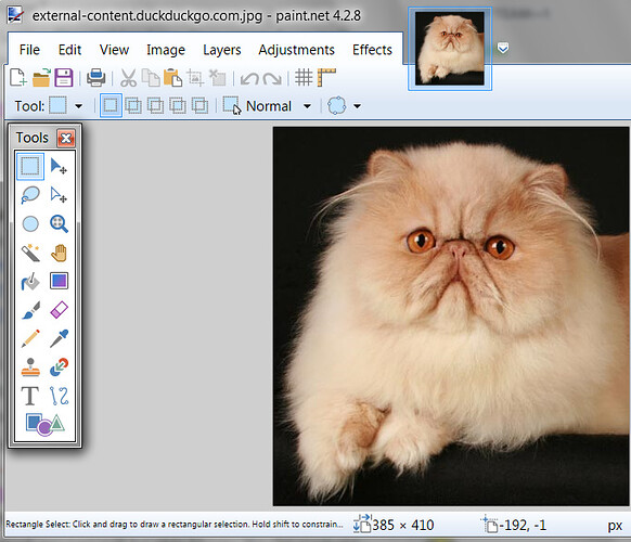
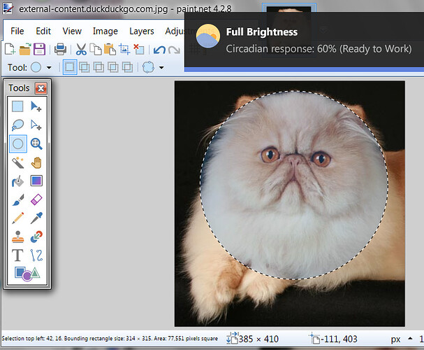
Here’s two screenshots of said program:


Note the text at the bottom left. It explains the tool’s usage when actively selected (only 1 tool can be active at a time). Having used the program for awhile, I rarely look at it.


In this one, a tool is being used, and the text now tells some information that’s useful to know, so I look at it more often.
On the contrary, for simpler tools like Paint Bucket, the text stays as trivial as in the first screenshot.

That was just an example of why I thought the info text was neat to look at, though. Apart from needing to learn Storage events, I can respect how you feel about that design of the program.

Pretty much! The idea is that it would make the colour raising values faster. However, I suspect it will cause something to break because colour values are integers/numbers without decimals, and TimeDelta() causes a number with decimals to be generated.
Nevertheless, to start, TimeDelta() converts your operation to “0.01 per second”, so if you put “1 * TimeDelta()” it would increment the value by 0.01 per second, which is really slow. If you want to increase 1 per second, use 100 instead.

Thanks, that’s how I understood the variables. To solve the inconsistency issue in the second gif of my last post - if it’s even an issue - consider another variable, that holds one single current coloured value from the buckets, and then in another event, apply the colour variable to all three colours, depending on which ones of them are selected, so that the colours of all three options/the ones selected, when changed, stay consistent with each other with each change of the paint buckets.

Now that I’ve typed that out, it sounds even more confusing than usual, and may actually be bad design. Your call there!

Hopefully that explains some of my comments - didn’t get that much sleep last night, and my grammar/writing is taking the toll.

1 Like

Oddly enough, I made the resolution smaller, but reworked some of the buttons and the overall layout.

Thank you :slight_smile: I may adopt a similar approach as Paint.net as having it in a little bar at the bottom is less in-your-face, but still there if you need it. It’s a good idea and I definitely don’t want anyone to feel lost on the tools at any level of use. Perhaps if I add more options, like texture overlays or something where it would be a bit more info to absorb, I’ll do that.

Indeed, it did! I just posted about it here.

I can already see a difference in speed on preview, but of course, the real test will be getting it published online for the real trials by fire. :grin:

Ahh, that’s it! Knew I overlooked answering something…sorry about that.

I think the problem there is threefold:

  • You’ll get black on the initial click, since it seems more intuitive and comfortable even to begin by adding color on new selections.

  • Deselecting options resets all the values to 0, which also ends up being black. This is to clear out color ‘residue’ in the variables, otherwise you might have blends when you don’t want or expect them. There are times where you will want them though, so this is something I’d like to allow. Hopefully it’s not going to end up being like wanting my cake and trying to eat it too…

  • Allowing selections to be locked in where all are colored the same has interfered with the rainbow bucket, as it can do different hues on all selected options at the same time - although it’s not accurately reflected in the values on the buckets and it’s hard to make slight changes after that due to the two previous things.

For now, this isn’t ideal at all, but a temporary workaround is to remember that any intial selections and deselections will erase your color settings from the variables - if you can plan for it when designing your pattern, it’s not as bad. The colors you choose before deselecting is still displayed on the grid since it was stored in the picker strings, but clicking the option again will be read as an ‘initial click’.

I don’t want to force anyone to start over when they only want to make a small change. I just have to make all of the above work in harmony, probably with another variable as you said.

Another idea is to make it possible to create & store a custom palette - at least for the duration of a session - which you can then apply as desired, and the only way these values would be edited or erased is if you choose to replace them or end your session.

You’re good, but I know the feeling when things seemed to sound better in your head lol. I hope you got some rest.

Thanks a million!

1 Like

Updated and ready for the crucible! :fire:

The FPS has improved slightly in Chrome, but it’s still awful in Firefox. :frowning:

I also added the ability to set some custom hues and moved the hints icon so it’s more visible/accessible. The new options include hints on mouse over.

For now this new option only allows you to set 3 custom colors, but I was thinking to do more like 5. When you click these custom paints, it will show their color values in the buckets, which makes it easier to adjust and create tints like the oranges in the image…both are from the one orange spot on my palette.

This app has been updated again.

I’m happy, relieved really :sweat_smile:, to say that the FPS issue seems to have improved greatly for both Chrome and Firefox on my end- their dev tools show a steady range of 50-60 now. I hope that’s the case for other machines too.

Whoa, this is mad better. It’s like it jumped from a v1 to a v2!
The FPS is infinitely better now, even on the previously-mentioned laptop and on Firefox. How did you do it!? (Exclamation of excitement, btw, feel free to actually tell)

The UI is also really more interesting. I did not check out the version eleven days before, since I thought I’d seen everything. The colour picker was definitely the highlight - it fills up in a second, yet takes several to decrement. So it’s like a game on its own, except a bit more fun because of how fast it is. But of course, now there probably needs a way to slow it down…
I also discovered I could hold mouse down and just hover the numbers I want to edit, and how quickly it selects them is just ingenious.
Worthy to mention the smoothly fading out text.

For the random paint bucket, I don’t know about epilepsy, but the flashing colours could be dangerous. Consider changing the event to “on mouse released” instead. It’ll be more tedious to randomize, but probably the safer design.

On another note, choosing Learn seems to crash the app on Firefox (it does light up when I hover on it, touching causes the below message to appear)

Also, I decided to play around and actually make something.
They’re not really much, but here you go!
Just to show I really liked this version.


image image
(this one’s Random bucket, of course)

It’s clear I don’t really know what to do with a Vedic square :sweat_smile: Was enjoyable though!

1 Like

Thanks, glad it’s more fun! :grin:

I opted to use static sprites for the numbers and bg tiles on the grid instead of creating them via events. With at the beginning of the scene and trigger once conditions, the painting functions stopped working for some reason.

The only downside to the sprites is that sometimes certain color combos make the number edges look slightly fuzzy to me. I can live with it if it isn’t very noticeable to users though; it’s a small price to pay for the better FPS.

Agreed, it’s harder to fine tune the values. I put adding colors at 1000 * TimeDelta() and subtracting is 100 * TimeDelta() as an experiment to see which is better. They’re both faster than the user can control though. I was thinking of maybe a turtle/tortoise and hare switch for that lol. Even if someone isn’t familiar with the old fable, they should understand the symbolism.

Very true, I actually have epilepsy, but I’m lucky that the seizures aren’t as frequent as they are for some. Still, this app should absolutely come with a warning label about that. I’ll put it on the main menu and once I get the intro page set up on my site, it can go on there too. :+1:

A ‘trigger once’ action might fix that as I suspect an on mouse released condition may do the same thing, except when you release the button Vs pressing it and someone might get confused when it doesn’t appear to do anything on touch/click.

Oof! Appears to be something to do with text objects.
I’ll dig in for closer look at that soon, thank you!

Thank you for sharing your creations too! Love 'em :blue_heart:

I like doing groups of numbers together and using tints or contrasting shades on each. Certain sets make certain shapes (i.e., 4 & 5 makes a circular shape, 1, 8, 4 & 5 makes a kind of asterisk, 3 & 6 the hash symbol). There’s no right or wrong way to do it as far as I know; it mostly comes down to what appeals to you aesthetically and the pattern you want.

As for the Vedic square itself, I’m not quite sure what else people do with it. Some people claim and believe all sorts of things, while others say it has absolutely nothing to do with the Vedas. There are other types of magic squares in recreational mathematics, but I don’t think they involve coloring by number.

1 Like

For the text object this is an known issue found by roracle and nobody really knows why it happens. I think switching to BBText might solve it. See GitHub issue: Game with Text extension crashes on Firefox · Issue #1392 · 4ian/GDevelop · GitHub

2 Likes