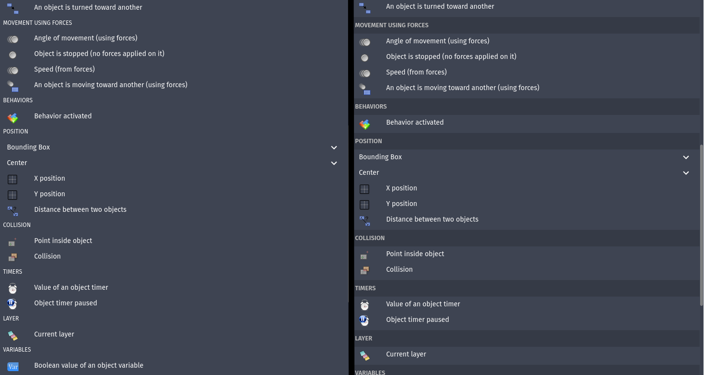
When browsing available event actions/conditions, you get a list of options grouped in sections (e.g. Animations & Images, Effects, Size, Visibility, etc.). But the section headings look very similar to to the names of action/condition parents (which you can expand to view the items within (e.g. Bounding box, Center, etc.)):
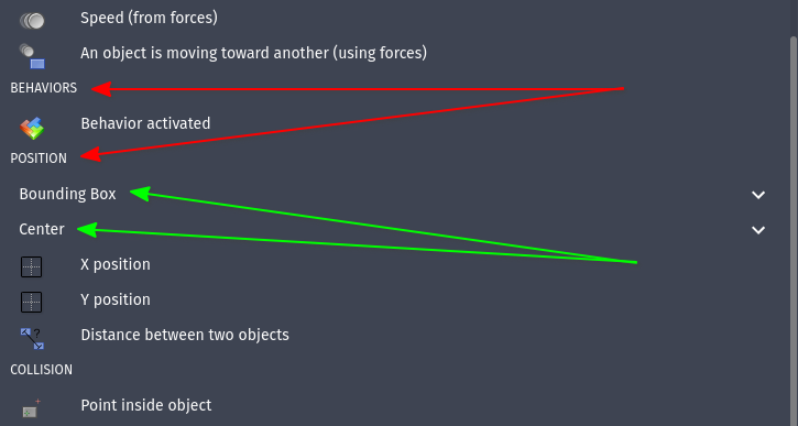
It’s hard to distinguish between ‘Position’ and ‘Bounding box’ in this case.
I’d like to propose a slight visual change that makes it easier to differentiate between these. Something like this perhaps:
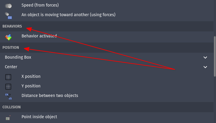
Give section headings a background colour so they stand out slightly. This’d make it easier when scanning the list.