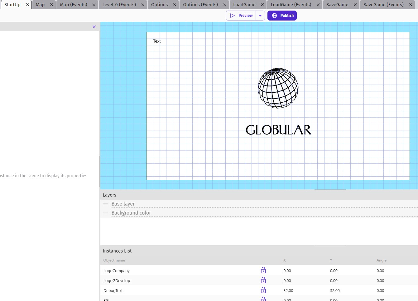
Hi, my suggestion/feedback is to color tabs differently for easier navigation. I often have multiple tabs open to test things or for some other reason, and it’s difficulty to go back and forth between relevant scenes to make changes. Below is an example of what my editor looks like:
And this is how I’m suggesting:
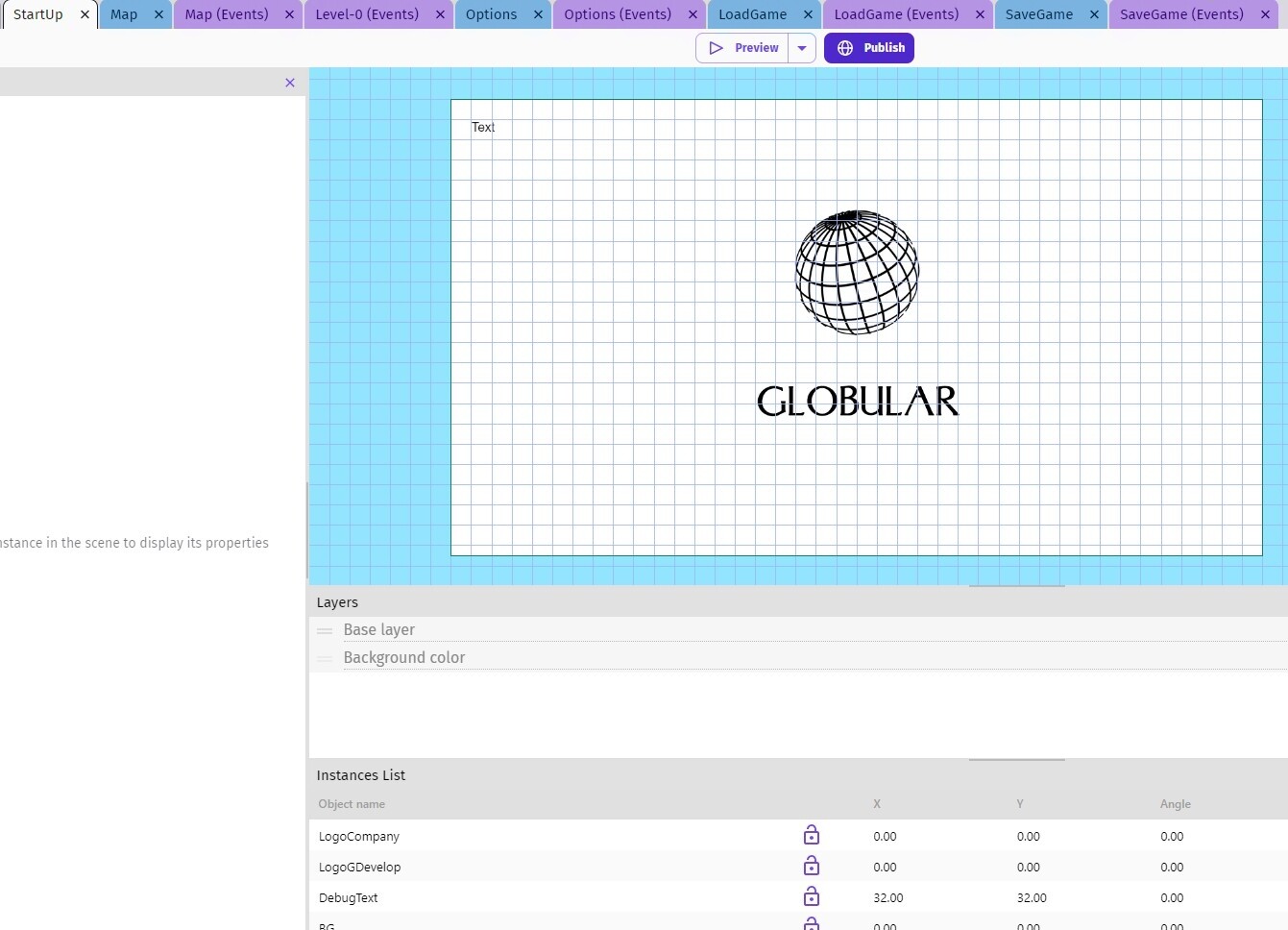
That way it’s much easier to tell which tab pertains to scenes or to scene events at a glance. It could be those colors which are GD’s colors, or any other GD devs deem good.
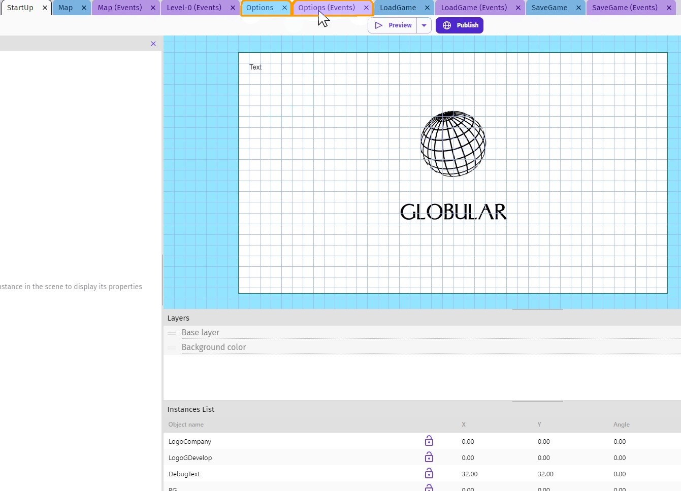
Now as an extra tab improvement: tabs that relate to the same scene could be highlighted when selected or when the cursor is hovered over them, like:
That’s my 2 cents, would help me at least.