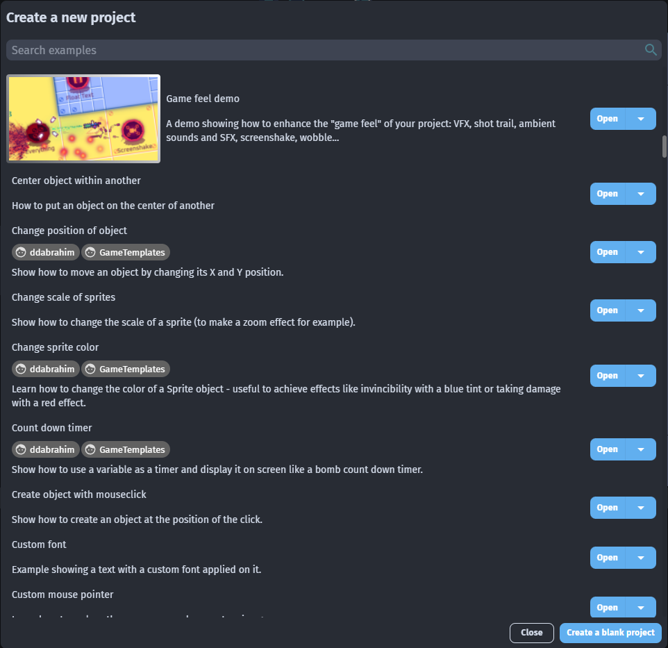
Hi, today I’ve noticed opening the Create a new project dialog that each example title and description without image are a little bit confusing for me but i think the same for new users so my suggestion is to put just a separator between them.
My suggestion is to change it from this (as you can see actually is a little bit confusing):
I think the old “new project” window had lines between each entry, so it was likely removed to reduce unneeded whitespace. Someone else may confirm either way.
That said, I’m not sure top-aligning the text on examples with banners changes anything about legibility at all, but that type of alignment is always going to be subjective.
Personally, If I were to change anything about the updated new project window, it’d be to have the Title and Description be different font weightings or sizes. I’d also specifically prefix “Authors:” before the author’s usernames, and put them after the description, not in the middle. Just listing the usernames as it is right now might make them seem like random text to a new user.
Agreed! I like the suggestion to change the font weight/size more than adding lines, but I support the general idea of making this screen more readable.