Dungeon Crawler under development

I’ve been working on this for a couple weeks. I call it Inner Demons: Dungeon Crawl

“Inner Demons” is a brand I’m developing which puts a different spin on a stats. Most games have some sort of stats to monitor: things like HP, Power, Defense, Strength, things of that nature. Most players are well accustomed to these themes. “Inner Demons” changes things around so that your stats are represented instead by “virtues” or “qualities,” like Courage, Willpower, and Patience. Instead of collecting items like “Fire Sword” or “Laser Blaster” you acquire attributes such as Faith, Confidence, Independence, Charisma. Enemies take the form of things like Ridicule, Doubt, and Temptation.

This game uses the example shared by @Jump here Endless thanks for sharing :slight_smile:
I added some extra feels: as you develop your character, the walls will change color depending on the attributes you grow. It’s a very subtle effect and will not be very noticeable until later in the game.

So far, it has about 30 minutes of gameplay in one playthrough but there are different paths you can take so there is some replay value.

This is my first release featuring gamepad support. Would love some feedback on this so I can take it in a good direction.

Most recent release can be found on itch

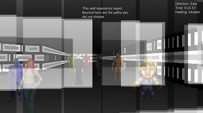
and of course a screenshot :slight_smile:

2 Likes

Really nice! Sometimes a tiny bit laggy but I love the general style and phylosophy behind it!
Keep up the good work!

1 Like

I don’t know if there’s really any way to “fix” the lag… there’s a lot of calculations (which I don’t have the math background to completely understand) required to scale and display properly the objects in “psuedo 3d”

To mitigate the effect of the lag I plan to make smaller interconnected scenes going forward rather than big scenes with lots of objects.

1 Like

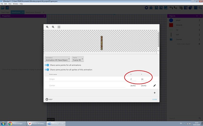
Interesting idea. To solve the problem with npc sprites you need to edit “origin” option.

1 Like

I’ve been crawling the walls for days trying to figure out those display issues, thank you :smiley: That was one place I didn’t look though.

This was the best attempt I could make to fix the display issues. Laugh if you think it’s silly.

Here’s another development release. This release is less complete than the previous release, but is completely different in other ways.

I was tendered another example by @Jump which uses an entirely different method to display the graphics. While the technique of raycasting is not new, Mikhail was nice enough to port this method to gdevelop and share it with the community.

The previous method generated images and arranged them in psuedo 3d based on sprites and points. A sprite is placed on a map, and the appropriate graphic is created and placed and scaled appropriately depending on the perspective of the player.

The new method uses raycasting, which is basically the way old 3d games like doom or Wolfenstein worked. The way it works is the player shoots a range of “rays” along a field of view. When the ray intersects an object, it performs some trigonometry to determine how to display the walls.

There are some pros and cons to each method.

In my experience, the first method, using points:
*is a bit faster, in general (frames per second)
*less prone to display bugs.
*level construction is more tedious since each piece has to be placed individually
*gets overburdened with larger maps

the second method, using raycasting:
*is a bit slower, in general
*prone to the minor display bugs you’ve been seeing in 3d games most of your life (ie objects appearing halfway through walls, and bugs caused when trying to display an object in front of another, since the rays don’t penetrate, objects blinking if a ray hits them one frame and misses in another frame.
*level construction is much easier since you can create a long wall with a single sprite, rather than using a row of sprites each one displaying one wall.
*handles larger levels without as much decrease in performance.

So what I’m looking is opinions between the old method and the new method.

Which do you like better and why? Disregarding the story elements, what version would you be more likely to play? Which one gives you the best performance? Are the display bugs too bad in the raycasting version, or are they minor enough to be ignored? Are the enhanced graphics in the raycasting version worth the decrease in performance?

Here’s a link to the new raycasting version.
https://games.gdevelop-app.com/game-ae15f32a-d187-4ae1-bb23-46b16e5bf139/index.html

And a link to the old version (also found at the top of this thread)

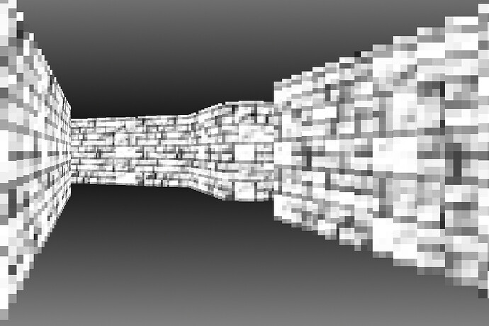
And of course a screenshot of the new method:

I definitely prefer the first one. The seconds just looks bad tbh, and I wouldn’t play it more than 1 or 2 minutes

1 Like

I mentioned this nasty effect with textures. It only looks good without textures.

1 Like

Thank you for the input. However, it makes me wonder. Are my eyes bad? is there something I’m not seeing? I thought the second method looked much better than the first one. Is it only a style difference that is disagreeable or is there some detail I’m not paying enough attention to?

If it looks bad or nasty, that is definitely an issue to be addressed, but without specific details I can’t see how to proceed. It would be simple to say I’ve had negative input on this method and I should scrap it and go for a new one, but without understanding exactly what is bad about it I am likely to make the same bad effects again.

Thank you again for your willingness to take time to try and offer some feedback to help me do things in the best way possible.

The second method is like “pseudo raycasting”, I did not have enough knowledge to complete it. In general, it does not work correctly, not like the classic raycasting algorithm in older games. The rays do not work correctly here, as a result of which the display of the wall texture is also not correct - they are too distorted (compare with the first example, this is clearly visible in motion). Also, you have problems displaying the floor and ceiling - animation and texture are too sharp, it is better to use a gradient texture. Sorry for possible mistakes in English - I use Google translator

1 Like

This is a great hint about the ceiling and floors, I will look into it.

For what it’s worth, I’ve never had any trouble understanding your English. It may not be perfect but I can tell you put effort into it which counts for a lot :slight_smile:

1 Like

Here’s a temporary update for feedback purposes, until I can get all the other exports built and uploaded; which probably won’t happen today because I’ve been working on this for several days and I’m ready to play with something else.

https://games.gdevelop-app.com/game-3ee782e5-9e17-4f26-bd6b-6f52983c9c3e/index.html

Big part of this update is I started to work on the next layer of the dungeon. In the second layer I put in some new wall tiles, and made some map-oriented puzzles, rather than combat oriented challenges featured in the previous stage. As recommended, I went back to the old method of making the walls instead of the raycasting.

I also (hopefully) fixed all the display bugs from combat scenes, and I’ve started paring down the size of the levels as much as I can. I’ve managed to trim about 200 objects from the largest level. I saw a slight increase in performance, but I still need to do more. I’ve started restructuring the walls which were improperly built before I understood how the walls were animated. That’s going to be a big task which I’ll try and do just a little at a time. If I do just 1 or 2 sections of wall a day, eventually it’ll all be finished, just like eating an elephant.

Also changed the way some non essential parts of the code are executed (instead of running every frame, they run once per second) in hopes of getting a little bit more performance boost.

I’m considering writing a walkthrough or some instructions. I don’t know if the game is intuitive enough as it is… Any feedback on this would be great.

I implemented multiple control methods so it’s playable via multiple platforms.
As a note, you’ll probably need a pretty high end tablet/phone to play this on mobile. I have a low end phone I tried it on, and it’s really really bad. My roommate has a better phone and it runs “ok” on his - It isn’t great, but playable.

On mobile, you press the right button to turn right, the left button to turn left, and both to go straight. Y to confirm, N to deny, L to load, and S to save. The game should detect if you’re on mobile and show you the on screen controls.

Keyboard controls save with 1 and load with F1, arrows or wasd to move, Y or N to confirm/deny.

Gamepad - up/down/left right to turn or move backward and forward. Square to save, triangle to load, cross to confirm, circle to deny, or the respective buttons on another gamepad. I also added strafing with shoulder buttons.

gamepad and mobile controls haven’t been thoroughly tested so there’s probably bugs.

Currently featuring 22 attributes you can acquire (you won’t be able to get them all on a single playthrough; the game is designed this way for replay value) 7 “enemies” you can defeat, and 6 map puzzles (walls you’ll have to knock down if you have the right attributes to do it)

Estimated playtime is about 45 minutes to 1hr in a single play through.

Questions/comments/suggestions are always welcome and appreciated. Even if you tell me you hate, as long as you tell me what you hate about it, that’s valuable input.

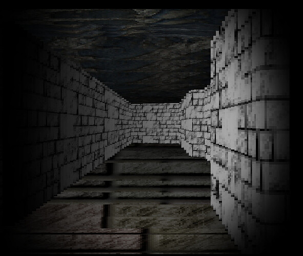
Finally, a screen shot of the new level:

1 Like

Congratulations on the release of version 0.5)) I noticed several errors in the mobile version: The name of the game when installed on the phone is not correct - it remains from the example. Another bug - control disappears when changing location

1 Like

Thank you. This feedback is very valuable as I can’t really test it on mobile, my phone runs it too slow.

I changed the name of the package in the game settings.

The controls disappearing was a simple mistake easy to correct. I initially only put the controls in the first scene to test them out and if it worked I meant to make them global… which I forgot.

I’ve now made the mobile control objects global. The control functions are on an external events sheets attached to each scene. Then I just hide the controls on the combat screen since they aren’t necessary.

I’ve made all the changes necessary so it should be working, but I’ll wait til tomorrow for a new build when I have more export slots available.

In the temporary, here’s a version with the fixes implemented:

https://games.gdevelop-app.com/game-5fa857cd-77af-4519-88a8-30b4322dfb70/index.html

Also should be fixed on the browser version on itch

1 Like

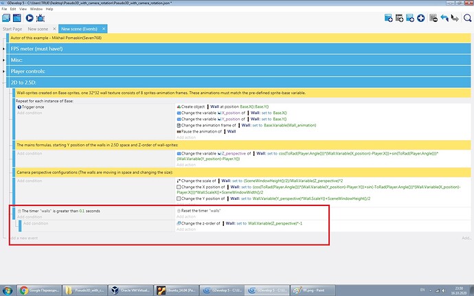
To increase FPS, I can advise you to transfer the z-order to the timer condition:

1 Like

This is a great simple solution, especially since the wall events are held in external events sheet, making it easy to add throughout every scene.

I tried first a timer value of .1 on the timer. This made rotating run extremely smooth, but going forward a bit choppy.

I then reduced the timer value to .05 (12 frames/sec) and it made a noticeable difference.

Thank you for sharing :slight_smile:

1 Like

Yes, this is a very simple solution, but I thought of this a couple of days ago :sweat_smile: Sometimes the most obvious things are not immediately visible))

Why 12 frames/sec? It should be correct to say 20 frames/sec (1 / 0.05 = 20)
Did you try 0.04 as parameter for the timer? (25 frames /sec which is near of the speed of video frames)

1 Like

Sorry, math is not my strong suit lol. I was confusing sixty seconds in a minute with 1/100th’s of a second.

Anyways, I like the suggestion you made because it game me a good idea. Since the Z order needs to be modified more often when you are going forward and less often when rotating, this is what I did. Not a HUGE difference but still better than it was. Every little bit makes it better :smiley:

In other news I’m still tinkering with this and other things. I started adding some extra “feels” and I’m having a lot of fun with the battle scenes, putting in different music, parallax backgrounds, lighting layers, and other subtle changes to make it more interesting and fun. Hoping to have an update within the next week, but I tend to always underestimate that sort of thing.

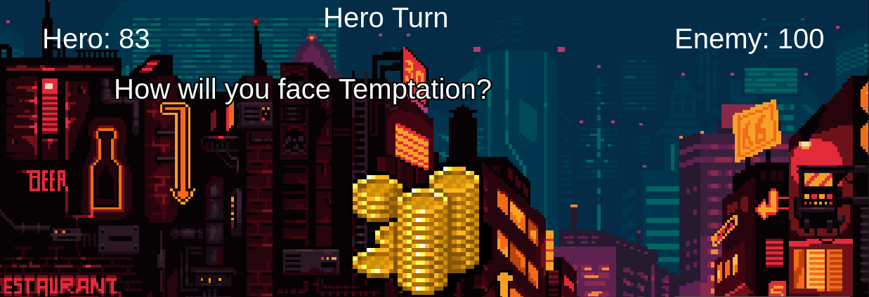
Here’s a screenshot of “Temptation”. The artwork isn’t mine, I only made only slight changes to it to fit the game.

I still need to make some lighting effects and custom attacks for this scene, but it’s coming along nicely.

I plan to finish this, one other combat scene, and create 2 more small maps for area 2 before releasing the next update.

Since GDevelop makes it so easy, here’s a temporary sneak peak into the next update, if anyone is interested in giving some feedbacks on the changes.

Looks better with new textures! By the way, i do not recommend making the “Z_Perspective” variable under the timer, as this greatly affects the smoothness. Z-order only.