The event sheet parameter colors are being updated in both the official Light and Dark GDevelop themes. Here’s what’s happening and the reasoning behind it.
The problem
The two official GDevelop themes were not sharing the same color language. An object parameter could be blue in “GDevelop Default Light” and pink in “GDevelop Default Dark” mode, not by design, but because small inconsistencies had built up over time.
The same types of parameters had ended up with different color codes depending on which theme you were using.
This was a problem because a UI system should give the same meaning to all its colors, no matter which theme you are using. GDevelop Default Light and Dark modes should adapt brightness and contrast to their context, not redefine what a color represents.
What’s being fixed
Both themes now share the same hues across all parameter types (objects, variables, operators, numbers, etc.), with each color adjusted for readability on its background. The updated palette also follows WCAG contrast standards for text smaller than 18px, which is a baseline requirement for accessible design. This update brings the updated palette closer to being usable by the widest range of creators.
Rollout
These changes are coming to the web app first, with desktop and mobile following progressively.
FAQ
Why change something that people were used to before?
The previous color split was a design inconsistency that needed fixing to make the two themes consistent and reliable. We know this transition has the cost of “getting used to new things”. We appreciate your patience while the new color rules settle in. Building familiarity with a new color set takes time, and we thank you for bearing with it.
Why not give users the option to keep the old colors or customisation their own?
Maintaining multiple color variants means every future fix has to work around every current exception. That is development time spent on preventing customisation from breaking things rather than working on technical engine improvements. The goal is to make the official GDevelop Default Light and Dark themes solid to keep the foundation stable.
As someone who is always in for “Give users choice”
I cannot express how much it makes me happy that you will hard code it
Cause whenever i see someone showing events with different theme
I get hardly confused by their colors
IDK which is text and which is number until i deduce it from events logic
Where it should be obvious to me and any1 just by looking at colors of text
I see it as excellent change in totally right direction
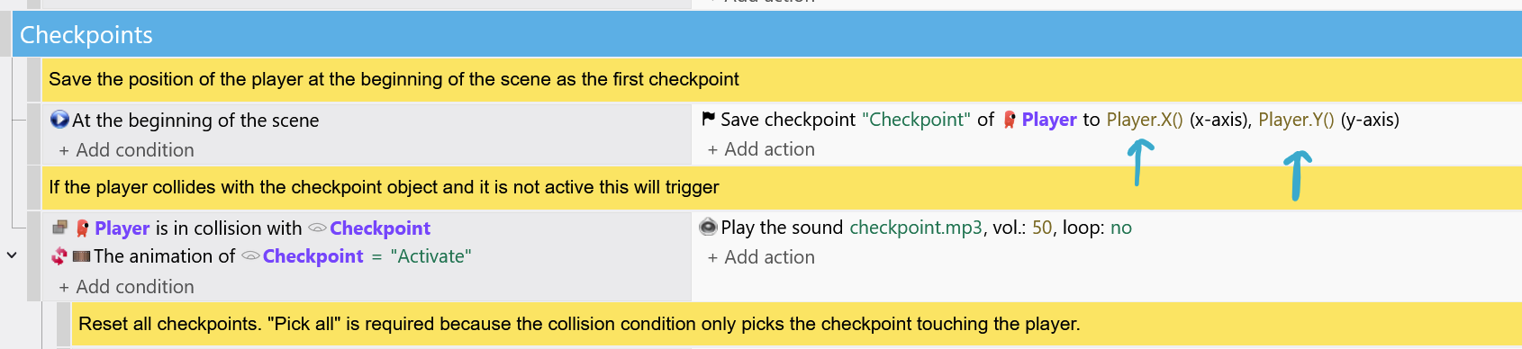
I had a look at one of the examples in the online editor. I noticed that the number color doesn’t really have much contrast to the normal sentence words in light mode. I think yellow/brown is really a problematic colour, it just doesn’t work well with light backgrounds.
Good contrast helps us find things when we’re scrolling through a lot of events. I don’t think the text green color has enough contrast either. The old light mode green used for numbers was bright, the new green for light mode text is much darker.
Hello Bubble, thank you for taking the time to comment.
The reason the values have to be darker in Light mode is because bright colors (yellow, green…) against white are impossible to read in that font size (the lines of the letters are way too thin so there is a risk of not seeing a thing). That is why a “darker hue” of yellow and green had to be used.
Other hues were tested for the numeric value, but they looked too similar to the rest of the hues (cold colors and warm colors) which caused “identification” problems because the type of info couldn’t be easily spotted.
I’ve checked yellow/brown and green (light mode), for accessibility and they pass the AA good contrast ratio required (4.5) in light mode, so that should be good for readability. That should be covered.
Thanks!
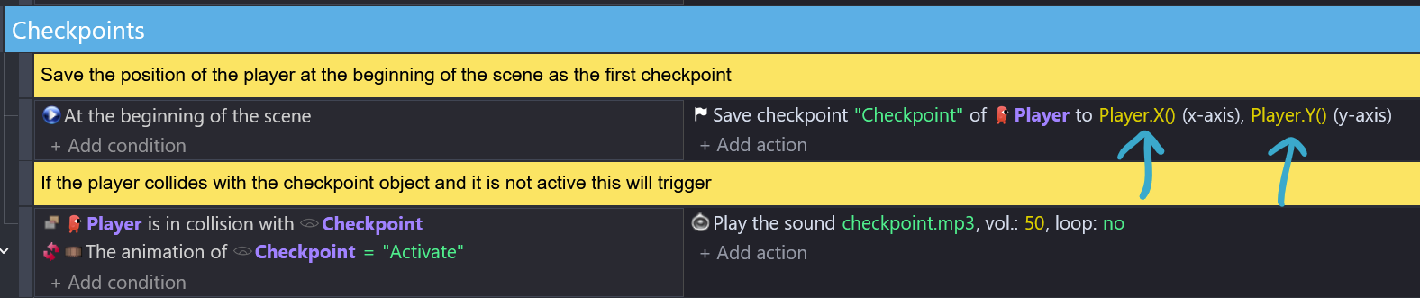
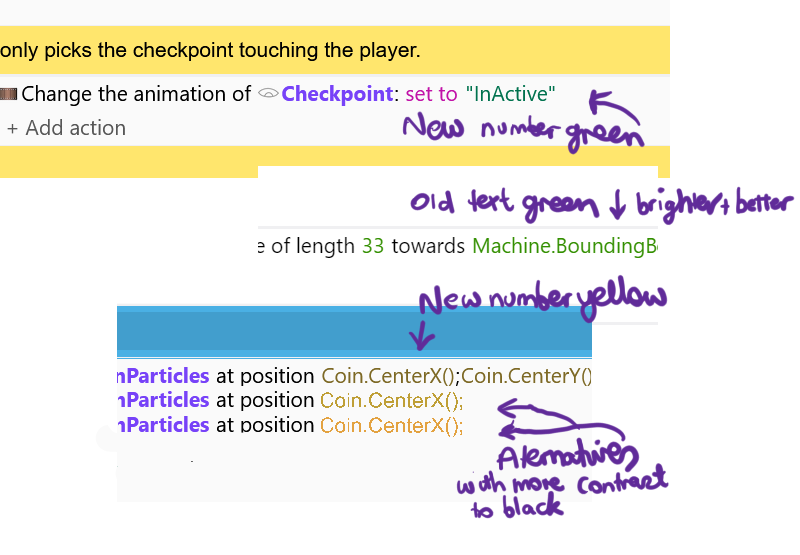
Hi Luni, I have a screenshot to show the current green for numbers which is brighter than the new green for text. And it’s easy to see and I believe is better. I accept that the new green passes accessibility tests but I think that the old number green would too and is easier to see the difference between it and black.
I have also shown the yellow brown number color with some alternatives below it that have more contrast with black and seem to me to be readable.
Just to be clear, my point is not about contrast to the light background, it’s about the contrast to black text of the event sentences.
Hello everyone!
This is funny because in my (old) time, we programmed in green on a black background on monitor screen.
And we couldn’t change that too much…
But at that time, we weren’t talking about ergonomics of course.
Hey Bubble,
Thank you for the screenshots. Images always clarify what others are seeing and referring to, so I will take them as the base for my response.
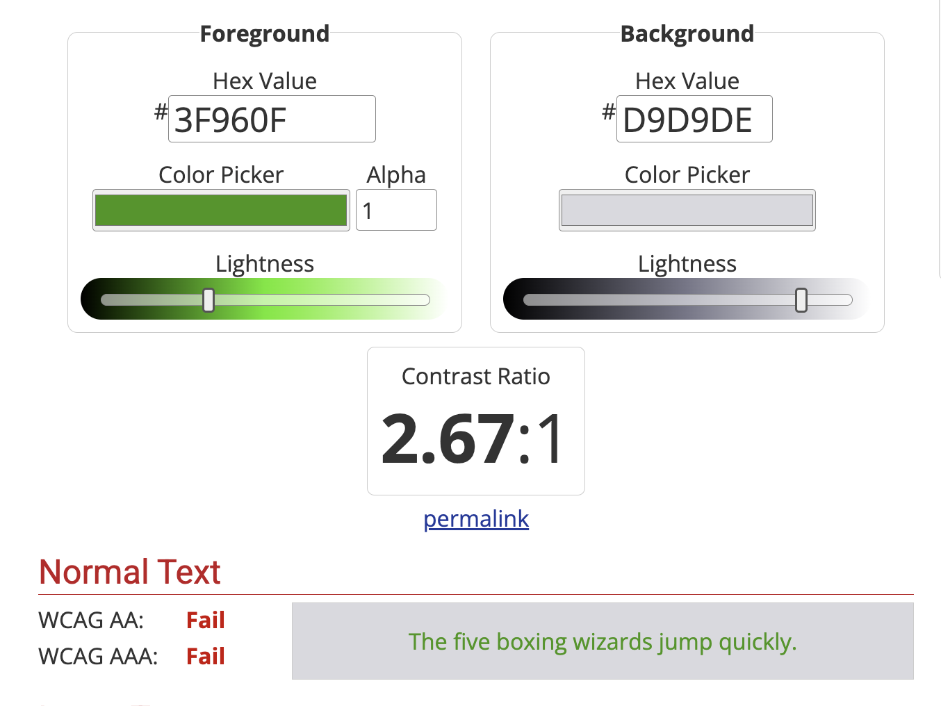
I grabbed the yellow and green that you mentioned to illustrate their AA ranking (remember we need a minimum of 4.5 contrast value), and used the condition block background color to test. Indeed, if it passes this contrast ratio in the darkest background color for this theme, it will definitely be visible in lighter backgrounds which is what we need:
The yellow in your image fails the minimum of AA accessibility (aka “regular” text for sizes smaller than 18px) landing at 1.57:
Since the background colors cannot be changed, it is the “Light” value in the color hue that has to be modified to create a color that will hit at least 4.5.
Hope these visual examples illustrate these kind of evaluations better!
Kind of related note: These notions of “working with color” and serving human accessibility are covered on Chapters 3 and 4 of the UI/UX Essentials Course in case y’all curious about learning more around UI/UX/Accessibility Design.
Definitely interesting stuff, thanks for the insights Luni. I had a play with the accessibility checker at https://www.accessibilitychecker.org and indeed all my suggested colors failed the contrast check with the background color you provided.
The new yellow and green colors passed the AA rating for large text but for small text, (defined on that site as regular weight below 16px) failed with the dark grey background but passed with the white background. For the benefit of others, the dark grey background is the event highlight color when the cursor is hovered over it (worst case scenario). But I assume that your decisions are based on large/normal text and therefore the fails for small text are irrelevant although 16px and below doesn’t seem that small.
I’ve had a look at the making your own theme instructions and it might be possible for me. If not and I’m unhappy with the new colors there’s nothing I can do except request that there be more than just the one default light mode theme. There could be a second one that sacrifices some contrast with the background for better contrast with the black event sentence text.
But I’ll definitely give making my own theme a go.
%%%%
Update, no don’t think I will, it involves editing the GD theme folder on Github. I thought it was going to be editing a theme in a folder where GD is installed on my computer
One thing that I noticed: I grabbed a darker shade of gray in the examples above (#D9D9DE), but a more accurate color would be #EBEBED (which is the latest updated color for the condition block in “rest”). Sorry for the confusion!
You might want to use that background hue as reference for your theme experiment. For colors, I’ve been checking them individually with Web Accessibility Color Contrast Checker - Conform to WCAG for AA (you could push your standard to AAA, but that would give you a “high contrast” theme which I don’t think is your goal) and if you want to find/use the “most accessible color” of a certain hue that you like, https://contrast-finder.tanaguru.com/ gives you the nearest color (I really appreciate that function).
Hope this helps!
Thanks for the links especially the find the most accessible color, very interesting. I know I would enjoy the creating a color theme process a lot and even submitting one if it was good enough but it really seems a bit too hard to have a go at it. You may not have seen my update to the previous post. I believe I’m capable of getting through the process of the github theme stuff but it’s the kind of thing that would take me a lot of time and brain stress.
My GD hasn’t updated yet and I haven’t pushed to do so this time so my comments are on Zero’s dark mode screenshot.
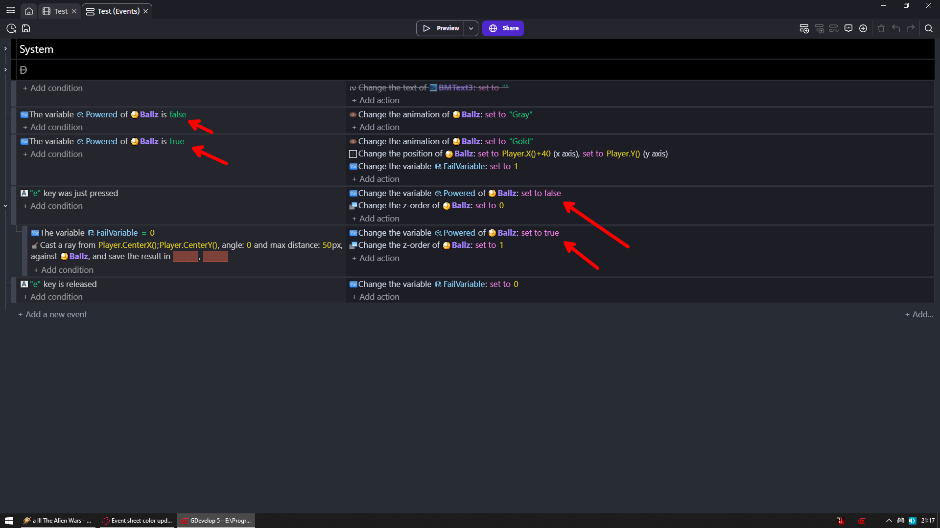
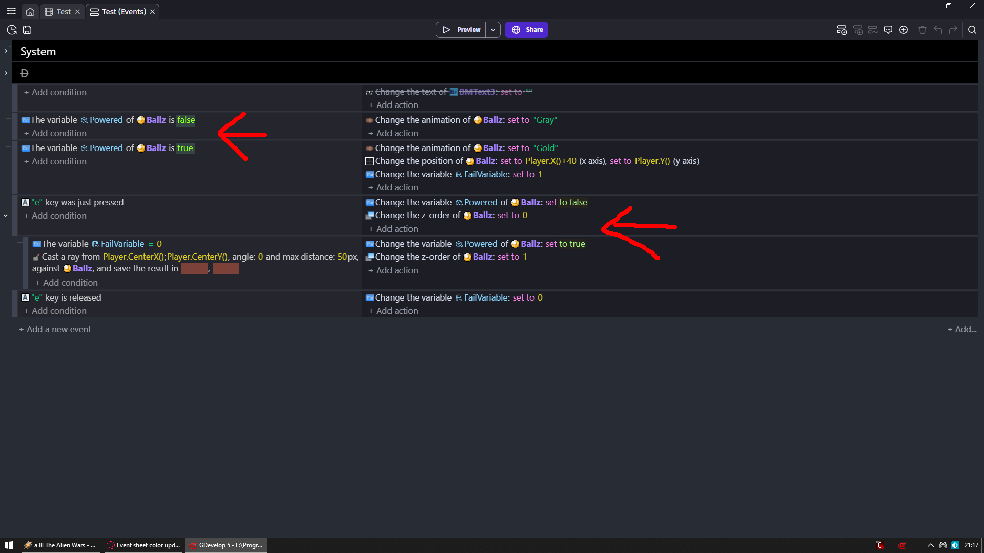
Yes, first of all, Zero’s point is right, two different colors for booleans is confusing.
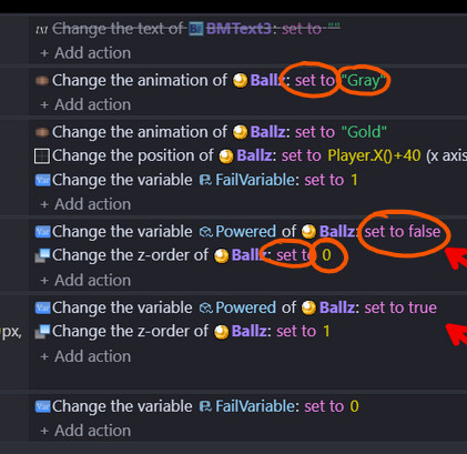
Secondly, if you look at my edit of Zero’s screenshot you will see that set to and text are two different colors set to and numbers are two different colors but set to and boolean are the same color.
I would argue why does set to (or whichever modifier it is, add, subtract etc) even need a color, it could be the default sentence color, in this case, white. In the old light mode set to is also the same color as the boolean and I always wondered why they were tied together. But if it does need a color it would be good if it wasn’t the same color as the boolean as it will help the boolean stand out when quickly scanning through the events.
My god i did not even notice but you are 100% right
So we either would need different color for set/add/subtract/multiply/divide
Or booleans could not be either pink or green and would need different color
I would say this is best compromise
NOTE i was trying to make them same color but i kinda failed but you get the idea
In light theme, the objects color (purple) is way too high, It’s readable for sure, but it burns the eyes to even look at them, and the yellow one is barely readable…
I agree with VegeTato, the new object name color is intense. If the object name is bold (good) then I don’t think it also needs to a very bright color.
Here is an old screenshot of mine showing object name in dark blue. It stands out but doesn’t dominate.
As for the yellow, I’ve already said a lot, but maybe it can be orange instead.
In ZeroX4’s image: it might seem like we chose to have an inconsistency with 2 boolean colors. What is actually happening under the hood is the following: the code names and event categories are structured in a certain way by the engine code: The “false” condition in green on the right is a “default, general and string value” (tagged as base-color ) -you will notice that other things like sound files, layer names or mouse right/left clicks are also part of this category-. The “set to false” on the actions in the right are operator-color so, even when the text reads “true/false” boolean, they’re actually responding to their “event sheet tagging category” (their token-name).
In Bubble’s image: set to is an operator so it displays pink. A text is a base-color so it displays green, and numeric values are number-color that is why they all display in yellow. This is correct and matches the code.
The categories to which these values belong to have been pre-existent for long time in the engine. They weren’t modified nor restructured during the changes are not related to color (they’re are expected behaviors due to their token-name in the engine). ← Meaning, besides the color in which they display, nothing changed*.
For color behavior: Indeed a blue text surrounded by a blue context (handles, icons, images) does not stand out because the rest of the environment is blue too (that is what happens in a monochromatic palette). The same would be true in a mostly red environment:
For color choices: What remained important was to make sure colors were readable with good contrast ratio. That is the case for all colors (including purple and yellow). This standard kept us away from an arbitrary “I don’t like X color” (which are personal preferences) and rather helped us evaluate under the lens of accessibility.
*Color changes touch muscle memory which is always hard to get used to. The brain will try to find the “error” which creates arguments and resistance against change (the brain hates cognitive effort so it will fight to maintain the old ways). It is normal to feel uncomfortable while the brain tunes-in to the updates.

 The yellow in your image fails the minimum of AA accessibility (aka “regular” text for sizes smaller than 18px) landing at 1.57:
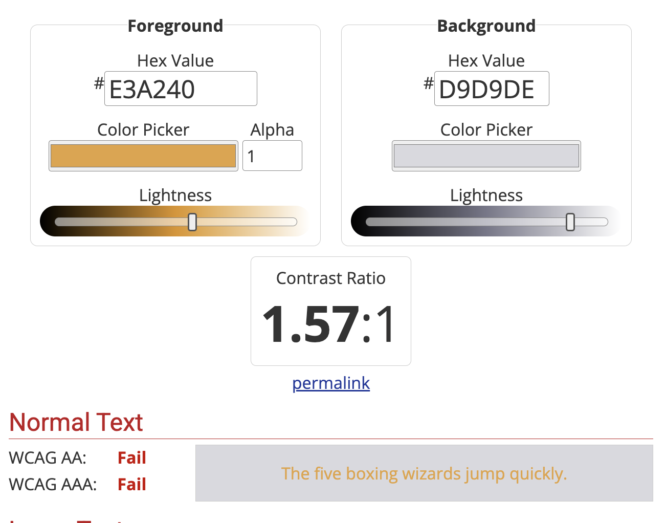
 The categories to which these values belong to have been pre-existent for long time in the engine. They weren’t modified nor restructured during the changes are not related to color (they’re are expected behaviors due to their