Luni many ppl will not even understand what you just wrote
And in the end only thing they gonna care is what they see
Was it intentional/mistake/oversight/hard coded or whatever will change nothing
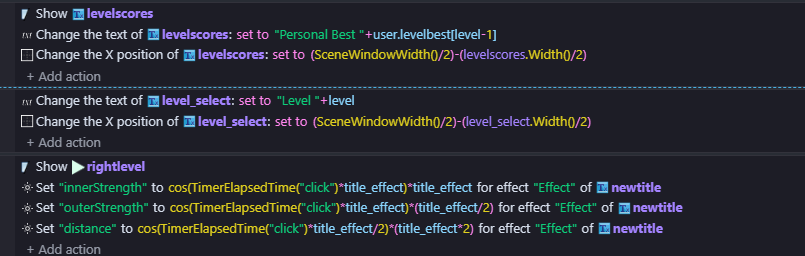
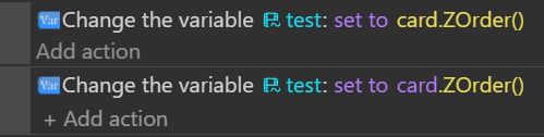
The fact someone will see same color between text and value (or state in this case) will be what ppl will remember
Actually i don’t understand what you just wrote
It cannot be changed?
Or like you are just pointing out it was not intentional and can be changed?
Hi Luni, I appreciate your reference to the brain doesn’t like change but that’s not what’s happening here. We’re embracing the change but we don’t want to be stuck with the mistakes of the past.
When each of us started using GD it was all new to us and the interface was part of the learning process, inconsistencies and all. We didn’t notice them because everything was new to us.
Now that there has been a change and our brains have to get used to new things, we do notice the inconsistencies.because GD is no longer a learning experience for us and so we become aware of the things that don’t make sense.
I see a new colour system as an opportunity to also examine everything and not just do things the same as they’ve always been done.
The whole thing is about the user experience and here we are giving our user experiences.
personally …i don’t think that set to/add/subtract needs to be a colour at all and i find its pink colour distracting. As mentioned above…i agree that there needs to be boolean consistency
ZeroX4: Thank you for the feedback. Indeed, maybe these “token things” might not help with understanding. I’ll try to explain this better: some values (string, object, number, variables…) display in different colors depending on how the engine classifies them internally (the “physical drawer where they’re stored” if you will). This classification was already there before this update (which only changed the color of the tag pasted in “the drawer” if you will). The palette didn’t change that classification. So what you pointed out is more related to “architecture legacy” (which I am writing down for the future).
Bubble: I read you. I agree that the discomfort is a thing when updating. I apologize if it sounded like I dismissed your particular experience. That was not the intention.
I’d just like to share that we’ve received feedback from users who find the current version easier to understand -including neurodivergent people and individuals with visual processing differences- who find the changes make a meaningful difference in event sheet comprehension.
Some colors were adjusted during the first soft (web) launch, and the direction stayed the same: accessibility compliance and equivalent colors across themes. We will stand with those choices as the rollout made its way to desktop and mobile.
Thank you all for the time and attention that you put into this feedback.
Hey everyone, sadly I’m sick, going tomorrow to get a tooth removed and the pain is not great to focus on my project, so I didn’t got the time to check the new update fully but maybe in like 2 days I will get back to working on my game.
Anyway I did check the new update quickly, while it’s great and a step in the right direction, I saw the inconsistency in booleans like @ZeroX4 mentioned.
Also the idea that @Amigo54 mentioned is the best one so far.
Why not give us the ability to make our own colors?
I will also say that changing colors suddenly made me a bit lost but I know that things like that will get updated with time and we just have to adapt.
But I would love to have this option… Because the way we look at colors is different, your blue is not my blue and so on … It would fix the issue completely and will make everyone happy.
To reach a point where everyone is happy about the colors is not something possible I believe.
Anyway if I feel like it … I will give a more in depth review soon about this when I get back to the engine and try it for some time… Haven’t checked everything yet but thought to read the post and give a general opinion.
Short focused response to the main post: For what it’s worth on my side, the current contrast does take some adjustment to get used to but it doesn’t seem glaringly problematic. At least not when I compare it to other accessibility focused themes in things like VS Code or Defold’s IDE.
Much longer post for everyone asking for some sort of user configurable option I think it’s important to clarify:
While I think that’s a great eventual idea, it isn’t really related to the main goal of this update. Or at least not as far as I understand from Luni’s post and other discussions.
The goal from this change is to update the main standard themes to be compliant/in-line with accessibility standards for various types of color blindness. This does not necessarily make it fit the aesthetics of every user, and it probably shouldn’t. It is going to take adjustment, and not everyone’s going to be happy with it. I don’t think the current color scheme is perfect, but if the focus is on color blindness accessibility it is a step in the right direction.
I think once they get those changes in place (main/default themes being fully compliant with accessibility standards in regards to colors/contrasts), I’d definitely want to see user configurable colors. That’s a much heavier lift than just changing the color scheming of the themes, though, so I’d expect that to come much later (if at all).
I suspected that allowing the user to change the colors by themselves would require a lot of work from the team.
But, if we think about it carefully and in my opinion, this should have been the first thing to do rather than putting in place themes which certainly do not suit everyone.
Because, by allowing you to change the colors of almost everything, this would have replaced the themes and would thus have given the user much more configuration freedom.
Its a bit of a mess after the update - I personally don’t think we need brackets to be a different colour …but here some are pink and some are yellow. I don’t think the + - etc need to be a colour either see below
Right! Im a bit slow .. doesn’t it need a different colour for each pair of brackets to work as a system …it seems a bit random at the moment.
@RMDB .it is starting to look a bit trippy…im starting to get used to the other changes …but it does look like there’s at least one colour too many …having just suggested a different colour for each pair of brackets!
I don’t like the color mess either.
Nice that we’re always asked if we want to be “improved”.. Is it possible to add a Preferences switch to deselect this adventure? It also exists for thumbnails in events, etc.