My biggest frustration with Functions is the parameter list. I would love at least the option for a parameter list where each parameter was on a single line.
Maybe make it like the object list. A single line list that you double click to edit.
Maybe it just needs a tighter UI with a more visual separation between parameters. It needs to be more obvious. The parameters currently just kind of blend all together.
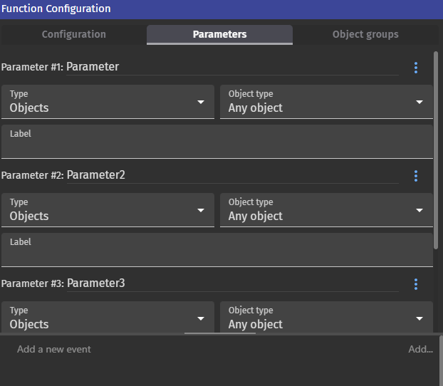
You would like the four fields (name, type, object type, label) to be on the same line?
This could work if you have a big monitor, but on smaller screens, it would be difficult, no?
Yes. That screen. Even on a large monitor, you can’t see much at a time. I don’t have the answer. I’m posing the question. How can we make it easier to use?
I like the idea of making it like the object list. Nice and compact. Double click to get to the settings. You could drag/drop to reorder. Add various options to a popup menu like duplicate, delete.
As mentioned elsewhere, the sentence would also have to automatically adjust to reflect the new order unless the param was replaced with the actual variable name using autocomplete so the order of the parameters wouldn’t even matter other than for organization and clarity. Maybe the parameter name would have to be surrounded by underscores.
IDK. I just think it can be made more user friendly without a major overhaul.
I don’t know that you can feasibly make this more compact than it is presently. Each field of the parameter needs to be visible, because each field is editable. Making it more like the object list would mean more clicks required for edits, which benefits noone.
While I agree there is visual noise, visual noise + scrolling is still preferable to slightly less visable noise + scrolling + more clicks before you can edit.
Not saying it isn’t possible, just saying I’m not seeing anything that would make it more compact while maintaining functionality.
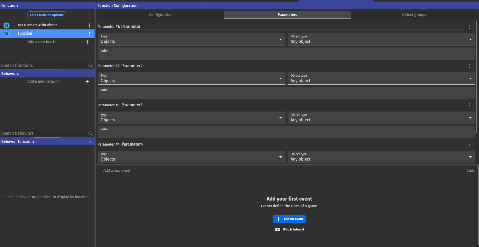
I understand what you’re saying. Maybe all it needs is a visual tweak. More white space or a divider between them or maybe different shades or colors. To me it looks like one long feild and even on a large monitor there’s only room for a parameter or 2 at a time and sometimes you need to see more and scroll less.
I’m not on my PC. I’ll have a good look the next time I am.
And if I know I’ll focus on the events for a while, I’ll resize that part to take up more vertical space.
I have a widescreen monitor, so there’s plenty of free horizontal space, but the software needs to accommodate all monitors, so I’m not sure we can pack everything in one line.
Maybe two lines, if we move the Label box next to the parameter name.
But feel free to take screenshots and edit them to show us what you think would be better.
This topic comes at the right time.
I’m actually thinking/working on input explorations that will be, hopefully more efficient.
So, any screen capture of your working spaces (how you really use them, like Gruk kindly posted) would be helpful to observe these components in the wild.
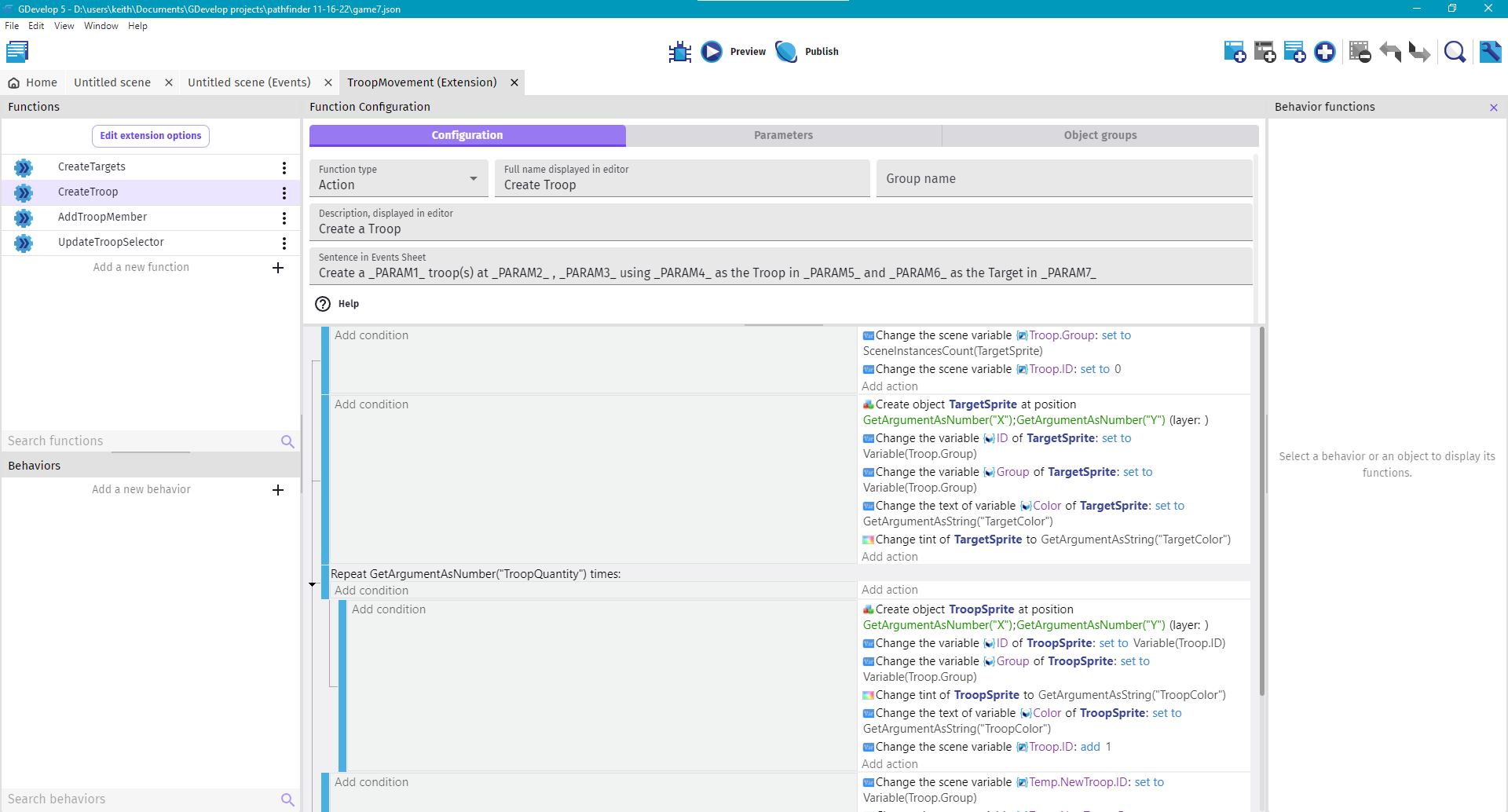
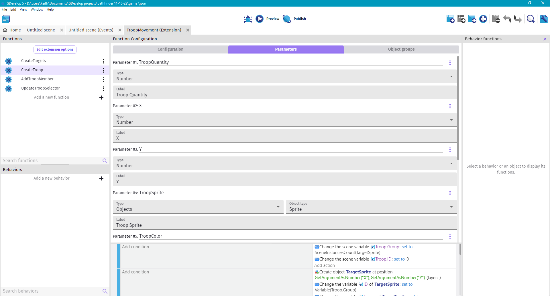
My workspace is basically the default. Although, I slide the divider between code and variables up and down when adding/arranging the variables. I use the light color scheme.
I mentioned elsewhere, what would help is if you could also insert a parameter by clicking the 3 dots and pick insert new parameter above/below. Someone else pointed out that the sentence would also have to autoupdate the param numbers.
It was also discussed about making the parameters draggable, so you could more easily rearrange them.
I can add a screenshot when I’m on my PC.
Edit. I usually have the split right below the ‘sentence in events’ box.
I can see what you’re saying. Indeed moving the section up and down can be annoying.
Thank you for the images and your explanation. I’ll start small with inputs, but this app section is already under my radar .