Feedback on GDevelop UI

GDevelop uses lots of different colors on its icons. Some icons are pale, some are bright. Some colors are muted and dull, others vivid and saturated. The buttons to open object and object group editors are slightly less saturated and more pale, while the other icons here are a bit more saturated and more vivid.

comparison.jpg

I’m testing those out. The problem is, they have to work against all sorts of different background colors. Here are the light blue base colors:

Icon colors v 1.png

1: Pale colors
2: Bright and saturated colors
3: The blue used in the new GDevelop logo

The dark purples are easy, in comparison. There’s only one hue of purple. Here’s a quick comparison - note that all of these purples are the same, they’re just seen in pairs, against different backgrounds.
Icon colors - purples v 1.png

All the icons currently use a darker shadow on the bottom left corner. I might leave that out for some icons, like undo and redo, that don’t have smaller shapes where just parts of the shadow are visible.

It would also be possible to change the strength of the shadow on these icons. I think the current setting is fine. Also, hue is a very minor design decision, so I think I’ll just go with pale blue number 3, the one used in the new GDevelop logo.

You make a good analyses !
I’m going to need you for my future video extention, i will need your help for create some icons.
I’ll keep you informed as to which icons i needed.
In accordance with GDevelop’s colors of course :wink:

Sure!

Once I’ve done some thinking and decided what sort of icons to make, I’ll most likely write up a simple style guide about it. I could also do a small tutorial about how to do the icons in a vector format, and create sample files in multiple different formats. At least Photoshop and Gimp formats, maybe Inkscape and Krita too.

Here’s one version of my mock-up implemented in GDevelop. It’s mostly done with themes, with one change in the actual code. The rows in the code editor were 1 pixel too close to each other, so I pushed them a bit further apart. I’m not sure if it’s something I broke with CSS styling, or if it’s something that’s actually been broken in the main GDevelop, but has gone unnoticed.

Any way, GDevelop UI is done with CSS, and it gets super complicated very quickly! Moving the vertical scrollbar to the side of the window is surprisingly difficult. Adding some empty space at the bottom of the event sheet is surprisingly complicated. Accidentally removing the little arrows that collapse and expand nested events? It’s so easy I’m not not sure how I did it! :smiley: Still, it’s a start!

1 Like

Some icon stuff: mock-ups for variable icons and object / object group icons, that could be used in the event sheet descriptions.
Icon-mockups - Variables.png

Icon-mockups - Objects.png

Edit:
and variables with scope

Icon-mockups - Variables with scope 1.png

Some scene icon mock-ups:

First version
variables with scope 2 - scene.png

Improved version with feedback from various GitHub discussions. The idea here is to have an icon for “global variable”, “scene variable” and “object variable”, where they each have an icon that both tells that it’s a variable, and describes its scope.

variables with scope  - scene v5C.png

Testing out new icons and different icon sizes for the event sheet.

Current icons are 16x16 pixels. Here are some icons remade to use tbe basic theme colors (light blue, dark blue, white).

Here’s what they’d look like if the icons were 24x24 pixels instead.

1 Like

Nice icons but I dislike the 24x24. I prefer the icons to be small.
You might want to post this on GitHub and Trello. Devs don’t read the forum that often.

Thanks for the feedback! I’ve actually been talking about these things with the devs on GitHub.

If you don’t mind me asking, what’s your screen resolution? Are you using GDevelop with a tablet, with a laptop (with probably a physically smaller screen), or from a desktop computer (with most likely a physically decent sized screen)? I’m using GDevelop mostly on a desktop computer, with a 1920x1080 resolution.

This discussion started because some of the icons I made work well on bigger sizes, but when downscaled to 16 pixels, they become a bit too small. So for once, this isn’t something I personally prefer or recommend. It’s just something I’m testing out. If it doesn’t work and if there isn’t any reason to change the icon sizes, I’ll have to rethink a few icon designs, but that’s not a problem.

I use GDevelop mostly on my desktop with the resolution 1680x1050 but I do plan to upgrade my monitor to 1920x1080.
I also use it on my 15" laptop sometimes at resolution 1366x768 but I do plan to upgrade to a new device with resolution 1920x1080
I don’t use it on my tablet but if I would the resolution is 1280x800 with no plan to upgrade in the near future.

Basically the smallest resolution I would personally use is 1280x800 with no plan to go below that and 1920x1080 is the biggest resolution I plan to be using in the near future with no plan to go above that for some years.

How about a space equal to construct2, so that the events always stay in the upper part.

I compile here some proposals made on the forum in various posts, I find the following ideas relevant and welcome.

  • We can open the functions from the eventsheet, but the “Behavior functions” panel does not open, I think you forgot to load it.

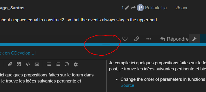
  • Change the order of parameters in functions, like we can do with animations of Object sprite
    Source

  • Add border line on frame “Function configuration”
    Source, and i approve this, border is not visible :frowning:
    Maybe we can have a border like this

  • Display “Strict mode” in JS events

  • Shortcuts for :

    • Launch preview
    • Refresh Preview of Project window (using the F5-key) or hot reload
    • Next tab, previous tab
    • Toggle project manager
    • Toggle Variable global, Scene
    • Toggle grid, snap
    • Naviguate with arrows in eventsheet, enter for open condition/action
  • When a window have “Cancel” button, bind ECHAP-key on it.
    Atm it’s not effective on all window, Global variable, windows for set properties about event choosen
    For fast shortcuts we should use keys on left side of keyboard with one hand.
    This way you keep your hand on the mouse and on on keyboard
    Source

  • Same bind ECHAP-key when we rename something

  • Possibility to enlarge JS event in eventsheet, with a button or drag and drop borders or something else (just enlarge, not open a new window)

For fast shortcuts we should use keys on left side of keyboard with one hand.
This way you keep your hand on the mouse and on on keyboard

I suggest making this a user preference. Some people (not me) control their mouse with their left hand, so having the keys on the left side will make GDevelop harder for them to use.

1 Like

I’ve started to talk with other peoples about interactive tutorials.
Because since few months the questions are often the same.

New users I don’t know where they come from or if they follow a written wiki tutorial, a youtube video, or if they try the software directly.

The question is how users find the resources to learn.
Because it is clear that they use them badly, or that they do not find them, otherwise we would not have X question on same subject.

We need more visibility, here a mockup

Maybe an interactive tutorial can be basic concept and also show in evidence the most popular questions

  • Audio files that do not work as they wish because they do not read the message/description. Difference between music and sound.
  • Video files, which require interaction before the video can be played back.
  • The multitouch which has different conditions than the mouse.
  • The gamepad/controllers that are via an extension.
2 Likes

Animations not working correctly is another one I see a lot and stuff related to variables.

1 Like

Quick question how do you like the GD interface?

  • From the point of view of the size of the elements, lists, colors, buttons, borders…
  • Separation between the panel/ separation in list…
  • Are there things you don’t like?
  • Things that are not very visible? Things that are too big?
  • Things that are better in other software? (if yes, please give us an example)
  • Are you close or open some panels in particular?
  • Do you resize them?

Please I’m looking for constructive feedback.
If you can compare with another software and provide some screenshot it is better.

The UI of GD is a bit unique because we use material-ui. This UI can’t fit to everyone and are a bit large, and also thinking for the web.
We can custom GDevelop as you want.
A good UI is important.

1 Like

Not sure whether this is the right thread, but the debugger could also be improved. Looking at this screenshot…

…I neither see in the tree which item I clicked, nor is that information given on the right hand side. Only the combination of the fields and values give an experienced user the hint that I selected the object instance. This hint has no value if I had multiple object instances.

I was thinking it would be more logical to store the network preview under the normal preview, rather than under the debugging icon, but actually, it would merit an icon of its own, 1. for ease of access and 2. to make newcomers aware of the feature.
Visually, the icon could be something like that:
image
(behold my mad GIMP skillz)

Coming from my post in Discord, do you guys think it’s a good idea if both the Scene and Scene Events share a single tab? Switching between a scene and its event can be done through a keyboard shortcut like Ctrl + Tab.

image

5 Likes

Welcome and thank you for making a post with your mockups!

While I don’t personally know how feasible it is, I think it is a great idea that could help clean up tab space as well as simplify user workflow.