What would you like to request:
Hello, to greatly reduce resolution issues across different phones, I propose adding two very simple options to the project resolution settings. In addition to “fill width” and “fill height,” it would be useful to have:
Fill width and adjust the ratio for the y-axis based on the screen (with optional cropping)
Fill height and adjust the ratio for the x-axis based on the screen (with optional cropping)
Problems this would solve:
In many games, especially puzzle games with a fixed screen, having black bars at the top (e.g., 9:16 on newer phones) looks bad. Even worse, with high resolutions (e.g., 720x1608), when playing in 9:16, two vertical black bars appear on the sides.
With this approach, you could instead create a high-resolution project, allow for optional cropping when playing in 9:16, and then use anchors or mathematical formulas to position grids and sprites.
Currently, I use the fill width function, which is helpful, but my case is a bit different. Let me explain better (and if there’s already a way to solve this, that would be fantastic).
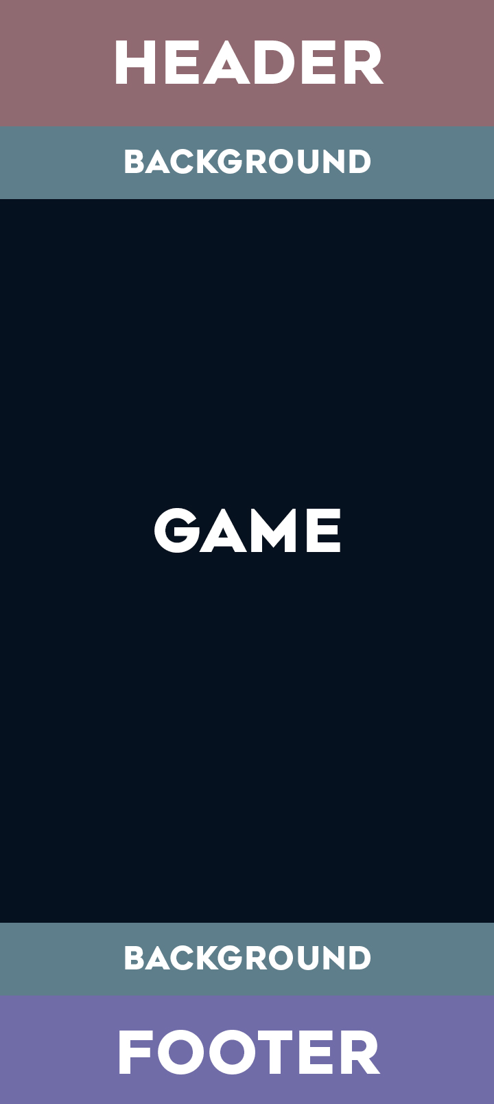
Figure 2 - My game on a 9:16 screen using fill width. The problem is that the game stays small in the center. Instead, I’d like everything to be proportionally resized, then cropped along the y-axis.
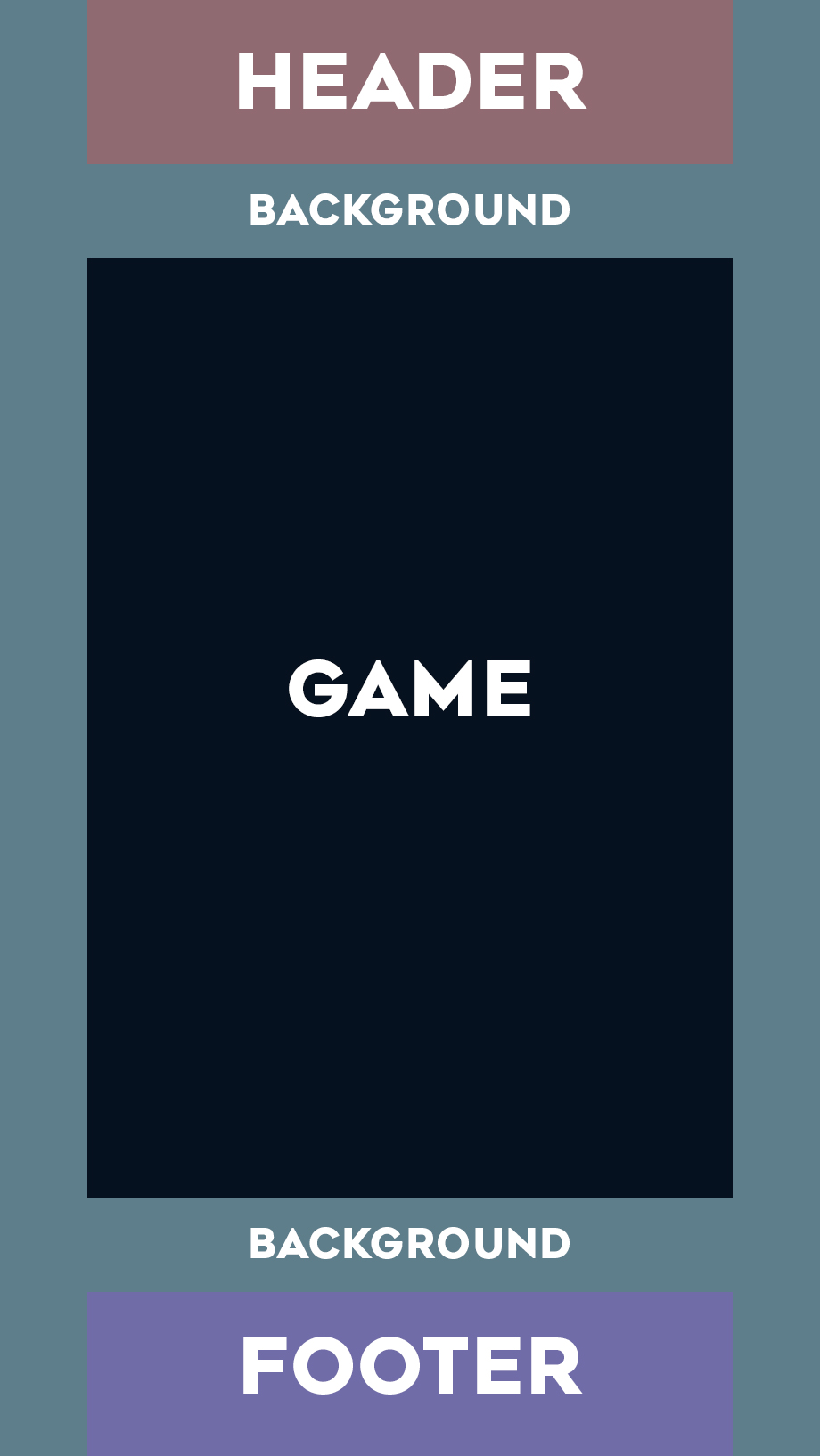
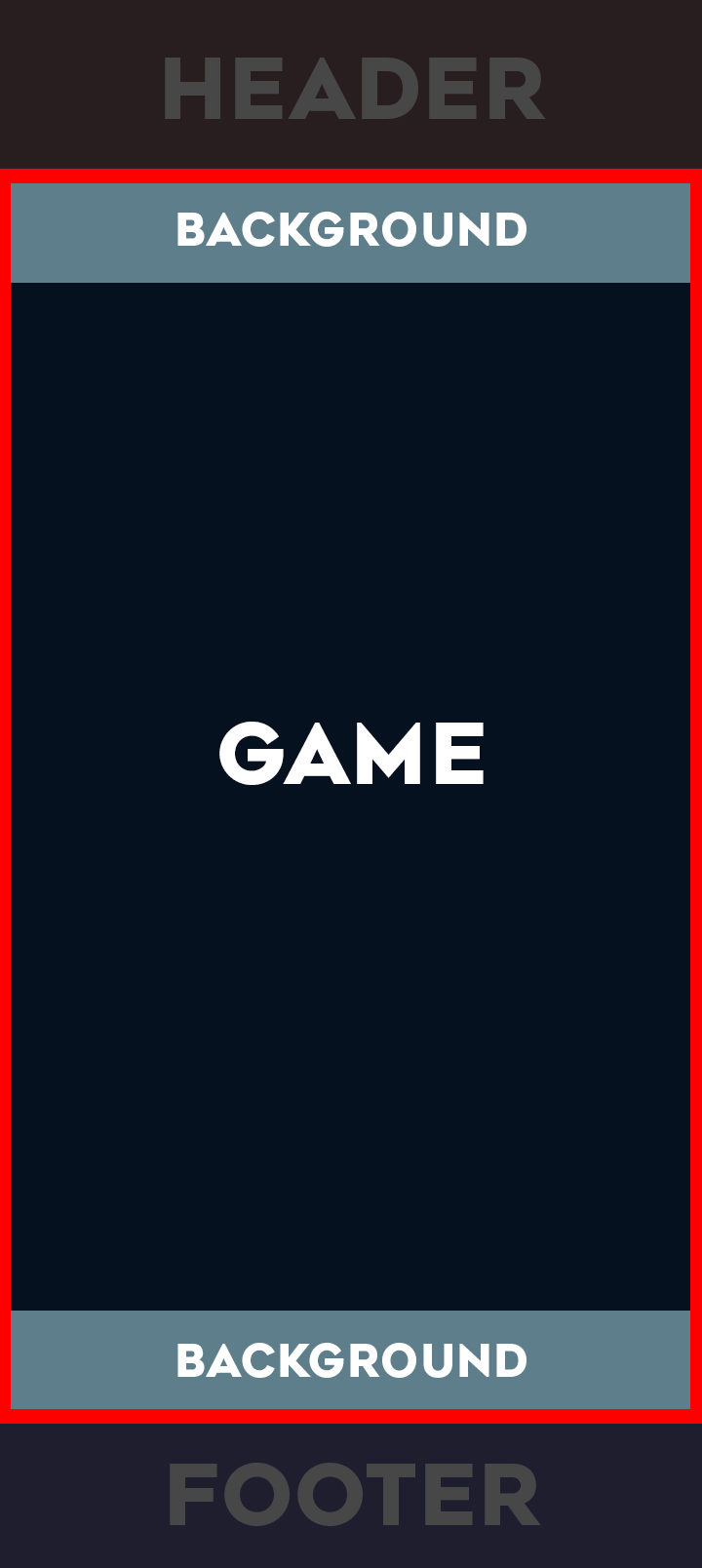
Figure 3 - What I want: my game on 9:16 screens
(the red rectangle represents all the screen). The game is proportionally enlarged and fills the entire screen. The header and footer are cropped out (and that’s fine).
When I saw the new Adjust Width or Height to Fill Screen (without cropping) feature, especially with the convenient option to center a layer, I was so excited. I was already doing something similar manually, and as soon as I read the release notes I realized that a lot of the tedious setup I had adopted would now be obsolete.
So to me the Adjust width or Height options are still viable depending on the game layout, especially with the new option to center the layers so we no longer have to do it manually, and the new extend width or height just gives the design options that much more flexibilty and ease.
I am curious if you’ve tried adjust height to fill screen (extend or crop) because to me it seems that it is the width that is important in your game, and the height that is negotiable/can be expanded/contracted to fill screen to measure.
From what I can best tell, your description very much sounds like you should be using adjust height as lucky-j said above, not adjust width. You would probably use that combined with ensuring the layer properties have the cameras expand from the center (instead of expanding from top left).
You’d also probably need to also use the anchor behavior for your headers/footers so you don’t have to manually move them.
Ignoring all of that, as far as I can tell your requested feature would not accomplish what you are looking for, as no scaling setting is going to adjust your object positions for you. It’s only going to adjust your canvas size and zooms. Also note you’re explicitly adjusting your aspect ratio in your description vs the “maintain the same ratio” in the title, so the feature as requested (even if it could move objects) would not do what you’re actually looking for.
Hello, and thanks for your responses. After your suggestions, I ran additional tests, exporting from Windows to Android.
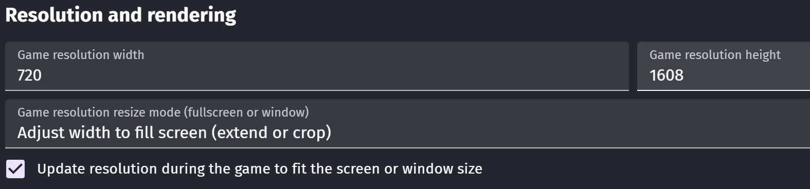
In my initial tests, I used fill height, but I hadn’t activated “update resolution during the game.” Then I started testing with fill width (also without success) until I activated “update resolution.”
Now I’ve exported again with the fill height option and “update resolution” enabled. From a quick test, it seems to be exactly what I was looking for (thanks). So far, I’ve only tested it on a 9:16 high-resolution tablet, and it worked. I hope to test it soon on phones with the same format.
Hello, I’m about to finish my game and I’m doing all the checks. I can confirm the issue: if I select “Adjust width to fill screen (extend or crop)”, the function does NOT activate, and the screen remains the same. It only works if I select “Update resolution during the game”.
What’s the point of this? I think it’s a bug (otherwise, the second option shouldn’t even exist).
My game is for Android, but Google Play is now bringing all games to PC as well. Changing the window size during the game causes major issues.
Before deciding whether to stop the PC version (which would be a real shame), I’d like to understand if there are any alternatives—or if this is just a GDevelop issue.