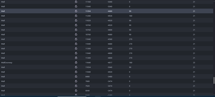
It can be hard to tell at a glance when an object in the instance list is unlocked or locked, especially when there are over a hundred objects.
Would we be able to color code this or maybe use letters or just something more…distinct between the two states?
7 Likes
Luni
2
Hello TheQuirkyGamer
Thank you for reporting this usability issue.
I’m letting you know that I’ve created a GitHub issue here for it to be adressed: Update Layer panel icon components for better comprehension · Issue #6755 · 4ian/GDevelop · GitHub
Thanks!
