I’m trying to figure out how to make it so the game automatically detects the viewport of the device,
I’m testing my apps in android studio with its emulators and been noticing the app just keeps the 800 x 600 as static, but need it do dynamically change to fill the whole screen depending on the device the game is being used on in landscape mode
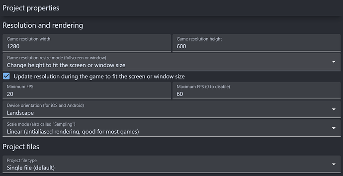
I’m game settings, you can tell it to either expand the width or the height to fill the screen.
Yea I saw that, but its only one or the other, I need it to be responsive for both height and width.
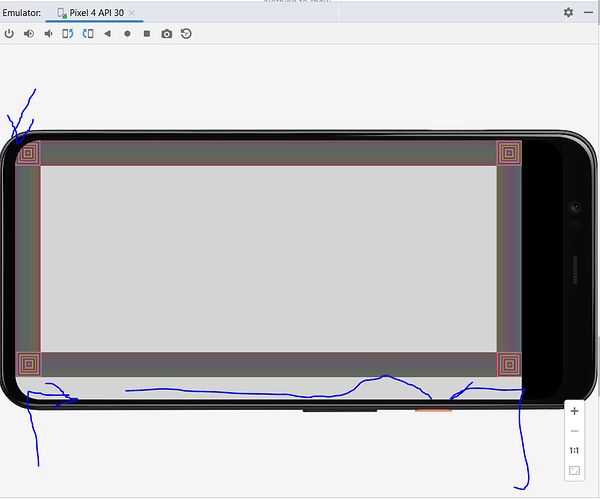
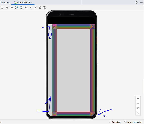
Right now heres what it looks like in the emulator. I’ve tried several device emulators and keep running into the same issue
The blue arrows are referring to the areas im talking about. such as the large grey area outside of the border and the corner thats cut off.
The curved edges of the screen…I don’t think you can do much about that. That’s just how screens are these days.
Have you tried setting the game resolution using ScreenWidth() and ScreenHeight()?
I think you are confused. The viewport IS filling the whole screen already, as you can see there are no black bars and the scene background is filling the scene. Though, while the size of the viewport changes, the size of your objects don’t. If you want the objects to have their position/size adapt to new viewport resolutions, you’ll have to use the anchor behavior,
1 Like
Thank you for clarifying what I was doing wrong. I set the edges as proportional, everything is working fine now. Thanks again


