Hi!!! ![]()
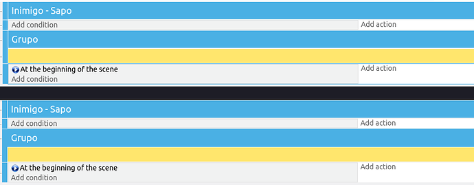
I have a simple suggestion. When we select an event in the event panel or a comment, it is well highlighted with a thin blue outline (may vary according to the theme). But when is a group selected it’s difficult to see. For most themes by default the groups is the exact same color by as the outline generated by the selection. Here a screenshot compare the group “Grupo” Not selected and selected (almost no visual difference for me):
This could be changed in a thousand and one ways. My suggestion is:
- Following the example of the search function, I think one of the changes could be the left rectangle can change color:
- And change the color of outline of the themes with the same color of retangle. I made an edit of how it could look with these two changes:
(I thought this color was a bit exaggerated, but it’s just an example)
Thanks. ![]()


