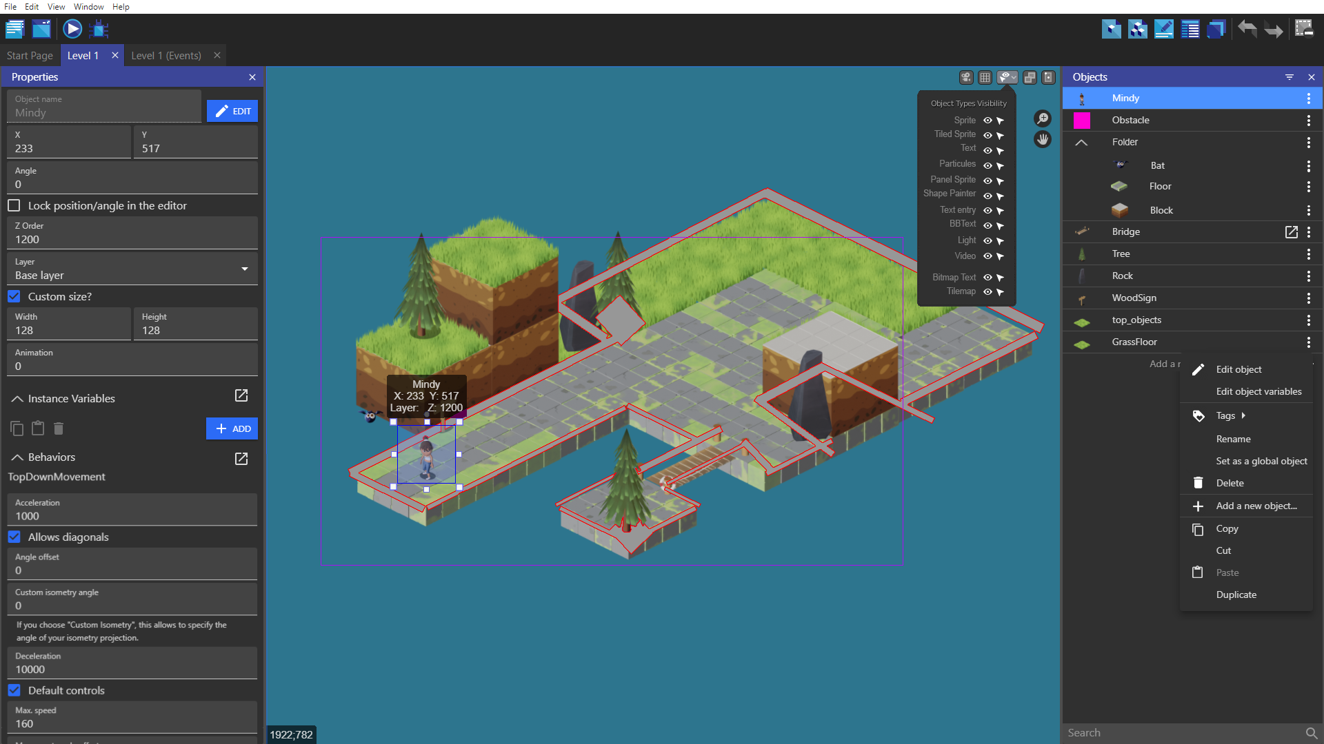
Yes it’s true that they use almost all an asset store with a selection that displays in the panel the modifiable properties. This is a principle that I like, we can see and edit what we see. It’s also a UX principle. Display what the user needs at the right time, not to disturb or lose him with too much information.
What I take from what you say is that you want to organize yourself what is in your project in groups/folders.
And I totally agree, I want that too, the organization, this is the way..
But if you are pushing for an asset manager, I’m totaly against it because it’s the opposite of order.
Why i think that? click for open my arguments
An asset manager that mixes images, sounds, videos, tilemaps, jsons (yarn) files and objects is a bad idea. It’s counter productive.
If tidying up your room every day is a pleasure it is a good idea.
If you don’t like it, everything will be a mess.
We could have filters with a search bar to find what we want. But I’m wondering why we put in the same basket the towels and the cloths (it’s a french expression, idk if this have sense haha, i hope you get the idea)
We have the resources tab which manages the files, it is certainly not very provided in options, but it deals with the files.
The closest thing to an asset store in GDevelop is the object list.
There are no folders yet, this is one of the most requested things because nobody understands tags, that’s a pity. When folders will arrive they could also arrive in the resources. A folder for each type, sound, image, tilemap, video, font…
In resources we already have a panel for properties, that’s also a reason why an asset store is not useful.
There is no need for an asset store to mix files and objects, we just need something to better organize our lists and not add content that we already have.
I’m also against the asset store because files have a place on the hard drive, but not objects, for me they are two different things.
[…] and Blender being bloated and indeed it can be extremely frustrating experience to dig through so many properties,
It’s the same with an asset store. Browsing through too many unrelated things (files&objects) is frustrating and time consuming.
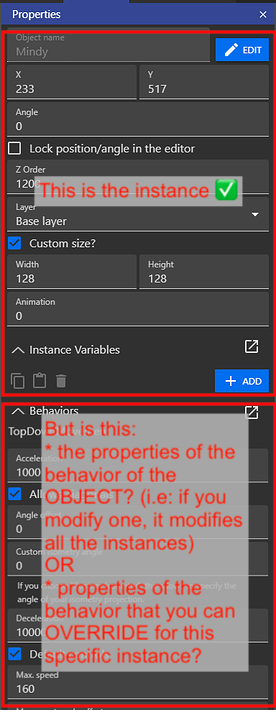
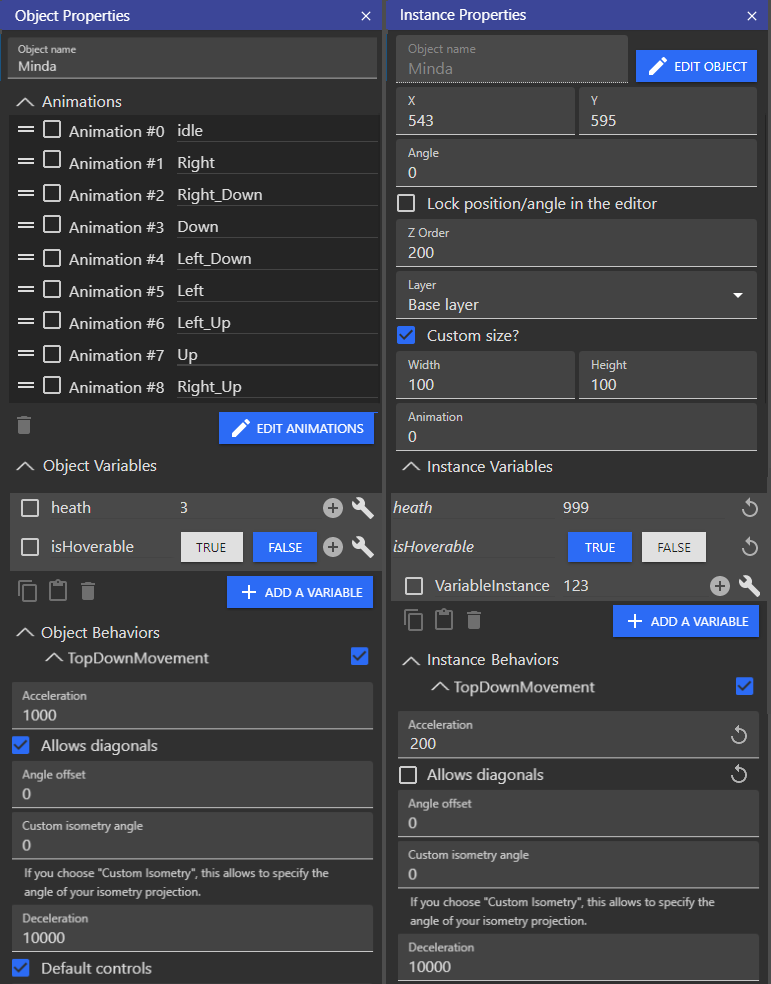
So then we need 3 panels only. Instances on the right, Assets at the bottom, Properties on the left and a different properties view for Instances
Why a panel for the instance and one panel for the object?
It’s loosing space to keep both on screen, one depending of the selection is enough.
Assets manager → Object list, enchanted with folders & list of prefab created from extensions. Why not rename it to “Object manager”?
Properties on left - > My mockup of instance/object properties depending of the selection.
And voilà, two panels are enough.
If the goal is to organise the instances on the scene, maybe we could enchance the instance list, rename it outliner or something better, and add folders in this list.
In the case of objects are mixed up with the resources, i have ideas for make one panel with layers and instances from the instance list.
The UX principle of displaying the right thing at the right time and not overloading the user with information and avoid a bloated UI, is the principle I like the most.