Improving GDevelop usability

It would be cool to be able to sort the debugger list by ms time taking to execute.

1 Like

Here few ideas on this mockup.

  • Icons for the viewport in the viewport (icons and UI come from Blender)

    • The lens is for zoom, it can work like Blender click and drag and drop the mouse, the camera zoom. The distance from the icon is the level of zoom.
      We can keep the old menu with right click.

    • The hand is for moving the camera in the view port, this replace the limited blue slider on top and left of the editor. (Currently limited to -5609 on X and Y), the button use the distance from the button to the mouse on both axes for move the camera.

    • Visibility panel, allow to hide and lock the selection by types of objects on the scene editor.

    • Camera icon, is for toggle the mask of the camera with left click

    • Grid icon, is for toggle the grid with left click, and right click open a small popup with options for cell dimensions and incoming isometric button.

    • Next icon on right, is for toggle the collision mask on visible objects.

    • Next icon on right is for toggle the points of visible objects. Right click open a popup for options, toggle the custom name, toggle the origins and the centers points.

  • In the object list

    • Folder is a folder ¯_(ツ)_/¯ (only for manage your project)

    • Bridge have a new icon on right, it is for prefab/extension object, it can be an object made in an extension. Read more on prefab/extension object.

    • The context menu have icons! Are you always looking for the most common buttons, because depending on the menu the button changes its place? Icons are more instinctive and faster than reading the whole list!

  • Properties panel

    • A properties panel should be show to you the properties right? When why not make the behaviors properties editable on this panel?
8 Likes

:+1:

Nice, hopefully tiled isometric map support gonna follow.

Huge yes on this. This is something that I’ve found incredibly useful on other engines, and would make using behaviours much easier.

1 Like

Also very exciting seeing this concept being given serious thought.

Nice mockup! :slight_smile:

  • A properties panel should be show to you the properties right? When why not make the behaviors properties editable on this panel?

Totally, but I would go even further, why not make the whole object editable in this panel? :slight_smile:
We could imagine having an option to show the object editor in this panel (with collapsible parts).

Some concerns to handle are:

  • is this more intuitive than a separate dialog? We must be sure users understand the difference between an object and an instance.
  • speaking of this, I think in the mockup there can be some confusion already. Are we editing the behavior of the “instance” (a new interesting capability by the way) OR the behavior of the object (that would make sense… but can be surprising because just before it’s the instance that you edit!)

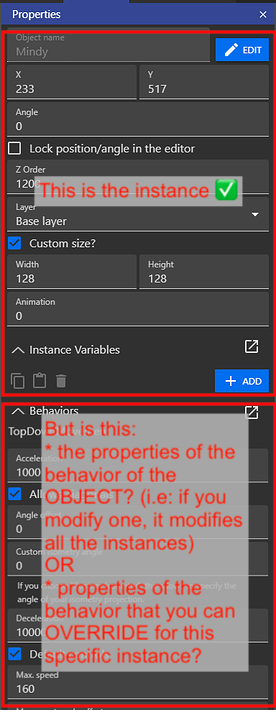
In other words, I think there might be a better separation to do - we could for example show the behaviors and the object editor in the panel, but ONLY when you click on “Edit” button.
So that it’s clear “this is the object” and “this is the behavior”.

Note that we could have, like for “Instance variables”, some properties of the behavior that could be overwritten for each instance! That would be great, but also a new source of confusion so let’s try to get this right :slight_smile: What do you think?

Bridge have a new icon on right, it is for prefab/extension object, it can be an object made in an extension.

This is a good idea, when we’ll work on this kind of “Custom”/“Composite”/“Container” object, being able to quickly edit an object will be essential.
(Even if internally this is considered as an extension, this should be almost invisible).

In the object list

Overall agree on all of this :slight_smile:

Icons for the viewport in the viewport

I’m fine with this as long as we try hard to keep these icons simple & easy to use (i.e: avoid the “too many buttons” syndrom of most game engines/3d modeler apps).

2 Likes

I think it would only make the UI feel bloated and not very organised.
Personally I like the idea better to be able to edit the behaviour properties for the selected instance in the instance properties panel instead of allowing users to change object properties in the instance properties panel.

It would be useful so we can conveniently set initial values including the ability to enable/disable behavior in the properties panel / instance instead of using events. We would have to use events only if we would like to change something at runtime if certain conditions are met or in case we create instances programatically at runtime. Otherwise we can set everything in the instance properties panel.

It could work similar to custom size, we would have a custom check box to use if we would like to set custom properties for the selected instance only (could select multiple instances).
The box would be checked automatically if we change something. Alternatively, could make it so if the box is unchecked we ignore the custom values entered but that is not very nice (I have just noticed this is how it currently works with custom size, I think it should be changed and instead ignoring the entered value, check the custom box automatically if a value is edited.

When we change the properties of the object in the object properties panel, it would apply to all instances in the editor except the ones with the custom box checked, those would be ignored at the time we edit object properties.
In case we uncheck the custom box, the values of the instance would reset to the current object values.

In my opinion this workflow could be more organised and generate less bloat and confusion than allowing users to change object properties in the instance properties panel and also in the object properties panel for no real benefit. Better to keep them separated imo and keep the instance properties panel for the instances :+1:

That’s the idea, yes.

The principle is to eliminate the component dialog panel as much as possible, putting the properties of the object in the properties panel is possible, here how:

At the moment the property panel is reserved for the instances selected on the scene.
Let’s keep this functionality, it’s very good.
Let’s remove the automatic selection of the object in the object list.

By removing the selection of the object in the list when an instance is selected it gives the possibility to select an object AND an instance.

The selection of an object it is now possible, we can display the object properties in this panel!
It’s still intuitive, you want to modify an object select an object and modify it in the panel, you want to modify an instance then select your instance on the scene and modify it in the panel.

For the instances and their behaviors I didn’t think about overriding the values, I don’t know how doable or useful, the idea is appealing, this idea fit well in this logic of instance and object properties through the properties panel.

Here a new mockup for the properties panel:

On the left when an object is selected in the list.
On the right when an instance is selected in the scene.

  • Start with the Object properties on left:

    • First section is Animations, as this section take a lot of space with the images maybe my list of animation is not the best but we keep the button for edit animation in a panel!
      Once the animation sprites are added when it’s done it’s done, but maybe when we work on the eventsheet the order of animations can be wrong or we want change the name.
      As the trash bin icons can be missclicked on this panel and as the confirmation popup is a BAD thing, it’s interesting to mimic how the variables are deleted, first select which animation you want delete, two click on trash bin icon. (Or click on Edit animation and get the current panel or edit what you want like we can do in current betas.)

    • In the next section bellow there is the Object variables. Nothing more to said.

    • Next section is Object behaviors.
      The image is cropped but like the variables and the animations, there is a blue button for “ADD A BEHAVIOR”.
      There is also a button on the right of each behaviors for enable/disabled the behavior at the startup of the game. (Like suggest ddabrahim), maybe a similar button could be added for toggle the visibility of an instance and object.

  • On right we have the instance panel, when a instance is selected on the scene.
    It basically the same thing but with override system on variables, and why not on behaviors like you suggest. Seen the loop back icons!
    Here the Animations section is gone and replaced by the instance transforms.
    And the name of this panel change from Object Properties to Instance Properties.

This way of seeing the instances and objects is rather common.
Everything is also very quick to access, there is no hidden menu in a right click, or an edit button, or knowing that you have to double click on an object to edit it.

The main reason is as I said at the beginning, it’s to remove the popup panels, it looks old, people find it dangerous because they click next to it and so it cancels all the modifications.
If we correct a bad behavior of the users by a dialog box that asks for confirmation it’s also bad, it penalizes the users who use the backdrop click to cancel, and it breaks the workflow with a confirmation window, nothing better to waste time. Loosing time with confirmation everywhere because it’s a easy bad fix or loose every change because a miss click happend, or a better solution without confirmation and without missclick possible, and edits faster. My choice is done.

Having the object and instance properties in this panel is a non-blocking workflow solution and you have everything in front of you. Nothing hidden in a menu, nothing blocking with a confirmation, and nobody loses the changes made, it reduces the has-been popup panels, it’s more modern.
No one like the changes, i agree with that idea, but i think it for the best.

Unity, Unreal engine, have a properties panel that works with instances and objects.
Blender too.

I don’t know c2,c3, I was looking at it and it seems to mix the instance and object section in the same properties panel.

In each of these software there is no object panel like we have.

I haven’t seen anyone complain that it’s cumbersome and no one complain that it’s slow, but mostly no one wasting time with a bad interface like ours.

They are having something called an Asset Manager where you can manage all your objects, images, sounds, scenes, scripts…everything and use it in a similar fashion. You can create and store your base objects in the asset manager and then create instances of it in the scene by drag 'n drop objects from the asset manager in to the level editor or in to the Instances panel. I think It could be actually useful to have a similar Asset Manager so people can manage all their assets one place, objects, groups, images, sounds, scenes, layouts, functions, fonts…everything managed in one place and able to sort them in to folders. I would love that.

However, regarding mixing Instance and Object props, lot of people complain about Unreal, Unity and Blender being bloated and indeed it can be extremely frustrating experience to dig through so many properties, options especially when you do know what you are clicking after for 2-3 minutes could be done in few lines of code in 2 seconds. This is why many people hate these visual clicking tools so I am uncertain if to squeeze everything on to a single panel in a single view is the right way to go.

But I do support the idea to have different views on the same panel and display them based on what is selected and to have an Asset Manager to manage everything in one place. So then we need 3 panels only. Instances on the right, Assets at the bottom, Properties on the left and a different properties view for Instances, Objects, Scenes, Behaviours, Object Groups…etc to be displayed in the properties panel when something is selected in the Asset Manager, Instances panel or the level editor.

1 Like

Yes it’s true that they use almost all an asset store with a selection that displays in the panel the modifiable properties. This is a principle that I like, we can see and edit what we see. It’s also a UX principle. Display what the user needs at the right time, not to disturb or lose him with too much information.

What I take from what you say is that you want to organize yourself what is in your project in groups/folders.
And I totally agree, I want that too, the organization, this is the way..


But if you are pushing for an asset manager, I’m totaly against it because it’s the opposite of order.

Why i think that? click for open my arguments

An asset manager that mixes images, sounds, videos, tilemaps, jsons (yarn) files and objects is a bad idea. It’s counter productive.
If tidying up your room every day is a pleasure it is a good idea.
If you don’t like it, everything will be a mess.
We could have filters with a search bar to find what we want. But I’m wondering why we put in the same basket the towels and the cloths (it’s a french expression, idk if this have sense haha, i hope you get the idea)
We have the resources tab which manages the files, it is certainly not very provided in options, but it deals with the files.

The closest thing to an asset store in GDevelop is the object list.
There are no folders yet, this is one of the most requested things because nobody understands tags, that’s a pity. When folders will arrive they could also arrive in the resources. A folder for each type, sound, image, tilemap, video, font…
In resources we already have a panel for properties, that’s also a reason why an asset store is not useful.

There is no need for an asset store to mix files and objects, we just need something to better organize our lists and not add content that we already have.

I’m also against the asset store because files have a place on the hard drive, but not objects, for me they are two different things.

[…] and Blender being bloated and indeed it can be extremely frustrating experience to dig through so many properties,

It’s the same with an asset store. Browsing through too many unrelated things (files&objects) is frustrating and time consuming.


So then we need 3 panels only. Instances on the right, Assets at the bottom, Properties on the left and a different properties view for Instances

Why a panel for the instance and one panel for the object?
It’s loosing space to keep both on screen, one depending of the selection is enough.

Assets manager → Object list, enchanted with folders & list of prefab created from extensions. Why not rename it to “Object manager”?
Properties on left - > My mockup of instance/object properties depending of the selection.

And voilà, two panels are enough.
If the goal is to organise the instances on the scene, maybe we could enchance the instance list, rename it outliner or something better, and add folders in this list.

In the case of objects are mixed up with the resources, i have ideas for make one panel with layers and instances from the instance list.

The UX principle of displaying the right thing at the right time and not overloading the user with information and avoid a bloated UI, is the principle I like the most.

2 Likes

Basically an Instance panel is to show what is in the scene and the object list contain the base objects you can create instances from. So it is 2 separate things but I guess it could be combined similar to how Godot and GameMaker Studio does it where the object list is also the instance list, so if you have 2 enemies in the scene then you have 2 enemy objects in the list. But even if we keep them separate, the Instances panel is ok to be optional, doesn’t have to be visible at all times, only needed when it hard to find or difficult to select an instance in the editor. So then yes only 2 panel is enough. Object and Properties :+1:

No I am not pushing for it, I don’t miss it. Only wanted to point out some engines uses Asset Manager and you have everything in one place organised in to folders in the asset manager. I think it is useful if the goal is to reduce the number of windows and panels a user need to navigate between.

  1. Drag a font from your desktop and drop it in to the Fonts folder in your Asset manager.
  2. Select the font in your asset manager and see the font properties in the properties panel, change the size, colour…etc
  3. Select a label in the editor and see the label properties displayed in the properties panel, change the position, font…etc
  4. Open the Fonts folder in the asset manager and drag 'n drop the font from the asset manager directly in to the font field in the properties panel while the label is selected.
  5. There you go, you have imported a font in to your project, customised it and did set the font for a label in your scene while you did not had to open any additional window or dialogs.

So if this is not productive I don’t know what is.
But to clarify when I say Asset Manager I mean something like this;

It is a screenshot from an other tool so you may see some not relevant buttons here like Code and Message but worth taking a note of the:

  1. Folder structure on the left so you can navigate between folders, create them, delete them, rename them.
  2. Assets with thumbnail on the right for selected folder or…
  3. Pre-set categories on the top to choose from based on file type so even if the user feel lazy, the asset manager could sort content in to categories based on file type like .png, mp3, .ttf can automatically sorted in to categories and conveniently select at the top.
  4. Search bar is not visible in the image but could have one so we can search content by typing name too.
  5. Could also have some colour codes similar to Unreal to make it clear you are looking at a texture, an object, a font, a scene or what type of content.

I think an asset manager like this does fit the UX principle you mentioned to display information when needed and avoid overloading the user. I mean it does not look that complicated and it is straight to the point.

I don’t think it would be that people don’t understand tags, just don’t like them. I mean I open my Photos app on my phone and it is immediately display all the trash I don’t want to see or I don’t want others to see instead of nicely organised folders, if I add a photo to an album, it is not actually moving the photo but only add a tag, if I delete the album, it is only remove the tag but not the photo. The other day I have discovered 2GB Photo I thought I have deleted but no, I have only removed the tag and all the trash I no longer need is all over the place with no tags and no way to find them unless I go through all the images 1 by 1 because no tags. How is this better than folders and most importantly, in case we are concerned about people get messy with the Asset Manager and folders, how is the tags helping?

Yes we talk about the same assets manager.

I see many issue by adding resources too easily in the project. First is everything is based on objects in GD. Second is if you want add a resource it’s always for an object or directly in the eventsheet, why add the resources in a asset manager first, there is a file selector and a button for select the file on the desktop. There is also no options on resources, except for loading and smoothing. (fun fact, the loading button from resources have no impact I guess it’s something not fully added during change of the major version GD4 to 5.)

There is nothing to change on a font resource in GD, a font is define in the font file, if you have to edit the colors or styles, it’s on the text objects. (Also editable in the instance/object properties like i suggest)

  1. There you go, you have imported a font in to your project, customised it and did set the font for a label in your scene while you did not had to open any additional window or dialogs.

Ok keep this concept, without the asset manager, you talk about fonts i suppose you will use it in a text object. I would see:

Click on add an object, select Text object, give him a name in the object list, (the input name is auto focus after the choice of the object). Once the name is valid the object is selected, and the properties panel is updated, here you edit the size and the text, the colors and the font. As the font need a file you select the file with the system window, or your drag’n’drop the font in the input.

This way we don’t have to add the resource first, the engine is always based on objects. Which is one of concept of GDevelop. We can directly config the object in the properties panel, and drag’n’drop the font file on the input. The input files can change of style when a file is dragged. And if it’s not very visible we can do bigger.

The tilemap/bitmap object can have different files, we could split the drop zone in two drop zone.

I really thought there is nothing to do with the resource file in an asset manager mix with objects.
There is almost nothing to edit on resources. And the resources are only one step in the process for create an object.

Anyways a bunch of time ago i’ve made a mockup of the object list.


Imagine the tags bellow are not tags but buttons for each type of resources.
You click on a font button, and you see the all the fonts in the project.
You select a font in the list and the properties panel is updated, display a preview of the font, let you manage the properties on the file, and that’s all.

But add an enchanced object list something like this, or an asset manager.
Will break the limit between resources and objects.
What to do with a resource when it is drag’n’dop on the scene?
Why do we allow objects but not resources to be on the scene?
Both come from the same panel. Don’t you find it disturbing?
Besides the fact that resources are only a step in the creation of an object. We rarely go back to them.

I don’t know if we will find an arrangement that suits everyone or that has a logic, in any case it’s interesting to exchange our points of view :slight_smile:

1 Like

Maybe it is just me but I think the Asset Manager is the most convenient way to help us to avoid additional dialogs and windows opened. What I am talking about is the ability to never have to leave the editor and never overlap the editor with any dialog and additional windows while you are editing a scene. But why am I talking about this, I have no idea :sweat_smile:

I guess all I really wanted to say is to please don’t expose object behavior properties in the instance properties panel, keep them separate so then it means we have separate dialog for objects so instead we should have separate views for the same properties panel so we never have to leave the editor but then, we still need to deal with dialogs and windows and leave the editor when we import assets and this is where the Asset Manager and the ability to drag and drop assets in to the editor could help so we never have to leave the editor…But why am I talking about this I have no idea :rofl:
It must be something you or 4ian mentioned that planted the seed in my head to “avoid additional dialogs and windows” and get me going.

Anyway, great mockup and please keep object and instance properties separated by any means you think reasonable :+1:

Lol, such incredibly poor arguments. Just say that you’re sticking to the particular design solution that’s already chosen and stop producing these sort of excuses, it’s unbecoming.

It’s you prerogative to design the program however you see fit, however, attempting to sell “the rest of the screen is a delete all button with no warning” as a good idea is rather baffling.

Confirmation dialog boxes break the immersion and fluidity in the application.The edit window is already a dialog box… add a confirmation over another one, it looks like a habit from 15 years ago on a bad OS.

  • Making a program pretty shouldn’t be a higher priority than making changes to the project safe from accidental deletion.
  • Immersion is a key value for games, again, for utility programs it shouldn’t go over making your work actually safe.
  • If you weren’t old enough to use a computer all day 15 years ago, I was.
  • Maybe using easily-dismissable dialogs for this kind of critical edition tasks is also a bad habit related to OS customs, except one from current trendy stuff :stuck_out_tongue:

If you miss click you have to be more precise with your mouse and all change need to be done with your complete attention relative to what you trying to do.

  • If the accept button wasn’t sitting right next to a “CANCEL AND DISCARD WITHOUT CONFIRMATION” area, this wouldn’t be a problem.
  • Same for the tiny scroll bar
  • After inputting 10 animations frame by frame from individual files (which bring up another dialog! In a different style! Won’t somebody PLEASE think of the immersion? it’s entirely understandable that your eyes are glazed over and you sometimes miss the accept button.
  • What’s not understandable is that the relatively small accept button is sitting right next to an arbitrarily large instakill hazard area when there is a cancel button…

The mousewheel allow to scroll in you list.
About the scollbar:
The scrollbar is moreover an element that becomes more and more useless, it remains and must always be visible to indicate a large area to scroll.
But its manual use is almost obsolete. Even more so with the age of touch.
The only people I see still using the scrollbar with the mouse are people 40 years old and older.
Your mouse has a scroll wheel, your keyboard has PageUp/PageDown

  • I use GDevelop with the same Intuos tablet I use for doing pixel art. I DON’T HAVE A MOUSE WHEEL
  • You’re putting very specific hardware restictions on common actions. Somehow I don’t see you saying “press ESC to exit the dialog, if you don’t have an ESC button that’s your own problem” or "ctrl+alt+s is the only way to save the project, having a clickable save menu interrupts ImMeRsIoN
  • Again with the age stuff. I’m not 40, I’m 35, but thanks for making me feel unwelcome anyways. Seriously, please refrain from making this kind of comment in public in the future. It’s OK if you tell this kind of thing to your young buddies, but using this as an excuse for your own questionable design decisions is just completely uncalled for and 100% asking to be chewed out.
  • A well-implemented scroll bar allows you to move to a particular position in the scrollable content with a single mouse OR TOUCH action, something that touch-sliding or PageUp/PageDown CANNOT do. Mouse wheel, or wheel click and drag cannot do it, either.

A confirmation box is fine only when an action of the software is unrecoverable.
Like converting an object to a global object, same for groups, and when you want to close the application.

  • Discarding your changes in the animation window is unrecoverable.
  • There is a cancel button.
  • Not using a confirmation prompt when discarding changes is plain irresponsible whether you want to admit it or not. An user could exit the window, NOT KNOWING ANYTHING WAS LOST since they didn’t hit “cancel” and they weren’t warned of any discards, then come back to it and wonder where the hell all their stuff is.
1 Like

First of all, thank you for your complete contribution to this discussion. You are making good points, but I think so is doing Bouh.
Having a big area acting as an exit for the dialogue is good for fast development and having a fluid software, which is required in order to survive today, and because many users like it.
However, a big cancel button like this one is very risky indeed, and i see why you would hate it.

Seeing that everyone has mixed opinion, we settled on letting users chose how they want their UI to behave, instead of forcing them onto using a certain approach.

As a moderator now, I would like to ask everyone to drop the subject, as it is a sensitive one and I think we prefer to keep this a civilized place for discussion, so I would like to stop this before it degenerates.

4 Likes

The majority of people complain and bring a solution of their own.
I complain that the dialog boxes are blocking.
You lose the changes because it happens.
My solution is to not have a dialog box.
Your solution is to have a dialog box.

The problem is not that my opinion has more value than yours or vice versa.
The problem is that if we make a choice among our solutions nobody is happy.

You and I have been selfish about the right solution, Arthuro has shown hindsight and indeed having a user preference for this is THE right solution.

With my poor arguments, if I thought only to me I would not go to implement the solution of arthuro.
I don’t say that my solution is the best, I speak for myself, I give my opinion like all users.

The difficulty is that people give their arguments, just saying something isn’t good doesn’t doesn’t help. If I have upset you with my arguments I am glad because it is by not being on the same wavelength that we finally see the arguments of others.

2 Likes

and @Bouh

I think a preference toggle is the best option, I’ll shut up now.

When I first saw this mockup, I thought it was a great way to inform users of the relationship between objects and instances. The object is displayed as the root item and the leaf items were the instances. It is obvious that any changes to the root item would affect the leaf items (by inheritance).

When users click on a root item (object), the properties panel would let them change the properties of the object. If the user clicks on a leaf item (instance), the properties panel would let them change the instance properties.

Do you think this method of nesting instances under their objects is a good idea?

(I realize that your mockup example was for grouping objects under a “tag”)

3 Likes

The idea has merit, but I think the issue is that it adds even more items to the already cluttered object list. I would think the list would need a design overhaul first (tag trees, folders, or something else) before any additional object iterations could realistically added.

I wonder if an alternative could be to group instances in the instance panel?

3 Likes