Kids magazine made in GDevelop

Hi,

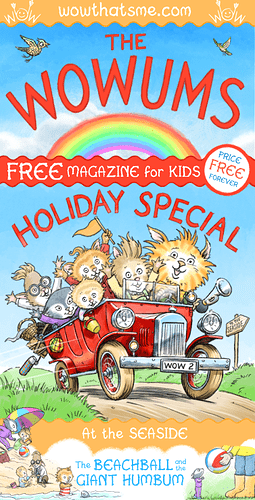
We’ve been making a children’s magazine called The Wowums. We used GDevelop and made all the assets ourselves, even the font!

It needs a bit of tidying up, so please excuse, and alert us to any issues you may find! It runs directly from the web and should work on mobile both in portrait and landscape mode. You may recognise one of the games we included! We’re giving it away free to help promote our personalised book business we are about to launch (also made in GDevelop). I hope you enjoy it and if you have small children (3-6) we’d love to hear what they think of it.

I’d just like to say that it is an unusual use of GDevelop and we are both still very much beginners, but we are so thankful for such a wonderful program that has made our project possible.

Fingers crossed it doesn’t break!

You can find it here

Best wishes,

Leo & Amanda

18 Likes

That’s rad as heck. I really dig the art style, and that’s a really unique use of the engine. Good work!

4 Likes

Wowwwww, so cute. I did some of the puzzles, it was good how you had the jigsaw pieces rotated. And also good how clicking the spot the difference differences in either picture would work. And I read one of the stories - The Flying Machine, don’t know if it was just me but the sound for the second one didn’t play, for “Wispa jumps into the flying machine and flies away”.
Everything is so cute and the artwork is beautiful, hope it all goes well for you.

Update, my mistake, the plane sound was quieter than the other sounds and I didn’t hear it with my sound not at full volume (my speakers aren’t good). And yes, haha, found and played the familiar Gdevelop game, very nice.

2 Likes

Bubble already said, but I have to say it again: so cute! It’s very capricious! I noticed a slight delay in each sound when it’s the first time it’s played. If you haven’t already, you can go to Resources and mark the “preload” on each sound. This allows you to preload audio files as music/sound, making them start quickly as you don’t have to wait for the audio to load.

1 Like

Looks awesome and definitely a nice, unique use of the app!

I’m not sure if you noticed these minor things:

On the introductory page when you open the magazine, on the right it says
“Find you* [sic] child on every page” should be ‘your’

When I entered my name for the stories, the name text needs a space in the beginning to separate it from the previous word. I’m not sure if you know that you can include the space within the " " in the event where you modify the name text. Like “[space]NameVariable”.

Those are the only two things that I saw. :eagle: :slightly_smiling_face:

Overall, it’s really cute, great work! :clap: :clap: :clap:

1 Like

really great well done! could be my internet but loading was a bit slow maybe because the artwork size?

1 Like

Thank you Bubble, We’re delighted that you liked it.

Yes, some of the tidying up is to adjust the relative sound volume. When you say ‘read’, did you only read the text or try the read aloud feature, i.e. click on the trumpet button along the bottom icons? Amanda reads the stories aloud but we’re interested to know if we need to draw more attention to that button. Something we’ve found is that UI design is so much more involved than we first thought. We’ve redesigned, discussed and redesigned like a 100 times! I don’t think the big boys always get it right, the other day I was floundering around in GMail trying to figure something out!

Thank Rasterisko, we’re thrilled you liked it.

Thanks too for the tip about the preload, we didn’t know that. :slight_smile:

1 Like

Thank you Shadow_Assassin,

You are right about the download size being a concern. I put all the art through TinyPNG to crunch it down. I’m also into the process of clearing out unused and/or oversized PNGs that we left lying about during development. It’s like tidying a messy bedroom!

The mp3s are some of the biggest files now. We tried a similar thing to TinyPNG with the mp3s, but afterwards they wouldn’t play in GDevelop. We’re new to sound stuff and I’d be grateful if anyone knows of a sound compression system that works in Gdev?

Great you enjoyed it :slight_smile:

1 Like

Hello again, thanks for really caring what people’s feedback is. So here is some more.

Story and other things audio
I didn’t know about hearing the story. I did click on the speaker at one point to see what it did and nothing happened, maybe just slow loading. And I don’t remember thinking ‘oh that’s a speaker’. I think because nothing happened when I clicked it I just wondered what the icon was, it didn’t scream ‘speaker’ to me, haha.

Customisation
On the type your name and pick your look pages I was expecting some kind of save button. And then I clicked the home button and the ‘You in the Stories’ links to those pages still had the default picture and blank name. So I thought it hadn’t worked and went back looking for the save button.

I realise now there were arrow keys at the bottom that would take me to the next step and then onto the intro where my name and pic would be used. But I guess, for me, I don’t necessarily follow a linear path and because I didn’t see the word ‘Next’ I didn’t realise there was a ‘process’.

And yes, it would be cute, haha, but not essential if the contents page with the name and pic link did update to the user’s choices.

An indication of time/pagecount for stories
I do remember when reading the flying story wondering how many pages it would go for, so some kind of progress count could be useful. Or even some kind of indication on the contents page.

LInear vs dipping in and out
And I didn’t realise til now on checking, that the whole magazine: intro, stories, games and activities is a one after the other thing with the arrow keys. My style was to do one thing and then click the home button and see what I wanted to do next.

Puzzles
And the audio feedback after completing a puzzle is really nice and encouraging. Took me a while to find egg number two in the egg hunt, haha. And the spot the difference wasn’t too easy either. So yeah, it’s good to give kids something to achieve rather than making it too easy. And because I didn’t know about the speaker button to hear the instructions I didn’t play the maze game because I thought what’s all that scribble and then just went back to the home page, haha.

And Phenomena is right about the space needed before the user name.

:blossom::blossom::blossom:

1 Like

Hey Bubble,

Thank you so much for your feedback and we care very much indeed. It’s incredibly useful and we’ll definitely take in your suggestions. I never thought it but UI design is so involved and subtle and we keep changing it as we see people using it. On the face of it it’s basically a flickbook, not unlike a PDF reader, should be as simple as flicking through a physical magazine… but no way!

Some of the UI design is limited by our lack of knowledge of programming. We’ve kind of relied on working around what we don’t know, although we keep learning new little areas of GDevelop that expand our capabilities. It’s why I love GD, it’s wonderful accessibility.

Thank you again for your detailed feedback, so grateful. :slight_smile:

On a side note you may be interested in the project as a whole and how we are approaching setting up the business (rather, stumbling around blindly!) I started a thread on a business forum about it here.

Thanks Silver Streak. I’m delighted that you thought it ‘rad as heck’, a fabulous expression!

GDevelop is as rad as heck with knobs on! I’d hunted around for other programs but couldn’t find anything that was as accessible, powerful and within our budget of virtually nothing! Back in the day I would have used Adobe Flash, which I loved.

Early on we hit a serious snag with our very limited knowledge, that of mobile rotation. Eventually I realised that we were treating the project as you would a fixed design program and we needed to look at it as a game, specifically the game port ‘camera’ as a movable window looking at the ‘magazine’ on a flat surface. It’s dumb that we’d not figured this out earlier!

Although it’s all working ok now, and once the tidying up is done, good enough to release, we feel it should have gestures, such as pinch zoom and swipe. We’ve hunted around but have struggled with the few tutorials we can find. I think part of it is our very limited knowledge to be able to adapt them to our unusual use case.

If you know of a tutorial that would help we would be grateful. :slight_smile:

This forum is the first place where we have shown it and we’re delighted that you like it.

1 Like

I read all the business story, very interesting. That’s a great idea to attract attention and love with a youtube channel devoted to how to draw. Perhaps some/all the videos could be aimed at simple but effective drawing for kids.

I remembered something else about my non linear dipping. In my first interaction, after I typed my name and picked my picture I didn’t even see the personalised intro because I went back to the contents page.

1 Like

Wow! So cute and fun to play and I’m an old man. :slight_smile: Great job.

1 Like

Thank you again Bubble and everyone for your feedback. So useful! We’ve implemented I think all your suggestions and now hope it’s all working. I’ve put it up on the same link

Also made an intro page on the Wow That’s Me website.

I’m delighted that you found our business story interesting. I’ve spent most of my life trying to find a solid business idea and escape the hours for work system. Of the many business books I’ve read the most realistic and practical are the books by MJ DeMarco the forum’s built around.

Thanks RbetterKids, You are never old if you love to play like a child. We’re both getting on a bit!

That’s really lovely. I know that I would have been sat for ages with such a thing if it were around when I was age-appropriate. I even wanted to illustrate children’s books for a similar age group many years ago. It feels interesting and enthralling enough for any young child.

It reminds me of things like Rupert the bear. :slight_smile:

1 Like

Thank you RuthCookie,

We sometimes worry that it’s bit old fashioned… but at the same time we grew up and love classics like Rupert Bear. We have lots of ideas for classic activities in future editions, things like Heads, Bodies and Legs, Mazes, silly limericks. We hope modern kids with all the sophisticated flashy games they have will still respond to a bit of old fashioned!

1 Like

Hi again, this time I read all the stories and did the games I hadn’t done before. It’s very good.

Some more notes:
I think there’s still some sound ‘levelling’ to do. For example, I could only hear the maze instructions if my volume was up full. And then the first bird I clicked on after doing the maze on the Sounds of Birds page almost deafened me, haha. It was the only one that was very loud, it was top right. And the top left one was very quiet. Also the door knock sound on page 10 was very quiet. I thought it didn’t work until I went back and checked after the maze/bird page disparity in sound. There were other examples but these were the most obvious. At one point I used some free software that would take a whole heap of sound files and bring them up to the same volume.

With the maze, I found it difficult when the lines dipped down out of sight and thought I was doing the right line. I didn’t really try all that hard (that’s my story), but for example, the blue bird’s line started off up in sight and then got lost among the tangle at the bottom. It could just be me though. And I ended up cheating by ignoring the lines and just carrying each bird to a perch and seeing if it would stick.

Is it possible to make the pic and name on the contents page update to the players’s details? It would be a nice touch.

1 Like

This is incredibly awesome, I never would have thought of doing something like this. Well done :smiley: !

1 Like