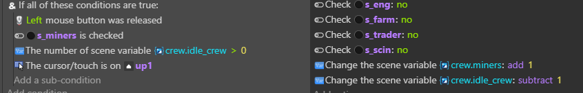
I would like the player to be able to select a single toggle switch and only 1 out of say 5 total. Then the player can click a + or - button they add or subtract from a variable then the player can select a new toggle switch and son on. Ive gotten everything working but the selection of a single one and unselecting the others on each selection. Its been driving me crazy.
Could you post your events? I guess that would make it easier to suggest something.
Just a question for understanding the situation better: is the toggle switch really necessary for what you want to do? Of course I don’t know what your game is all about but for allocating resources it seems you could just connect your up and down buttons to the variable that represents each area. A lot of games do that actually because it is rather unpleasant for the player to use a switch before pressing buttons again for in- or decreasing the number.
Can you post a picture if your UI. As mentioned, maybe there’s an easier way?
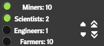
I used the word toggle because thats the sprite toggle switch extension. Its really a button to show selected or not and the problem is as I said you can toggle more than one. My problem is the user needs to adjust the people to jobs up or down in numbers for all of the job types. I wanted to do that with out putting a button next to each for + or - just select the one you wanted and change the job number.
Maybe the values themselves can be the collision object or a hidden object behind them if the values are too small in size. Keep it simple and make what they need to do extremely obvious.
Click the value then place the up/down or plus/minus objects beside the value or around the field.
Either - 16 + or 16 -/+ If this is for tiny mobile screens, I prefer wrapping the buttons around the value. It would give the user more space to click just one button at a time. Especially for people with larger fingers.
Clicking another field switches to it. Either change the color of rhe text and/or a sprite behind the text and/or add a border around the value to highlight it.
Another option is to use arrow sprites or keys to step through and highlight each field in sequence.
You can use one technique or a mixture of any.
I would look at how similar apps handle their settings screens and emulate what would be the easiest for the user to use.
Thanks for the help and I’m always open to new suggestions on how to do it. That’s why this is really just a mock up layout for once I do all the math on the back end and the front end can be adjusted how ever it needs. As I said my problem is allowing for both + and - then switching to a new item without 20+ action groupings
Edit: the very first line is a holder from a previous idea. I’m updating everything.
Edit: The extra line was removed from everything. There might be a remaining object variable leftover. IDK. I changed my concept several times.
I was intrigued. So, I played with this. It still needs a lot of work. The up/down arrows should probably be at a fixed location and there’s no validating but I think it has some good concepts.
Try online:
(Edit: this uses 2 text objects, a panel sprite for the hitbox set to the default size and 2 sprites (1 for increase and 1 for decrease) everything is created at runtime except the arrows but that would be an easy update)
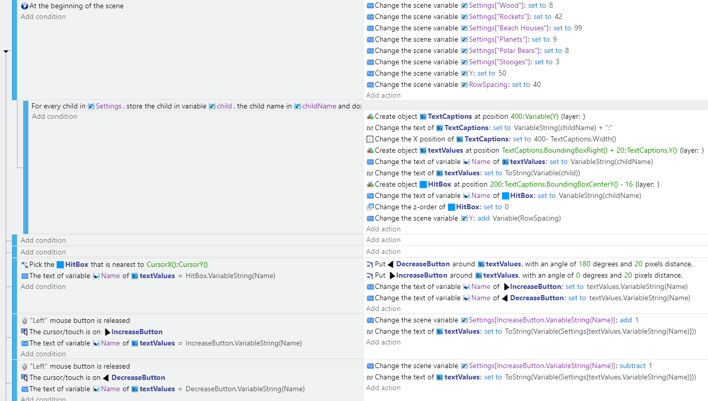
project:
doug13579/gdevelop-setting-screen-example (github.com)
Update: Instead of checking for the collision of the tiny arrow, I just had it check if the cursor.X() is less than or greater than the value box. Much more forgiving. Also, references are now based on the hitbox sprite. I created a different source file.
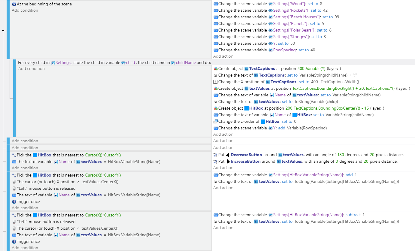
Source:
doug13579/-gdevelop-setting-screen-example2 (github.com)
edit: I think the arrows could be moved to the ends or maybe show or change the appearance of the arrows based on where the cursor is. Maybe keep the arrows and put your max and min arrows at the end and beginning of the hit box.
My thanks this looks like it will work well. I will download and update my code and let you know how it goes.
Thanks again for your help with this.
I enjoy helping and it helps me learn as well. I never made a settings screen. This is new to me as well.
This is actually the main game its loosely based on BRE ( Barren Realms Elite) and TW2002 old doors BBS text based games. The first part is menu and resource driven then the game changes and gets more modern platformer. Its ambitious for first game Dev but Ive never gone basic hahaha.
Really thanks again for the help
I made a settings screen for music only and figured out to add one toggle switch to turn on/off music. Where have you posted your game, I want to play it? If not already post it to Game Jolt.