Hi, I’m currently developing a new project and I know this will happened but this is my only solution I found, I have a game orientation = portrait, with the resolution of 480x650, and I activate full screen and turn off, keep aspect ratio. In this way my game will full screen with no black borders around my game, but the problem is when my game installed on my phone with a resolution of 1080x2080, some object stretched. I really can’t understand how full screen work. Been reading and finding it on forum.
Can someone help me how can I fix this one?
If you don’t “keep aspect ratio”, the objects stretch to adapt to the screen, it’s logical.
And you’re going from almost 1:1 to almost 1:2, so it much stretch a lot.
You need to adapt width or adapt height, depending on your game, I suppose.
Experiment with the settings. In preview, you can resize the window as you want.
Thanks for the help Gruk, but sadly still can’t really fix it on my own been searching on Google and in GD’s forum for related problem I have, I can’t really understand how aspect ratio work lol hahaha, I tried to create a dummy project with the resolution of 7201280 and 10801920 since I’m working with orientation = portrait, but still the black border around the game exists, I don’t know if I also did your suggestion of ‘adapt width’ or ‘adapt height’ right, I just did like this on event
Condtion: at the beginning of the scene
Action: adaptHeight, since I only work with portrait devices only.
My properties
Game resolution: No changes to the game size.
I guess, I didn’t do it right what you suggest to me, I really having a hard times with this problem and I hope to completely understand this issue.
I hope someone can explain to me specifically what should I do, Thank you.
Why do you use an action? Set adapt height (or width) in the game properties. Then click preview and resize the window with the mouse to see what changes.
Depending on the option you pick, on the right or the bottom side, the viewport increases, while on the other side, the game is rescaled but without distorting the graphics. And vice-versa if you pick the other option (height/width).
Game resolution resize mode = Change height to fit the screen or window size.
In smaller mobile devices it looks good until when I’m on my phone resolution, game is not fitted perfectly, there’s a white empty space below of the screen. Is there any tricks for this problem?
I guess I finally understand a little how these things works but I need to sure If I correctly figured it out.
So I need to set my game to change height to fit the screen or window size (as i’m working with portrait screens only) and for the background I should atleast create a 16:9 ratio for background size (bigger than my game height size ) so that if my game run on devices with a height of greater than my game’s height, it will not show white empty space and no black borders around my game. Am I right Gruk?
Anyways, I’m glad that I finally have an idea about this, how slow am I lol!
And yeah I’m taking back what I said that I don’t need an Anchor for this problem, I should at least apply it to some objects on my game if I have an objects on the bottom of the screen so it will stay on the bottom on any mobile screen.
Check this out, If I did it right with the background of the game. (Sorry I don’t have an internet, just a mobile data so I just took a picture with my phone).
Looks like you’re getting there
If the slimmest possible ratio is 1:2, then your background image should be 1:2
So, in your case, if your width is 480, the height should be 960.
2700 seems a bit overkill
You can also resize your sprites at the beginning of the game depending on the actual size of the player’s screen, to mitigate performance issues.
Good luck with the anchor.
Thank you so much @Gruk, you really helped me a lot to understand this well. Still searching about aspect ratios to gain more knowledge about this.
So yeah, that’s what I thought 2700 is way more taller than the recommended height.
I go with 1:4 as I red about the screen sizes on Felgo.
Reference here:
Basically I just applied the logic about the SD, HD and HD2, I went with HD2 for worst case scenario.
I edited my background to 480x1920, I actually can also go with 1:3 but I chose with the biggest size just in case.
@UlisesFreitas speaking about this issue I have after I applied Gruk’s solutions, I encountered a new problem with my sprites/objects is not look good as it only take the original size of my sprites/objects on different screen sizes.
Can you give me an example how can I do that about the camera and adapth height? I really have no idea how to do that.
 hahaha, I tried to create a dummy project with the resolution of 7201280 and 10801920 since I’m working with orientation = portrait, but still the black border around the game exists, I don’t know if I also did your suggestion of ‘adapt width’ or ‘adapt height’ right, I just did like this on event
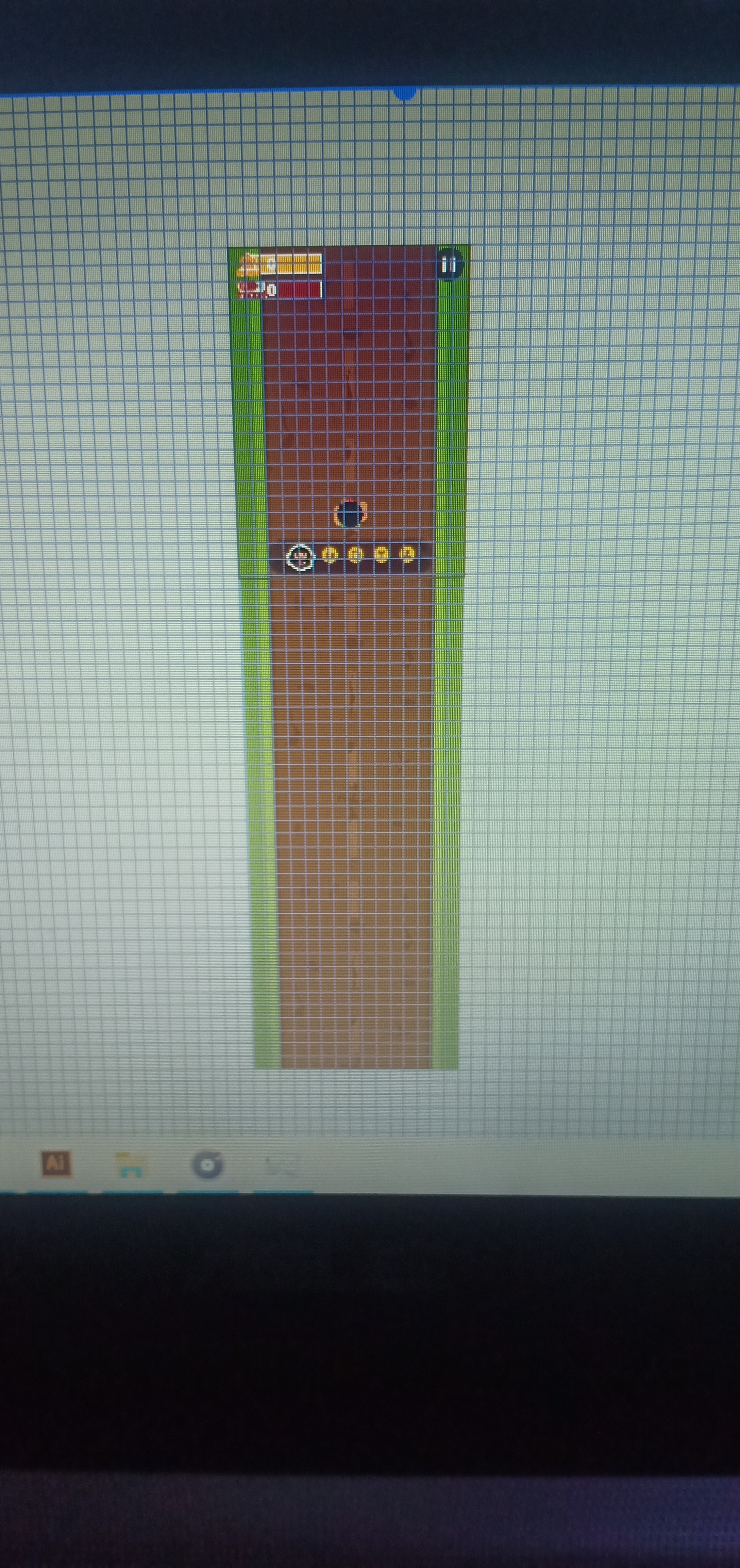