Hi DSM, I played your game on gdgames. Haha, I read your comment there that most of the plays are your test plays, that’s crazy that dev plays all get counted.
My feedback, firstly, there were 3 loading screens before I could play and it took about 5 minutes for them to load. Maybe there was a temporary connection glitch, I don’t know. Or are your sprites/other assets really big in file size?
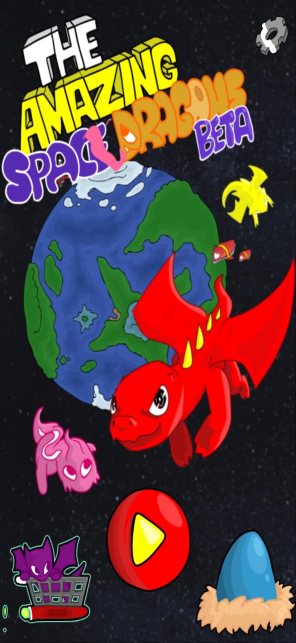
The second loading screen looked stretched and made the writing hard to read. I wasn’t sure, but the title screen looked a bit stretched too. I chose the first gameplay option and then there was another loading screen.
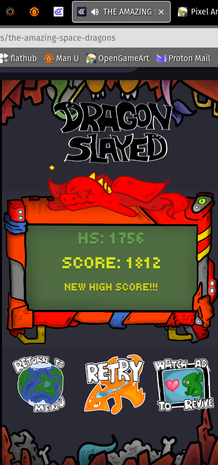
I’m not really a gamer type of person so my feedback is probably not relevant. I didn’t actually know what to do or what I was meant to achieve. I just randomly clicked and died or something very quickly. I chose retry and then there was another loading screen.
This time I realised I was meant to move the player object. But I didn’t know which things I was meant to be firing at or avoiding or deliberately colliding with. You might say, well you could learn from your score what’s good and bad. You’re right but I tend to be very focussed on one thing haha and don’t notice things on other parts of the screen. Which is a me problem for sure.
Could there be some kind of help system to know what things are good and bad? I know help systems are annoying to make so maybe you could have some kind of visual in game reaction/feedback effect for the first few collisions with each object type? Something that clearly shows whether it was a good or bad thing to collide with/shoot. Or get smarter players than me haha.
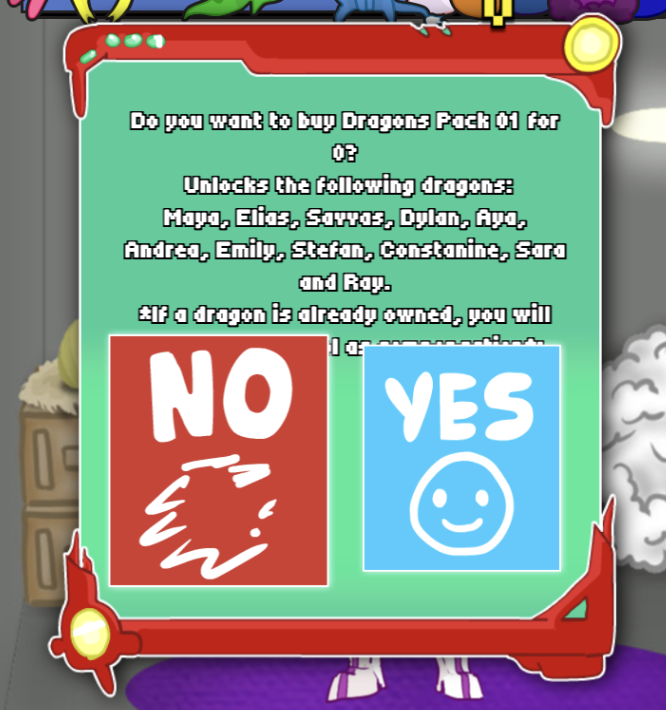
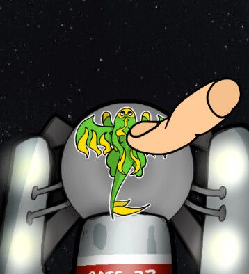
The visuals of the gameplay were creative and beautiful. But I feel like I’m going to be overly critical here, for me, the title screen with the play button (shown in your first post) is really bright and not representative of the game. All the intense colours meant I didn’t know where to look especially as it was so full of things. The menu screen between retries was also difficult to get a sense of what was important because of a lot of colours. Have you thought about making the title and menu screens more like the game itself - less colours, less objects and some of them a bit muted in colour?
As for the gameplay itself, it was very smooth, well done. I played on a laptop. I realise it’s intended for a phone where keyboard control isn’t an option but I thought the lack of wasd/arrows/onscreen joystick thing was great. Just moving the mouse to control player movement was easy and fun.