Why doesn't my game look good?

I don’t know why, but my game doesn’t look very good.

I make 20*20 tilemaps and most other art is a multiple of 20 too.

That might be the problem, but I want others opinions first, to see if there is anything else I could fix, or any art tips I could hear.

Here are some examples:


My initial thoughts are that the objects don’t have shadows and don’t have shading to them.

Also, the textures repeat with no break in the pattern. For those, consider creating a number of slight variations with different details. Have a look at the game art from Cainos - although the stones in the wall are pretty much all the same shape, they vary in colour or hue and have slightly different details (nicks, some with narrower gaps, some protruding or set back etc). If you apply this kind of variation to your walls and floors, it should make the game look better.

That is a good idea and I’ll try it. I think one thing that would help is lighting, but, developers can’t currently use light objects alongside the tilemap object because it looks very, bad.

Lighting can be faked. I do it a lot in my art. You can have light-beams coming through windows (yellow transparent shape), glowing candles (circular orange transparent shape with opacity tween loop), shadows in the corners of rooms (triangular black transparent shape) etc. In the example MrMen provided, the artist uses this technique. But it depends on the ‘rules’ you have given yourself for your pixel art. For example, if you have said “I will only use 16 colours”, then the kind of lighting I have described might not be possible, and you would need to experiment with dithering techniques instead. Some pixel art games have dynamic lighting and other modern effects on top (Animal Well), while others are very strict about looking like older games and would only use a limited number of colours and no transparency.

I’ve done some of ya’lls suggestions, and here are the results! I think it looks a lot better, though it could be even more so if more people gave advice.


Hi, It looks better than before. Here are a few things that stick out to me:

On a general note:
Do you use a color palette? My guess is that you are not and if you are using one, it has too many colors. It is really better to limit yourself with colors (especially at the beginning) and try to convey what something is through the texture, shape etc. Also gras doesn’t need to be green all the time or the sky blue etc.

First image:
Your room looks sterile. Is it a house with one room? A living room (if so what are the beds doing there)?

Is it necessary to have the same brown color for the wall and the floor? Does the wall need to have this horizontal lines which probably represent wooden planks? What about having just a different color for the wall or floor and a few images more and/or a window? Or shelves with books or some items that tell something about the people who live in this place?
If the wall and the floor are not very important for the situation in the game, you could consider to reduce their saturation and value. At the moment they seem to be as important as the character in the image.

Is it important that the table has this horizontal lines (you probably want to indicate that it is made of wood)? What about placing something there?

The room looks abandoned. You could scatter some items around. You could put a carpet inside. Is it necessary to align all the furniture to the walls?

How you answer these questions depends on what the background of this place is. Maybe it just has to look the way it does, based on your story.

1 Like

I’d still suggest shadows. It’ll make the objects appear like they are on the floor and part of the room. As they are currently, they appear to be just images pasted over the floor and walls.

You could also break up the walls with vertical beams/poles, more or larger pictures/paintings and maybe a window or two.

Also, if you move the furniture around so it’s not all in line with the wall then then it may make the appearance less staged.

1 Like

Just thought I’d throw in that some sprites have a black border and some don’t, I would probably try to consistently use one or the other for your sprites other than tile sprites.

1 Like

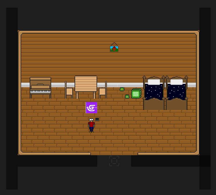
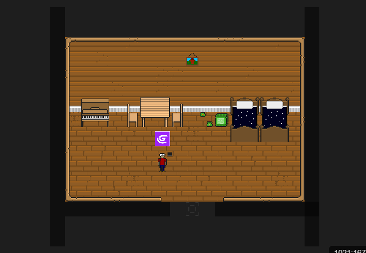
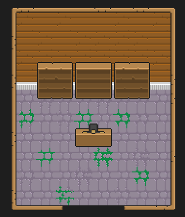
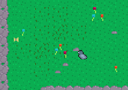
It looks alright to me.

What software do you use to make it?

The first advice I can give you is, try to spend 20 minutes every day following a step by step tutorial on Youtube, preferably in the art style you are learning (pixel?) and with the program you use.

Sadly I did a preliminary search on Youtube for pixel art tutorials and most of them are complete rubbish, featuring personalities that are all talk, tips and ‘theory’. No one ever got good at pixel art by listening to pixel artists talk about it. You need step-by-step tutorials that you can follow along, hands on. So you may have to do some searching to come across some decent ones.

Also, if you can find enough decent tutorials to follow along with, by the end of it you will end up with a small library of original assets for your own games (because your results are never going to look the same as the tutorial you are following - at least mine never do).

Also sadly, pixel art seems to be a style that is more difficult to make look nice than other styles - perhaps because there is a pitiful lack of decent tutorials. And the smaller you go, the harder it gets! I use Inkscape/vector graphics and it’s insanely easy to get decent fast with 20 minutes a day, because it is a popular software/format for eveything from game design, logos, and people that make tshirts or use cricut machines, so the step-by-step tutorial resources on Youtube are massive.

Seriously for pixel art your game is looking good so far, and you’re tweaking it here and there according to the good advice given. You will just keep getting better and better the more you do it.

You can also go to OpenGameArt.org or Itch.io and search pixel art for inspiration and to get an idea of what others do to liven up their images, if you can’t find decent tutorials.

EDIT So yeah don’t get too caught up in the art for this particular project. Just do the best you can for now (and it’s really not bad, I’ve seen some really popular games with ugly pixel art) and keep working to improve. The best way to improve is don’t worry about what it looks like, just keep doing it.

1 Like

Great advice from Lucky-j. To reinforce Lucky’s points:

  1. Games with amateurish, very basic, or even ‘ugly’ graphics have sold millions. Such games have a distinct look and charm, and that goes a long way. Also, it’s the gameplay that truly counts. Would people love Undertale if it had photorealistic graphics but terrible gameplay? Or Minecraft? Or FNAF? Or The Darkside Detective? Or Thomas Was Alone? I recently played the Frog Detective games. Those games have basic, barely animated graphics, but they have charm and a distinct style of their own.
  2. You will get better the more you practise. I’m 49 and my art still improves when I spend a lot of time working on it. I don’t think these skills ever plateaux.
  3. Your current art is promising and certainly not bad. I have seen far, far worse.
3 Likes