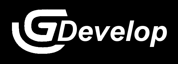
The change in the logo is to remove the “AME” and there is nothing wrong with that.
However, DEVELOP became inconsistent after cropping.
I don’t want the G logo to change because it’s cool.
All I want to do is rewrite “Develop” to be consistent with the G logo.
For example make “Develop” (Not “DEVELOP”) italic and bold.
I don’t know if I have the right to suggest something like this on my own but hey, just my opinion.
When i read trough your message the moment i understood what you want
I was sure it is so nitpicking on your side i could not believe you made post about it
BUT to be fair i wanted to see if my eyes will change my mind over what i saw in my head
And i stand corrected
You do have a point
Develop now looks more like its fitting G rather than DEVELOP in original logo
But i can’t decide do i like Develop or DEVELOP more
I like both
Okay, I admit it might be weird to make a post about that But since the full logo appears in some games I think it is worth it.
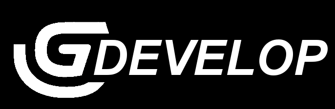
And yes, the logo with all the letters in upper case looks nice too.
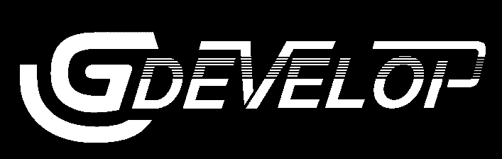
Not to be the contrarian, but i dont like your ideas…
They make too much of the same and take the shine away from the big part fo the logo, the “G”.
Having the “Develop” in thinner, smaller print, brings more impact to the trademark “G”, this is good design, makes your brand instantly recognized by a symbol and not what it says, even people that cant read can spot it a mile away… again, this is good marketing and design.
If you make everything the same, then it becomes about what is written and people need to acknowledge the whole thing instead of the symbol.
This is why brands such as Nike and Adidas have an extra, separate trademark symbol, distinct from the writing, so that the brand can be recognized in both ways.
Maybe “Develop” can be tweekd, but never to match the “G”, that just breaks everything.
I wasent saying the logo shouldnt change, i was just saying why making the “G” and “Develop” the same style would be a bad idea.
Id love to see new styles of Logos for GDevelop.
…also, this topic…
That shows what i was talking about… Its different, but it still keep recognition quick. The “G” is still the main focus with a new graphic, standing as the main logo, and then “Develop” just complements it.
Its snappy and you can spot it a mile away and pick it from a crowd…
Ye, that’s might be the reason why they have chosen the “Develop” part not to make bold and italic.
Oh well if you mean with that the fanart logo which I have created… Just imagine “G” as their blue one, then it has its main focus back / stand out again.
It was more like an attempt to make the “Develop” part more unique.
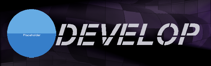
The blue ball is a placeholder, just imagine that there would be the blue “G”.
It is still overcomplicated in contrast to the current fashion of flat letter designs, oh… and I made a kitchy purple background.