This is probably the case for many people. I’ve had many times where I open the button action and search and search and can’t find “pressed” because I’m not in the condition.
Isn’t all of this handled with CSS? It should be possible to make your own designs: GDevelop/newIDE/app/src/UI/Theme/Global/EventsSheet.css at master · 4ian/GDevelop · GitHub
As for responsiveness… I wish for better keyboard input. I find that there are so many instances where mouse pointing should not be necessary.
However, you cannot change the event icon, as it is already part of the application (I have looked at the source code).
I love this new design, but like petlimpet said…
I also do that quite a lot.
Also, could we maybe…just maybe…get the ability to Add markdown to comments and groups? 
You can change the color of the event group.
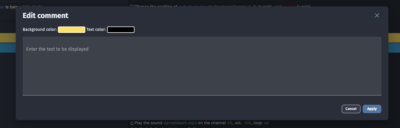
I absolutely love this, gdevelop should genuinely make this a reality
P… P… P…

Hey y’all.
I’m just letting you know that even tho this topic doesn’t follow the rules on ⭐ Welcome to the User Feedback channel! (which kindly asks to make one functional request per topic, and “improving design” is a subjective request), I am keeping the issue open so you can talk about general issues that you think are caused by the way the event sheet displays its buttons and information.
“Reducing logic errors” (aka making sure that you’re adding a condition and not an action, being able to find specific information hidden in a collapsed section…) is a better way to measure the desired benefits of your ideas than the past title.
Also, feel free to vote for specific event sheet related topics that you think would match your usability issues. I’ve made a list with existent tagged topics made by other users.
Thanks!